

The Centers for Disease Control and Prevention (CDC) provided Table 2-11 and Figure 2-12 showing mortality rate
Question:
The Centers for Disease Control and Prevention (CDC) provided Table 2-11 and Figure 2-12 showing mortality rate data from Delaware and California in 2014.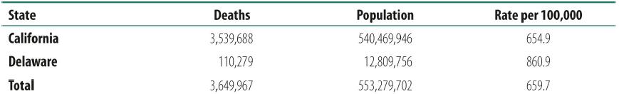
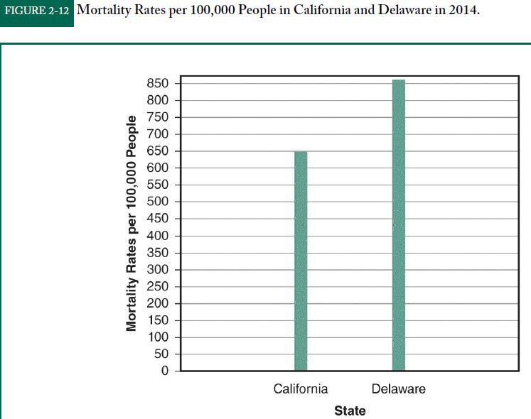
Reproduced from Centers for Disease Control and Prevention, National Center for Health Statistics. Compressed Mortality File 1999-2013. Archive on CDC WONDER Online Database, released October 2014. Data are from the Compressed Mortality File 1999-2013 Series 20 No. 2S, 2014, as compiled from data provided by the 57 vital statistics jurisdictions through the Vital Statistics Cooperative Program. Accessed at http://wonder.cdc.gov/cmf-icd10-archive2013.html on Apr 4, 2017.
Which is more effective for presenting the data about mortality rates: the table or the bar chart? Why?
Step by Step Answer:


Statistics For Nursing A Practical Approach
ISBN: 9781284142013
3rd Edition
Authors: Elizabeth Heavey
