

Use a statistical spreadsheet to construct a frequency or relative frequency bar graph for the data in
Question:
Use a statistical spreadsheet to construct a frequency or relative frequency bar graph for the data in Example 1.
Approach We will use Excel to construct the frequency and relative frequency bar graphs. The steps for constructing the graphs using Minitab, Excel, and StatCrunch are given in the Technology Step-by-Step. Note: TI-graphing calculators cannot draw frequency or relative frequency bar graphs.
Data from Example 1
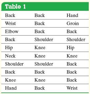
A physical therapist wants to determine types of rehabilitation required by her patients. To do so, she obtains a simple random sample of 30 of her patients and records the body part requiring rehabilitation. See Table 1. Construct a frequency distribution of location of injury.
Step by Step Answer:
Figure 2 on the foll...View the full answer


Statistics Informed Decisions Using Data
ISBN: 9781292157115
5th Global Edition
Authors: Michael Sullivan
