

In this exercise we see how the default settings in for producing boxplots in Minitab and in
Question:
In this exercise we see how the default settings in for producing boxplots in Minitab and in \(\mathrm{R}\) can be misleading because they do not take the sample size into account. We will generate three samples of di erent sizes from the same distribution, and compare their boxplots.
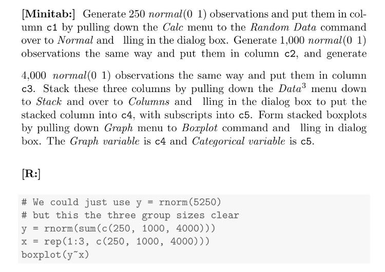
(a) What do you notice from the resulting boxplot?
(b) Which sample seems to have a heavier tail?
(c) Why is this misleading?
(d) [Minitab:] Click on the boxplot. Then pull down the Editor menu down to Select Item and over to Outlier Symbols. Click on Custom in the dialog box, and select Dot.
[Minitab version 17.2:] Left click any one of the outlying points in the boxplot. Then right click to bring up the context menu and select Edit Outlier Symbols. Change the symbols to Custom and use the dropdown box to select the Dot symbol.
[R:] In \(\mathrm{R}\) it is easy to make the box width proportional to the (square root) of the sample size by using the varwidth parameter. Simply type:
\[
\text { boxplot }\left(y^{\sim} \mathrm{x}, \text { varwidth }=\text { TRUE }\right)
\]
(e) Is the graph still as misleading as the original?
Step by Step Answer:

This question has not been answered yet.
You can Ask your question!

Introduction To Bayesian Statistics
ISBN: 9781118091562
3rd Edition
Authors: William M. Bolstad, James M. Curran
