

The following graph shows how immigration (in thousands) to the United States has varied over the past
Question:
The following graph shows how immigration (in thousands) to the United States has varied over the past century.
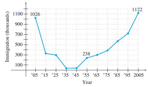
a. Find the average annual rate of change in immigration for the first half of the century (from 1905 to 1955).
b. Find the average annual rate of change in immigration for the second half of the century (from 1955 to 2005).
c. Find the average annual rate of change in immigration for the entire century (from 1905 to 2005).
d. Average your answers to parts a and b, and compare the result with your answer from part c. Will these always be equal for any two time periods?
e. If the annual average rate of change for the entire century continues, predict the number of immigrants in 2009. Compare your answer to the actual number of 1,130,818 immigrants.
Step by Step Answer:
Average Annual Rate of Change Immigration at End Year Immigration at Start Year End Year Start Year ...View the full answer


Calculus With Applications
ISBN: 9780321831101
10th Edition
Authors: Margaret L Lial, Raymond N Greenwell, Nathan P Ritchey
