

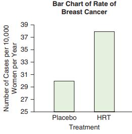
The bar chart shows a comparison of breast cancer rates for those who took HRT and those
Question:
The bar chart shows a comparison of breast cancer rates for those who took HRT and those who took a placebo. Explain why the graph is deceptive, and indicate what could be done to make it less so.
Fantastic news! We've Found the answer you've been seeking!
Step by Step Answer:
The vertical axis does no...View the full answer

Answered By
Anjali Arora
Having the experience of 16 years in providing the best solutions with a proven track record of technical contribution and appreciated for leadership in enhancing team productivity, deliverable quality, and customer satisfaction. Expertise in providing the solution in Computer Science, Management, Accounting, English, Statistics, and Maths.
Also, do website designing and Programming.
Having 7 yrs of Project Management experience.
100% satisfactory answers.
3+ Reviews
10+ Question Solved
Related Book For 

Essential Statistics
ISBN: 9780134134406
2nd Edition
Authors: Robert Gould, Colleen N. Ryan, Rebecca Wong
Question Posted:
