

A national news organization developed the graphic shown in Figure 22 to illustrate the change in the
Question:
A national news organization developed the graphic shown in Figure 22 to illustrate the change in the highest marginal tax rate effective January 1, 2013. Why might this graph be considered misleading?
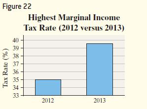
Approach We need to find any characteristics that may mislead a reader, such as manipulation of the vertical scale.
Fantastic news! We've Found the answer you've been seeking!
Step by Step Answer:
The graph in Figure 22 may lead the reader to believe that mar...View the full answer

Answered By
Anjali Arora
Having the experience of 16 years in providing the best solutions with a proven track record of technical contribution and appreciated for leadership in enhancing team productivity, deliverable quality, and customer satisfaction. Expertise in providing the solution in Computer Science, Management, Accounting, English, Statistics, and Maths.
Also, do website designing and Programming.
Having 7 yrs of Project Management experience.
100% satisfactory answers.
3+ Reviews
10+ Question Solved
Related Book For 
Statistics Informed Decisions Using Data
ISBN: 9781292157115
5th Global Edition
Authors: Michael Sullivan
Question Posted:
