Question: Module 4 Linear Regression Model Development using Power Bl Scenario: You are a university student, and you are trying to understand the best ways to
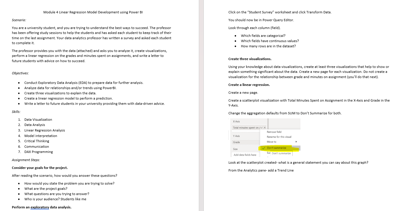
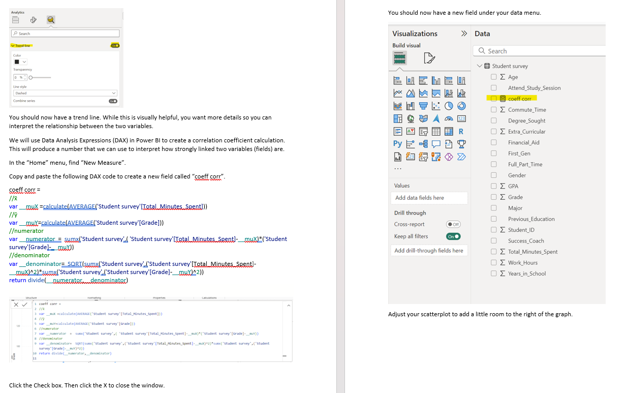
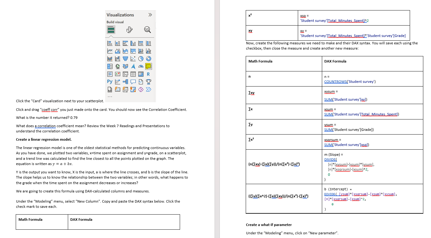
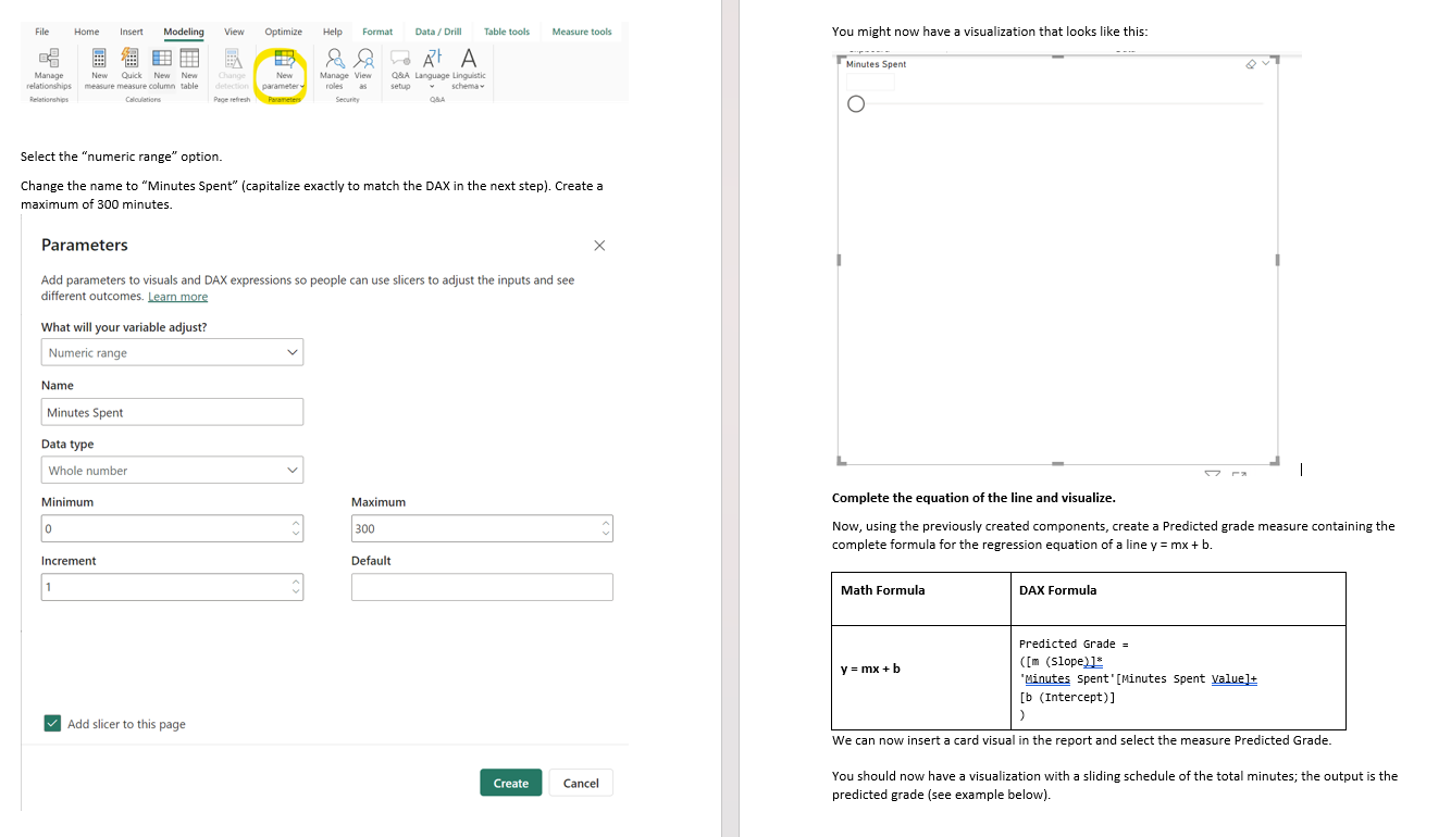
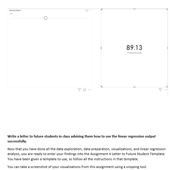
Module 4 Linear Regression Model Development using Power Bl Scenario: You are a university student, and you are trying to understand the best ways to succeed. The professor has been offering study sessions to help the students and has asked each student to keep track of their time on the last assignment. Your data analytics professor has written a survey and asked each student to complete it. The professor provides you with the data (attached) and asks you to analyze it, create visualizations, perform a linear regression on the grades and minutes spent on assignments, and write a letter ta future students with advice on how to succeed Objectives: Conduct Exploratory Data Analysis (EDA) to prepare data for further analysis. = Analyze data for relationships and/or trends using PowerBl_ = Create three visualizations ta explain the data. = Create a linear regression model to perform a prediction. Write a letter to future students in your university providing them with data-driven advice Skills, Data Visualization Data Analysis Linear Regression Analysis Model interpretation Critical Thinking Communication DAX Programming Mo on om wo Np Assignment Steps: 'Consider your goals for the project. After reading the scenario, how would you answer these questions? * How would you state the problem you are trying to solve? What are the project goals? What questions are you trying to answer? = =Who is your audience? Students like me Perform an exploratory data analysis. Click on the \"Student Survey\" worksheet and click Transform Data. You should now be in Power Query Editor. Look through each column (field). Which fields are categorical? Which fields have continuous values? How many rows are in the dataset? 'Create three visualizations. Using your knowledge about data visualizations, create at least three visualizations that help to show or explain something significant about the data. Create a new page for each visualization. Do not create a visualization for the relationship between grade and minutes on assignment (you'll do that next) 'Create a limear regression. Create anew page. Create a scatterplot visualization with Total Minutes Spent on Assignment in the X-Axis and Grade in the Y-Axis. Change the aggregation defaults from $UM to Don't Summarize for bath. X Axis Total minutes spent.on ev x Remowe field Rename for Me Ste Dontsummarize Sul Son't summarize d data fields here resem Look at the scatterplot created- what is a general statement you can say about this graph? From the Analytics pane- add a Trend Line Analytics You should now have a new field under your data menu. P Search Visualizations Data Build visual Q Search Color # Student survey arency O Z Age Line style O Attend_Study_Session Dashed Combing series coeff corr O Z Commute_Time You should now have a trend line. While this is visually helpful, you want more details so you can O Degree_Sought interpret the relationship between the two variables. O E Extra_Curricular We will use Data Analysis Expressions (DAX) in Power BI to create a correlation coefficient calculation. Py E - 09 Financial_Aid This will produce a number that we can use to interpret how strongly linked two variables (fields) are. First_Gen In the "Home" menu, find "New Measure". . . Full_Part_Time Copy and paste the following DAX code to create a new field called "coeff corr". Gender Values O E GPA coaff corr = /x Add data fields here O E Grade var _muX =calculate(AVERAGE('Student survey'[Total Minutes Spent])) Major Drill through var _muX=calculate(AVERAGE('Student survey"[Grade])) Previous_Education Cross-report . Off /umerator O E Student_ID var _numerator = sumx!'Student survey'( 'Student survey'[Total Minutes Spent]-_mux('Student Keep all filters 0 Success_Coach survey'[Grade]- coux)) Add drill-through fields here //denominator O E Total_Minutes_Spent var_denominator= SORI(sumx!'Student survey'('Student survey'[Total Minutes Spent]- O E Work Hours _mux142)*sumx!'Student survey'!'Student survey"[Grade]-_mu\\142)) O E Years_in_School return divide(_numerator denominator) Calculators X V 1 couff corr . a var mix =calculate(AVERAGE("student survey" [Total_Minutes_Spent]]) Adjust your scatterplot to add a little room to the right of the graph. 5 var_movecalculate (AVERAGE ( 'student survey" [ Grade ])) 6 /umerator 7 var_numerator sums( "student survey', ( "student survey' [Total_miru mix)" ("student survey" [Grade]-_muv)) //denominator 9 var _denominators SORT(sumx( 'student survey' . ("Student survey' [Total_Minutes_Spent 1-_mox)42)"sumx('student survey", ("student survey" [ Grade]-_muv)*2)] ie return divide(_numerator,_denominator) 13 Click the Check box. Then click the X to close the window.Visualizations x2 XSo = Build visual 'Student survey'[Total Minutes Spent142 xy XX = Student survey'[Total Minutes Spentl'Student survey"[Grade] BEME A Now, create the following measures we need to make and their DAX syntax. You will save each using the checkbox, then close the measure and create another new measure: Math Formula DAX Formula n n = Py b - 20 COUNTROWS('Student survey") Exy XXSum= . .. Click the "Card" visualization next to your scatterplot. SUM('Student survey"[x) Click and drag "coeff corr" you just made onto the card. You should now see the Correlation Coefficient. Ex XSum = SUM('Student survey'[Total Minutes Spent]) What is the number it returned? 0.79 What does a correlation coefficient mean? Review the Week 7 Readings and Presentations to Ev KSum = understand the correlation coefficient. SUM('Student survey'[Grade]) Create a linear regression model. [x2 xsarsum = SUM('Student survey"[xso]) The linear regression model is one of the oldest statistical methods for predicting continuous variables. As you have done, we plotted two variables, x=time spent on assignment and y=grade, on a scatterplot, m (Slope) = and a trend line was calculated to find the line closest to all the points plotted on the graph. The DIVIDE equation is written as y = a + bx. (n(Exy)-(Ex)(Zyl)/{n(Ex")-(Ex)2) Y is the output you want to know, X is the input, a is where the line crosses, and b is the slope of the line. [n]* [xsqrsum]-[xsum]^2, 0 The slope helps us to know the relationship between the two variables; in other words, what happens to the grade when the time spent on the assignment decreases or increases? We are going to create this formula using DAX-calculated columns and measures. b (Intercept) = DIVIDE( [xsun] * [xsorsun] -[xsun]* [xxsum], Under the "Modeling" menu, select "New Column". Copy and paste the DAX syntax below. Click the [n]* [xsorsum] -[xsun]*2, check mark to save each. Math Formula DAX Formula Create a what-if parameter Under the "Modeling" menu, click on "New parameter".File Home Insert Modeling View Optimize Help Format Data / Drill Table tools Measure tools You might now have a visualization that looks like this: At A Minutes Spent QVI Manage New Quick New New New Manage View QA Language Linguistic Hationships aquite measure column table parameter roles setup schema y Calculations Security O Select the "numeric range" option. Change the name to "Minutes Spent" (capitalize exactly to match the DAX in the next step). Create a maximum of 300 minutes. Parameters X Add parameters to visuals and DAX expressions so people can use slicers to adjust the inputs and see different outcomes. Learn more What will your variable adjust? Numeric range Name Minutes Spent Data type Whole number Minimum Maximum Complete the equation of the line and visualize. 0 300 Now, using the previously created components, create a Predicted grade measure containing the complete formula for the regression equation of a line y = mx + b. Increment Default Math Formula DAX Formula predicted Grade = y = mx + b ([m (Slope]] 'Minutes Spent' [Minutes Spent Value]+ [b (Intercept) ] Add slicer to this page We can now insert a card visual in the report and select the measure Predicted Grade. Create Cancel You should now have a visualization with a sliding schedule of the total minutes; the output is the predicted grade (see example below)89.13 Write a letter to future students in class advising them how to use the linear regression output successfully. Now that you have done all the data exploration, data preparation, visualizations, and linear regression analysis, you are ready to enter your findings into the Assignment 4 Letter to Future Student Template. You have been given a template to use, so follow all the instructions in that template. You can take a screenshot of your visualizations from this assignment using a snipping tool
Step by Step Solution
There are 3 Steps involved in it
1 Expert Approved Answer
Step: 1 Unlock
Question Has Been Solved by an Expert!
Get step-by-step solutions from verified subject matter experts
Step: 2 Unlock
Step: 3 Unlock
Students Have Also Explored These Related Mathematics Questions!


 Module 4 Linear Regression Model Development using Power Bl Scenario: You are a university student, and you are trying to understand the best ways to succeed. The professor has been offering study sessions to help the students and has asked each student to keep track of their time on the last assignment. Your data analytics professor has written a survey and asked each student to complete it. The professor provides you with the data (attached) and asks you to analyze it, create visualizations, perform a linear regression on the grades and minutes spent on assignments, and write a letter ta future students with advice on how to succeed Objectives: Conduct Exploratory Data Analysis (EDA) to prepare data for further analysis. = Analyze data for relationships and/or trends using PowerBl_ = Create three visualizations ta explain the data. = Create a linear regression model to perform a prediction. Write a letter to future students in your university providing them with data-driven advice Skills, Data Visualization Data Analysis Linear Regression Analysis Model interpretation Critical Thinking Communication DAX Programming Mo on om wo Np Assignment Steps: 'Consider your goals for the project. After reading the scenario, how would you answer these questions? * How would you state the problem you are trying to solve? What are the project goals? What questions are you trying to answer? = =Who is your audience? Students like me Perform an exploratory data analysis. Click on the \"Student Survey\" worksheet and click Transform Data. You should now be in Power Query Editor. Look through each column (field). Which fields are categorical? Which fields have continuous values? How many rows are in the dataset? 'Create three visualizations. Using your knowledge about data visualizations, create at least three visualizations that help to show or explain something significant about the data. Create a new page for each visualization. Do not create a visualization for the relationship between grade and minutes on assignment (you'll do that next) 'Create a limear regression. Create anew page. Create a scatterplot visualization with Total Minutes Spent on Assignment in the X-Axis and Grade in the Y-Axis. Change the aggregation defaults from $UM to Don't Summarize for bath. X Axis Total minutes spent.on ev x Remowe field Rename for Me Ste Dontsummarize Sul Son't summarize d data fields here resem Look at the scatterplot created- what is a general statement you can say about this graph? From the Analytics pane- add a Trend Line Analytics You should now have a new field under your data menu. P Search Visualizations