

Question: Figure 7.2 lists the best chart type for each visualization purpose. Select a chart type and describe why it is less than ideal for the
Figure 7.2 lists the best chart type for each visualization purpose. Select a chart type and describe why it is less than ideal for the other purposes listed in Figure 7.2. 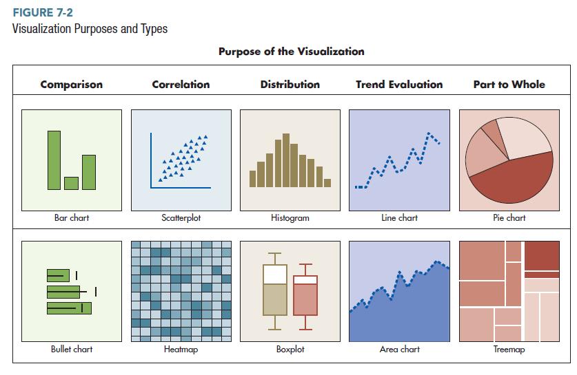
FIGURE 7-2 Visualization Purposes and Types Comparison L Bar chart Bullet chart Correlation Scatterplot Heatmap Purpose of the Visualization Distribution II. Histogram Boxplot Trend Evaluation Line chart Area chart Part to Whole Pie chart Treemap
Step by Step Solution
3.39 Rating (155 Votes )
There are 3 Steps involved in it
Lets take the Bar chart as the selected chart type and consider the other purposes listed Correlation A bar chart is not wellsuited for showing correl... View full answer

Get step-by-step solutions from verified subject matter experts