

Question: In Example 3, change the class limits to 1.0, 2.0, 3.0, 4.0, and 5.0 and then make a table showing the frequencies and relative frequencies.
In Example 3, change the class limits to 1.0, 2.0, 3.0, 4.0, and 5.0 and then make a table showing the frequencies and relative frequencies.
Data from Example 3
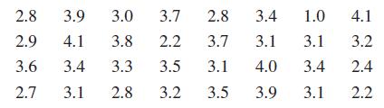
The birth weights (in kg) for a sample of 32 infants are given below. Make a histogram of these data.
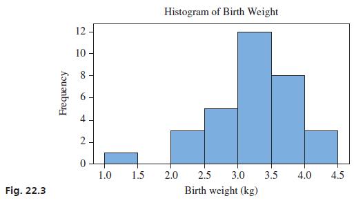
We will begin by making a frequency distribution by grouping the data and then counting the number of data within each group. The groups are called classes, and the number of data within each class is called the frequency. A table that shows each of the classes along with the corresponding frequencies is called a frequency distribution. The relative frequency is found by dividing the frequency by the total number of data. We will adopt the somewhat common convention that the left endpoint, but not the right endpoint, is included in each class. The frequency distribution for birth weights is shown to the left, with the relative frequencies also included. A histogram is a graph that places the classes on the horizontal axis and uses rectangles to show either the frequency or relative frequency, which is plotted on the vertical axis. A frequency histogram for birth weights is shown in Fig. 22.3.
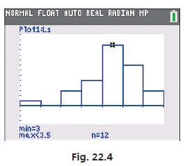
The stat plot feature on a calculator can also be used to make a histogram. The classes may be adjusted with the window settings, and the trace feature can be used to toggle from bar to bar to observe the frequencies in each class. For example, the histogram shown in Fig. 22.4 shows there are 12 birth weights between 3 and 3.5 kg.
3.0 3.7 2.8 3.4 1.0 3.7 3.1 3.1 3.4 3.1 2.8 3.9 2.9 4.1 3.8 2.2 3.6 2.7 3.4 3.3 3.5 3.1 4.0 3.1 2.8 3.2 3.5 3.9 4.1 3.2 2.4 2.2
Step by Step Solution
3.40 Rating (153 Votes )
There are 3 Steps involved in it

Get step-by-step solutions from verified subject matter experts