

Question: The data in the following table show the percentage of U.S. households that have a landline telephone for various years. Make a time series graph
The data in the following table show the percentage of U.S. households that have a landline telephone for various years. Make a time series graph of these data.
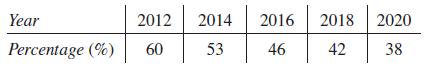
Year 2012 Percentage (%) 60 2014 2016 2018 2020 53 46 42 38
Step by Step Solution
★★★★★
3.34 Rating (160 Votes )
There are 3 Steps involved in it
1 Expert Approved Answer
Step: 1 Unlock

As we have the percentage of US households th... View full answer
Question Has Been Solved by an Expert!
Get step-by-step solutions from verified subject matter experts
Step: 2 Unlock
Step: 3 Unlock