

Question: A control chart is a graphical tool to help determine if a process may be exhibiting non-random variation that needs to be investigated. If non-random
A control chart is a graphical tool to help determine if a process may be exhibiting non-random variation that needs to be investigated.
If non-random variation is present, the process is said to be “out of control” otherwise it is said to be “in control.” The following figure shows a control chart for a production line that fills boxes of cereal. Based on past data, we can calculate the mean weight of a box of cereal when the process is in control. The mean weight is 16.05 ounces. We can also calculate control limits, an upper control limit (UCL) and a lower control limit (LCL). New samples are collected over time and the data indicates that the process is in control so long as the new sample weights are between UCL and LCL. As shown in the chart, only sample 5 is outside of the control limits. 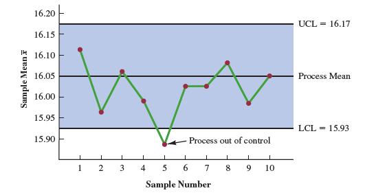
a. Is the control chart an example of descriptive, predictive, or prescriptive analytics?
b. Suppose the control cart is part of a data dashboard and the chart is combined with a rule that does the following. If four consecutive sample mean weights are outside of the control limits, the production line is automatically stopped, and a message appears on the dashboard. The message says “The production line is stopped. The process may be out of control. Please inspect the fill machine.” Is this new enhanced control chart combined with a rule an example of descriptive, predictive, or prescriptive analytics?
Sample Mean 16.20 16.15 16.10 16.05 16.00 15.95 15.90- Process out of control 1 2 3 4 5 6 7 8 9 10 Sample Number UCL 16.17 Process Mean LCL = 15.93
Step by Step Solution
3.44 Rating (151 Votes )
There are 3 Steps involved in it

Get step-by-step solutions from verified subject matter experts