

Question: For each example, which descriptive data visualization is better : a pie chart or a bar chart or line chart. Example Trend of net income
For each example, which descriptive data visualization is better : a pie chart or a bar chart or line chart.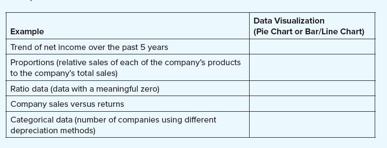
Example Trend of net income over the past 5 years Proportions (relative sales of each of the company's products to the company's total sales) Ratio data (data with a meaningful zero) Company sales versus returns Categorical data (number of companies using different depreciation methods) Data Visualization (Pie Chart or Bar/Line Chart)
Step by Step Solution
3.40 Rating (163 Votes )
There are 3 Steps involved in it
Example Trend of net income over the past 5 years Proportions relative sales of each of the c... View full answer

Get step-by-step solutions from verified subject matter experts