

Question: The contour map shown in the figure was computer generated using data collected by satellite instrumentation. Color is used to show the ozone hole in
The contour map shown in the figure was computer generated using data collected by satellite instrumentation. Color is used to show the “ozone hole” in Earth’s atmosphere. The purple and blue areas represent the lowest levels of ozone, and the green areas represent the highest levels.
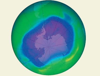
(a) Do the level curves correspond to equally spaced ozone levels? Explain.
(b) Describe how to obtain a more detailed contour map.
Step by Step Solution
★★★★★
3.23 Rating (184 Votes )
There are 3 Steps involved in it
1 Expert Approved Answer
Step: 1 Unlock

a No the level ... View full answer
Question Has Been Solved by an Expert!
Get step-by-step solutions from verified subject matter experts
Step: 2 Unlock
Step: 3 Unlock