

Question: The bar graph shows the differences among age groups on the Implicit Association Test that measures levels of racial prejudice. Higher scores indicate stronger bias.
The bar graph shows the differences among age groups on the Implicit Association Test that measures levels of racial prejudice. Higher scores indicate stronger bias.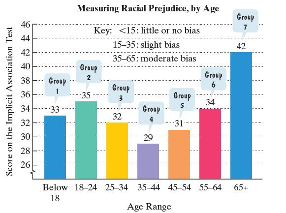
a. The data can be described by the following polynomial model of degree 3: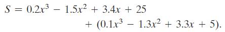
In this polynomial model, S represents the score on the Implicit Association Test for age group x. Simplify the model.
b. Use the simplified form of the model from part (a) to find the score on the Implicit Association Test for the group in the 45–54 age range. How well does the model describe the score displayed by the bar graph?
Data from exercise 45-54
Score on the Implicit Association Test 46 44 42 40 38 36 34 32 30 28 26 Group 1 33 Measuring Racial Prejudice, by Age Key:
Step by Step Solution
3.42 Rating (158 Votes )
There are 3 Steps involved in it
a b S 02x15x34... View full answer

Get step-by-step solutions from verified subject matter experts