

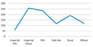
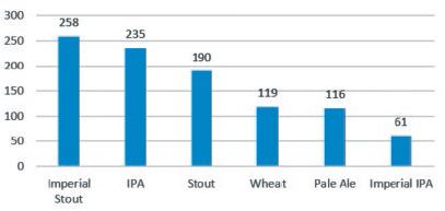
Question: The following four charts represent the exact same data quantity of each beer sold. Which do you prefer, the line chart or the column chart?
The following four charts represent the exact same data quantity of each beer sold. Which do you prefer, the line chart or the column chart? Whichever you chose, line or column, which of the pair do you think is the easiest to digest?
a.
b.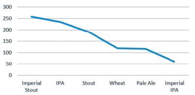
c.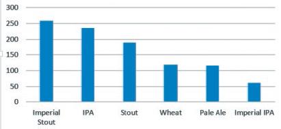
d.
300 250 200 150 100 50 0 Imperial Imperial IPA Pale Ale Stout Wheat IPA Stout
Step by Step Solution
There are 3 Steps involved in it
1 Expert Approved Answer
Step: 1 Unlock

Question Has Been Solved by an Expert!
Get step-by-step solutions from verified subject matter experts
Step: 2 Unlock
Step: 3 Unlock