

The scatter graph shows the oil production P and carbon dioxide emissions C for various years since
Question:
The scatter graph shows the oil production P and carbon dioxide emissions C for various years since 1970. A line of best fit has been added to the scatter graph.
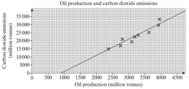
a. Use two points on the line to calculate its gradient.
b. Formulate a linear model linking oil production P and carbon dioxide emissions C, giving the relationship in the form C = aP + b.
c. Interpret the value of a in your model.
d. With reference to your value of b, comment on the validity of the model for small values of P.
Fantastic news! We've Found the answer you've been seeking!
Step by Step Answer:
a First let us take any two points from the graph Let A be 23251500 ...View the full answer

Answered By
Pushpinder Singh
Currently, I am PhD scholar with Indian Statistical problem, working in applied statistics and real life data problems. I have done several projects in Statistics especially Time Series data analysis, Regression Techniques.
I am Master in Statistics from Indian Institute of Technology, Kanpur.
I have been teaching students for various University entrance exams and passing grades in Graduation and Post-Graduation.I have expertise in solving problems in Statistics for more than 2 years now.I am a subject expert in Statistics with Assignmentpedia.com.
3+ Reviews
10+ Question Solved
Related Book For 

Edexcel AS And A Level Mathematics Pure Mathematics Year 1/AS
ISBN: 9781292183398
1st Edition
Authors: Greg Attwood
Question Posted:
