

Question: In the graph for Exercise 7.27, explain how you can tell from the shape of the graphs which has the largest sample size and which
In the graph for Exercise 7.27, explain how you can tell from the shape of the graphs which has the largest sample size and which has the smallest sample size.
Data From Exercise 7.27.
A Zener deck of cards has cards that show one of five different shapes with equal representation, so that the probability of selecting any particular shape is 0.20. A card is selected randomly, and a person is asked to guess which card has been chosen. The graph below shows a computer simulation of experiments in which a “person” was asked to guess which card had been selected for a large number of trials. (If the person does not have ESP, then his or her proportion of successes should be about 0.20, give or take some amount.) Each dot in the dotplots represents the proportion of success for one person. For instance, the dot in Figure A farthest to the right represents a person with an 80% success rate. One dotplot represents an experiment in which each person had 10 trials; another shows 20 trials; and a third shows 40 trials.
Explain how you can tell, from the widths of the graphs, which has the largest sample (n = 40) and which has the smallest sample (n = 10).
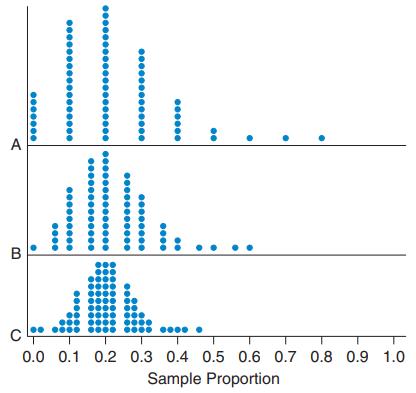
A B C 0.0 0.1 0.2 0.3 0.4 0.5 0.6 0.7 0.8 0.9 1.0 Sample Proportion
Step by Step Solution
3.33 Rating (156 Votes )
There are 3 Steps involved in it
The top dotplot has the large... View full answer

Get step-by-step solutions from verified subject matter experts