

Figure 8.13 is a scatter diagram of the annual rates of return on Apple and Microsoft stock
Question:
Figure 8.13 is a scatter diagram of the annual rates of return on Apple and Microsoft stock during the years 1998–2008:
a. What was the highest annual return for Apple?
b. What was the lowest annual return for Microsoft?
c. Was the average annual return higher for Apple or for Microsoft?
d. Was there a greater dispersion in Apple or Microsoft returns?
e. Were Apple and Microsoft stock returns positively related, negatively related, or unrelated?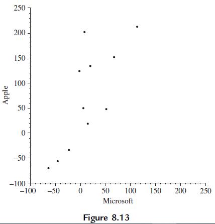
Fantastic news! We've Found the answer you've been seeking!
Step by Step Answer:

Answered By
ELISHA KIBET
Hello
I have done graduation from CCS University in Meerut Uttar Pradesh (INDIA) I have done the graduation in stream in Commerce means Bachelor of Commerce. I am having the 1 year experience as a teacher.
Thanks
0 Reviews
10+ Question Solved
Related Book For 
Essential Statistics Regression And Econometrics
ISBN: 9780123822215
1st Edition
Authors: Gary Smith
Question Posted:
