

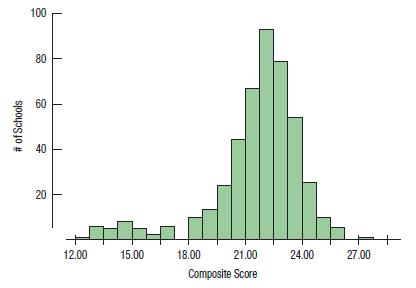
The histogram shows the distribution of mean ACT composite scores for all Wisconsin public schools in 2015.
Question:
The histogram shows the distribution of mean ACT composite scores for all Wisconsin public schools in 2015. 80.1% of the data points fall between one standard deviation below the mean and one standard deviation above the
mean.
a) Give two reasons that a Normal model is not appropriate for these data.
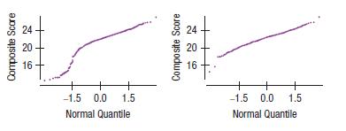
b) The Normal probability plot on the left shows the distribution of these scores. The plot on the right shows the same data with the Milwaukee area schools (mostly in the low mode) removed. What do these plots tell you about the shape of the distributions?
Fantastic news! We've Found the answer you've been seeking!
Step by Step Answer:
a The distribution of mean ACT math scores bimodal so it i...View the full answer

Answered By
Dada Sangale
I have six year experience as teacher. There i tought Thermidynamics, Chemical Kinetics, Molecular spectoscopy, States of matter, Cristal structure, Coordination chemistry, ect topics of chemistry. I have very nice approach in problem solving. I am taking private c;asses of Eleventh and twelveth science students.
0 Reviews
10+ Question Solved
Related Book For 

Intro Stats
ISBN: 9780134668420
5th Edition
Authors: Richard D De Veaux, Paul F Velleman, David E Bock, Nick Horton
Question Posted:
