

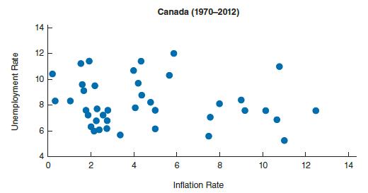
The following graph shows inflation and unemployment rates for Canada for the period between 1970 and 2012.
Question:
The following graph shows inflation and unemployment rates for Canada for the period between 1970 and 2012. Does this graph show evidence in favor of the Phillips curve?
Fantastic news! We've Found the answer you've been seeking!
Step by Step Answer:
ANSWER Inflation and unemployment rate are co related by using the scatter graph we c...View the full answer

Answered By
Anum Naz
Lecturer and researcher with 10+ years of experience teaching courses in both undergraduate and postgraduate levels. Supervised 17 BA theses, 07 MA theses, and 1 Ph.D. dissertations. Edited and co-authored 2 monographs on contemporary trends in political thought. Published over articles in peer-reviewed journals.
11+ Reviews
51+ Question Solved
Related Book For 

Question Posted:
