

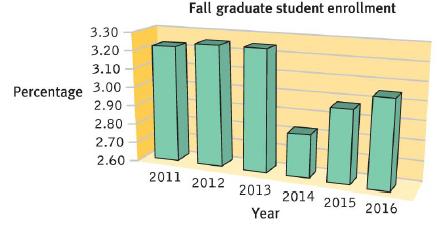
The following figure presents the enrollment of graduate students at a university, across six fall terms, as
Question:
The following figure presents the enrollment of graduate students at a university, across six fall terms, as a percentage of the total student population.
Description
The x-axis represents the year and the y-axis represents percentage.
Data from the graph are summarized as follows. All data are approximate.
2011-3.20 percent; 2012-3.22 percent; 2013-3.22 percent; 2014-2.80 percent; 2015-2.95 percent; 2016-3.02 percent
a. What kind of visual display is this?
b. What other type of visual display could have been used?
c. What is missing from the axes?
d. What chartjunk is present?
e. Using this graph, estimate graduate student enrollment, as a percentage of the total student population, in the fall terms of 2011, 2012, and 2014.
f. How would the comparisons between bars change if the y-axis started at 0?
Step by Step Answer:
ANSWER a The visual display is a line graph b A bar graph could have been used to dis...View the full answer


Statistics For The Behavioral Sciences
ISBN: 9781319190743
5th Edition
Authors: Susan A. Nolan, Thomas Heinzen
