

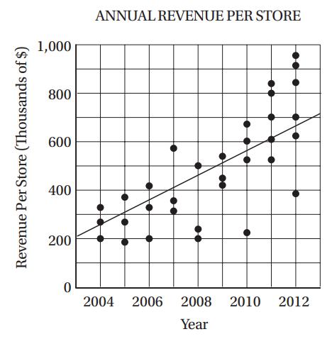
The scatterplot above shows the annual revenue for all of the individual retail stores operated by a
Question:
The scatterplot above shows the annual revenue for all of the individual retail stores operated by a clothing company for each year from 2004 through 2012. Based on the line of best fit to the data shown, which of the following is closest to the percent increase in revenue per store from 2005 to 2011?
A) 50%
B) 100%
C) 120%
D) 300%
Fantastic news! We've Found the answer you've been seeking!
Step by Step Answer:
C In 2005 the revenue per store accordi...View the full answer

Answered By
Anoop V
I have five years of experience in teaching and I have National Eligibility in teaching (UGC-NET) .
1+ Reviews
10+ Question Solved
Related Book For 

McGraw-Hill Education SAT 2017
ISBN: 9781259641657
1st Edition
Authors: Christopher Black, Mark Anestis
Question Posted:
