

Question: TV Time. Consider the following table showing the average hours of television watched in households in five categories of annual income. a. Construct a scatterplot
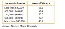
TV Time. Consider the following table showing the average hours of television watched in households in five categories of annual income.
a. Construct a scatterplot for the data. To locate the dots, use the midpoint of each income category. Use a value of $25,000 for the category “less than $30,000,” and use $70,000 for “more than $60,000.”
b. Briefly characterize the correlation in words and estimate the correlation coefficient.
c. Suggest a reason why families with higher incomes watch less TV. Do you think these data imply that you can increase your income simply by watching less TV?
Explain.
Household income Less than $30,000 $30,000 $40,000 $40,000-$50,000 $50,000 $60,000 Weekly TV hours 56.3 51.0 50.5 49.7 48.7 More than $60,000 Source: Nielsen Media Research.
Step by Step Solution
There are 3 Steps involved in it

Get step-by-step solutions from verified subject matter experts