

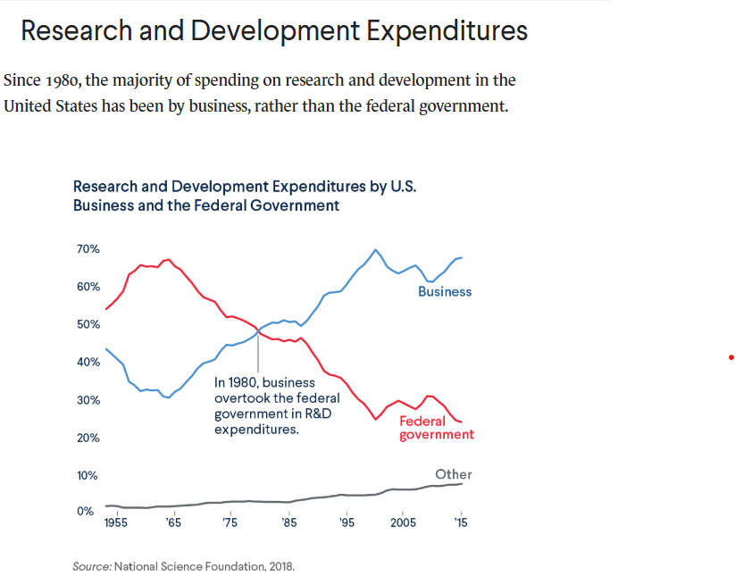
Question: 1. Find a data visualization in the wild, perhaps from a news article, book, YouTube video, or TV show. It doesn't necessarily need to be
1. Find a data visualization "in the wild," perhaps from a news article, book, YouTube video, or TV show. It doesn't necessarily need to be a terrible one, but there should be some room for improvement. (Attached the data visualization image below)
2. Get an image of the visualization. If it's animated, perhaps just include a link to the visualization
3. Write in Quarto/RMarkdown, in approximately two pages of text (not counting images):
a. What you think the story the visualization is trying to tell is
b. How effectively you think it conveys that story
c. Whether it's being misleading in some way (intentionally or not!)
d. How well it holds up the visualization principles we've learned about
e. How it could be improved
f. Why your improved version (from step 4) improves it
4. Design and draw (by hand or computer) an improved version of the visualization.
5. Include your text, original visualization and/or link, and improved visualization in the same document.
SUBMIT: Yourknitted Word Quarto/RMarkdown document. If your initial submission is an RMD I will ask you to knit it and you will lose 1 point.
Can you help me from step 3-5?
Step by Step Solution
There are 3 Steps involved in it

Get step-by-step solutions from verified subject matter experts