

Question: 1. The three graphics on the previous page all represent the same data. Regarding the types of representation used (money, volume, and a bar chart);
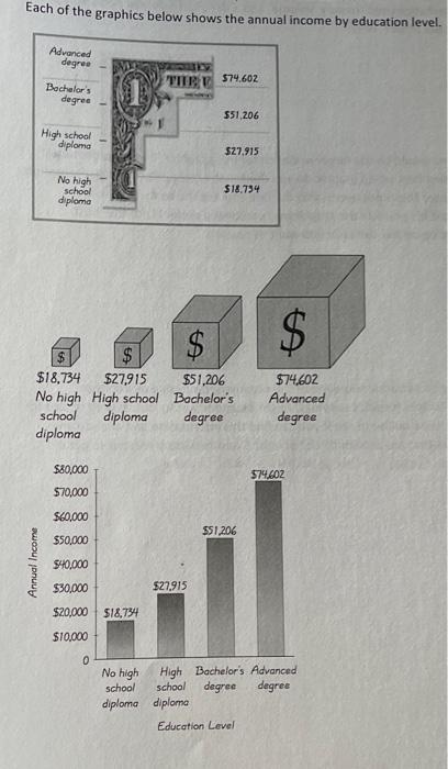
1. The three graphics on the previous page all represent the same data. Regarding the types of representation used (money, volume, and a bar chart); do you personally prefer one more than the other? Why? 2. Who do you think would be the target audience for this graphic? Based on the target audience you identified, which graphic do you think is the most effective representation of the data? (Note: This is not necessarily the one you like the best. Take into consideration that it's possible the graphic you personally prefer is not the most effective depending on the audience you want to reach.) Each of the graphics below shows the annual income by education level
Step by Step Solution
There are 3 Steps involved in it

Get step-by-step solutions from verified subject matter experts