

Question: 1. Using the data below, complete the percentage column in the frequency table. You are given the total for each category; you need to
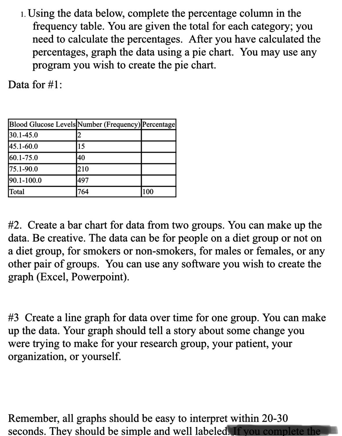
1. Using the data below, complete the percentage column in the frequency table. You are given the total for each category; you need to calculate the percentages. After you have calculated the percentages, graph the data using a pie chart. You may use any program you wish to create the pie chart. Data for #1: Blood Glucose Levels Number (Frequency) Percentage 30.1-45.0 2 45.1-60.0 15 60.1-75.0 40 75.1-90.0 210 90.1-100.0 497 Total 764 100 #2. Create a bar chart for data from two groups. You can make up the data. Be creative. The data can be for people on a diet group or not on a diet group, for smokers or non-smokers, for males or females, or any other pair of groups. You can use any software you wish to create the graph (Excel, Powerpoint). #3 Create a line graph for data over time for one group. You can make up the data. Your graph should tell a story about some change you were trying to make for your research group, your patient, your organization, or yourself. Remember, all graphs should be easy to interpret within 20-30 seconds. They should be simple and well labeled. If you complete the
Step by Step Solution
There are 3 Steps involved in it

Get step-by-step solutions from verified subject matter experts