

Question: 1. Welfare analysis: Basic concepts Identify whether each of the following statements best illustrates the concept of consumer surplus, producer surplus, or neither. Consumer Producer


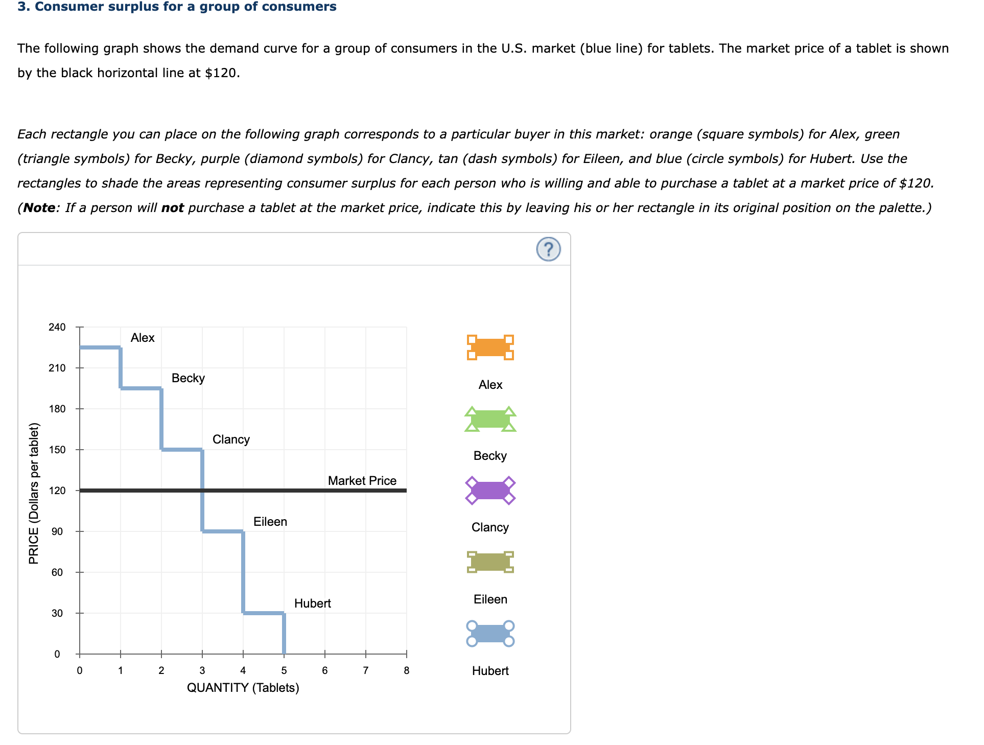


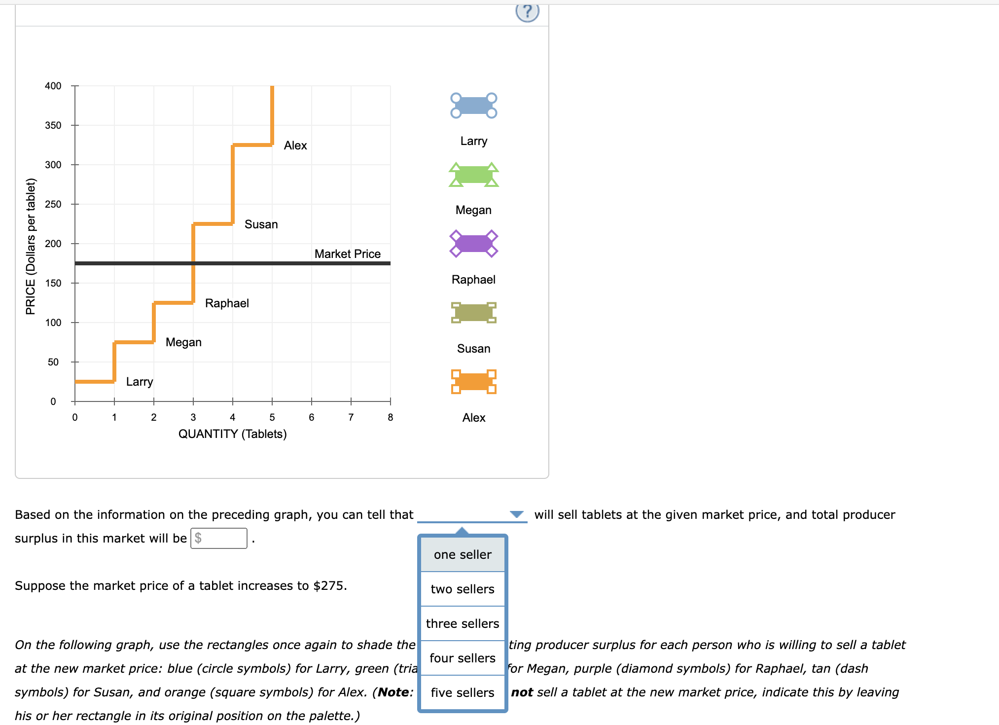
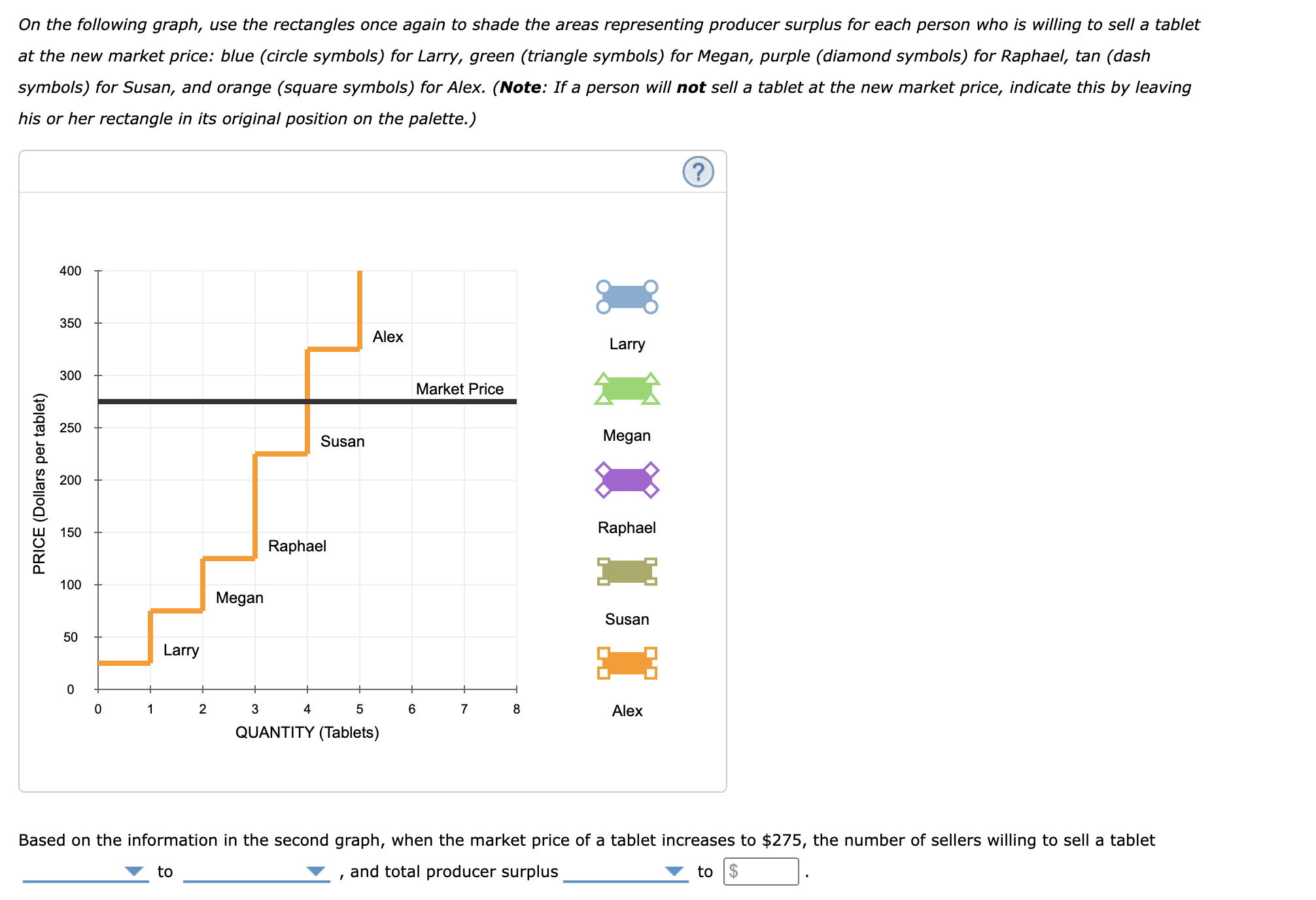

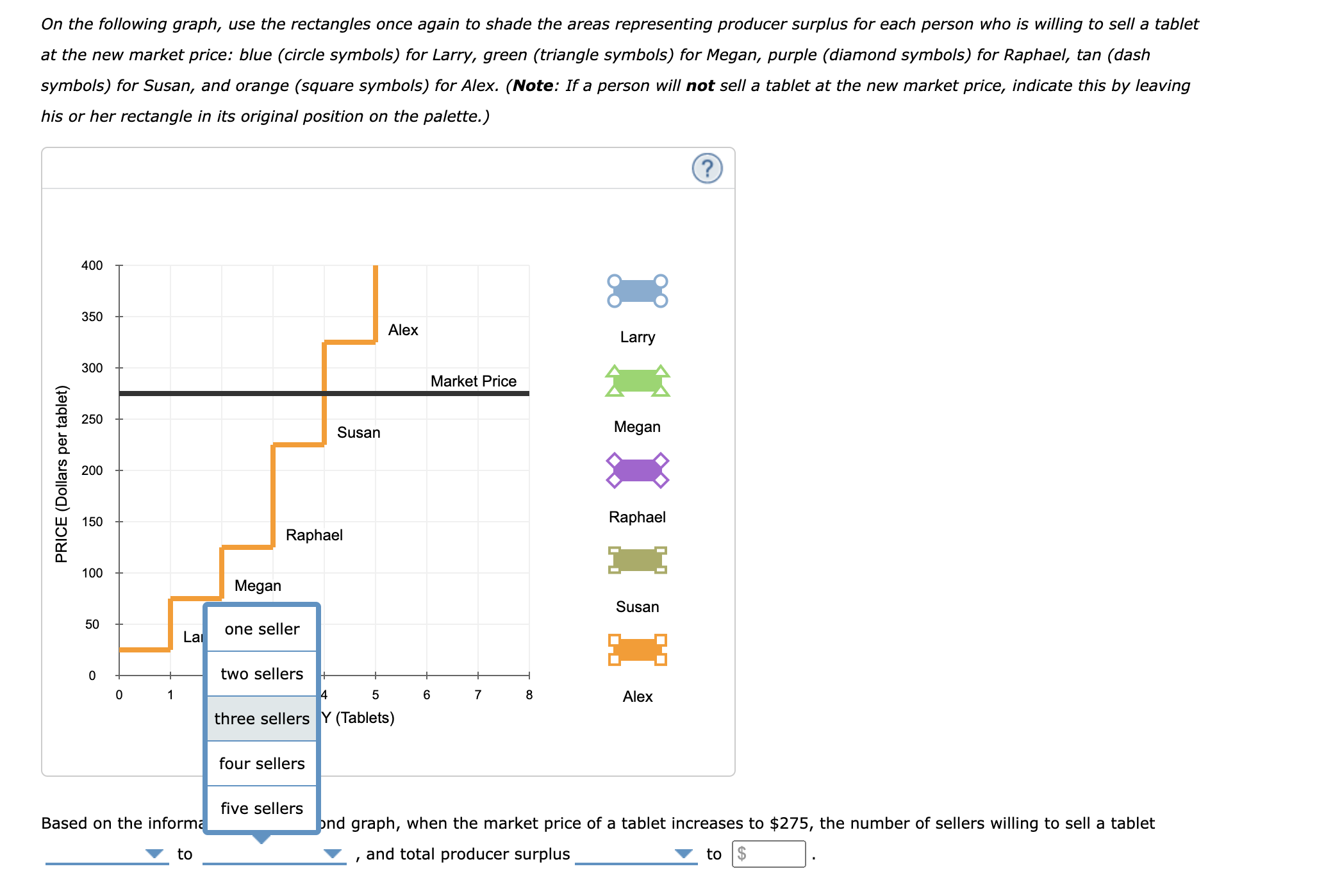


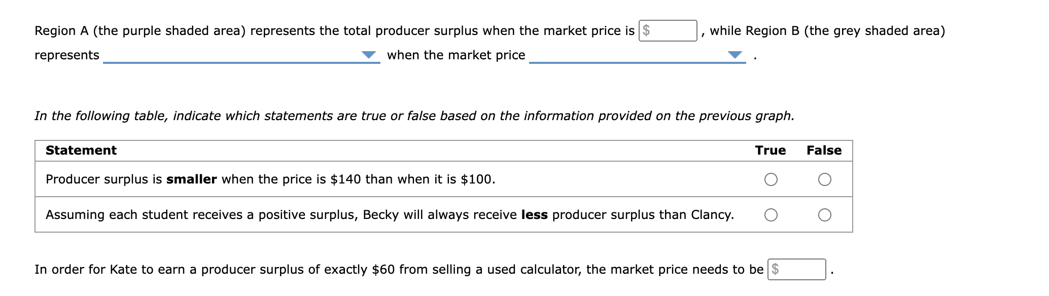


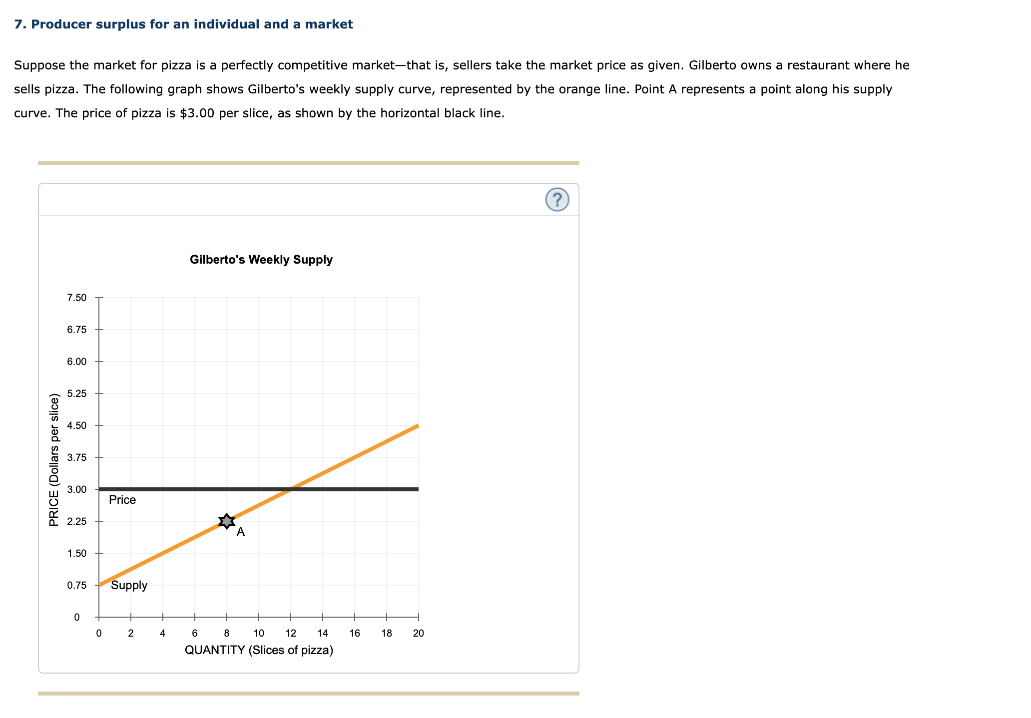

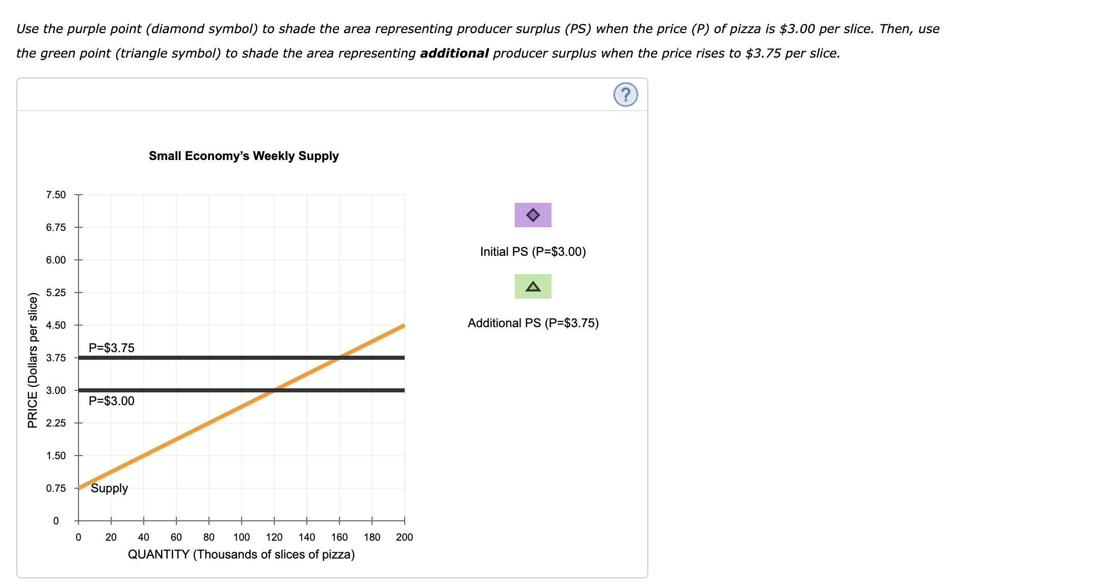

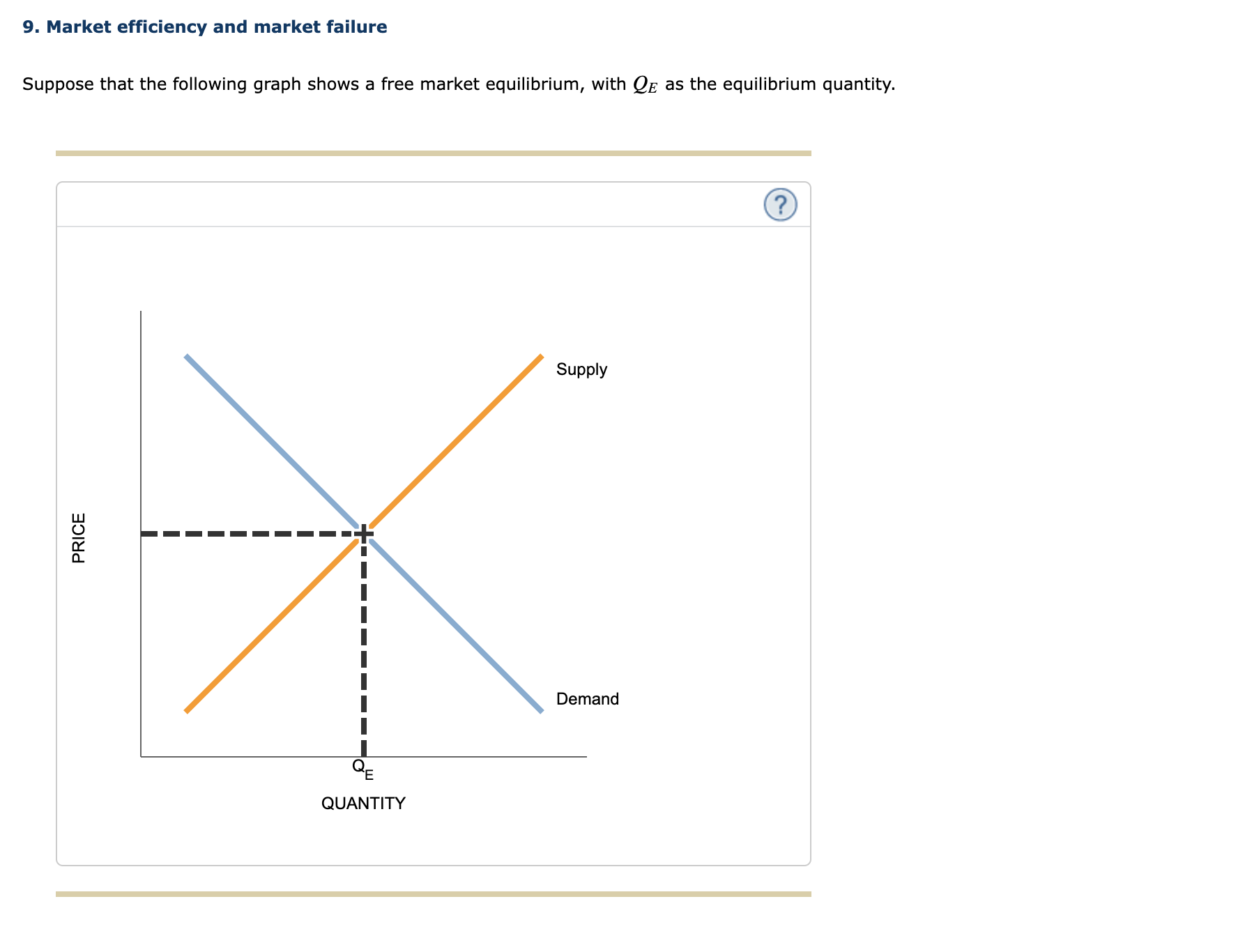
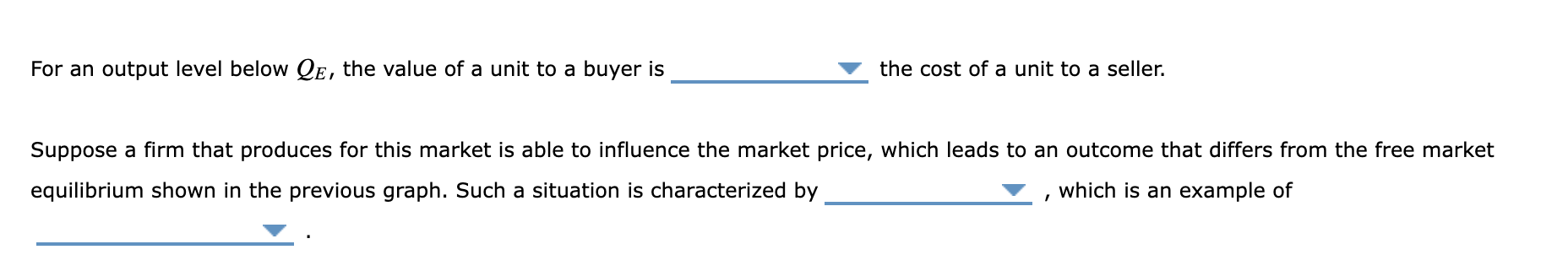
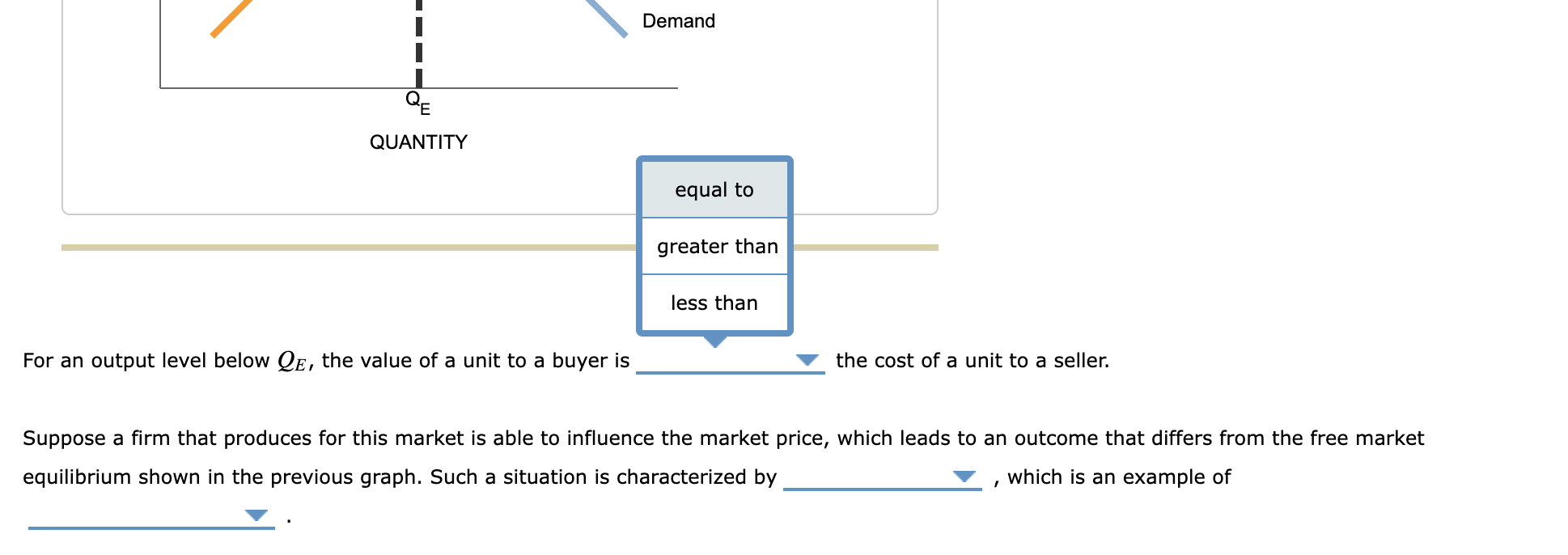
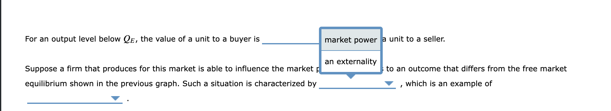
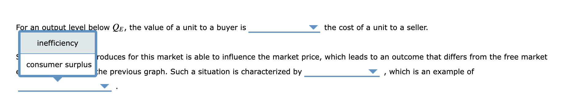
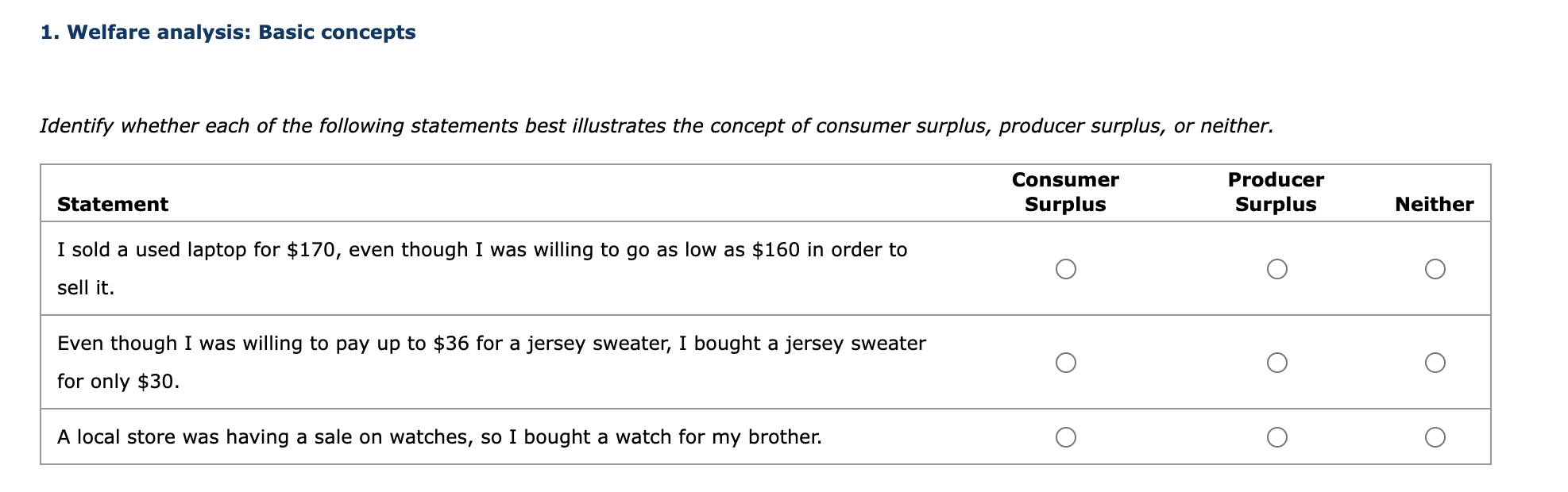
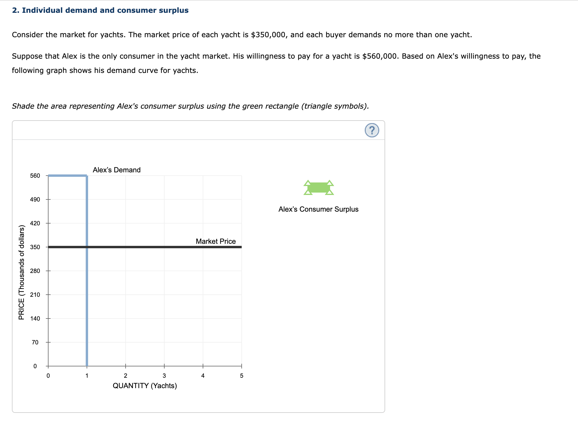
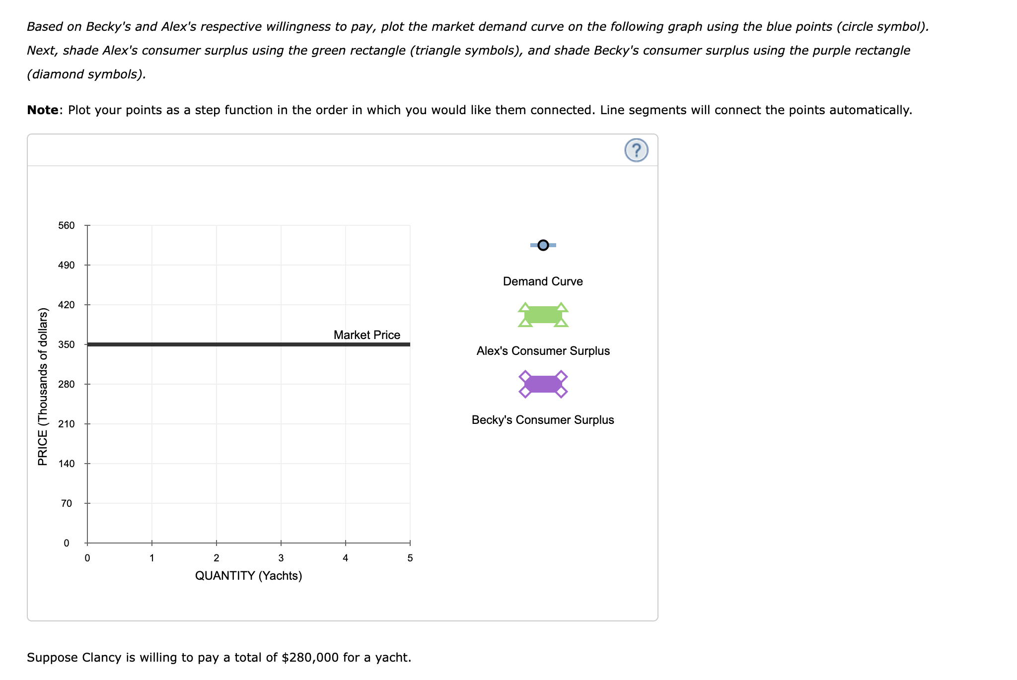
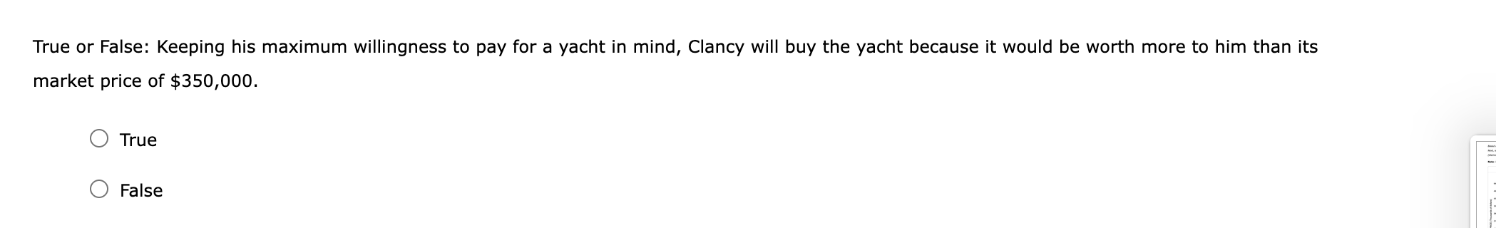
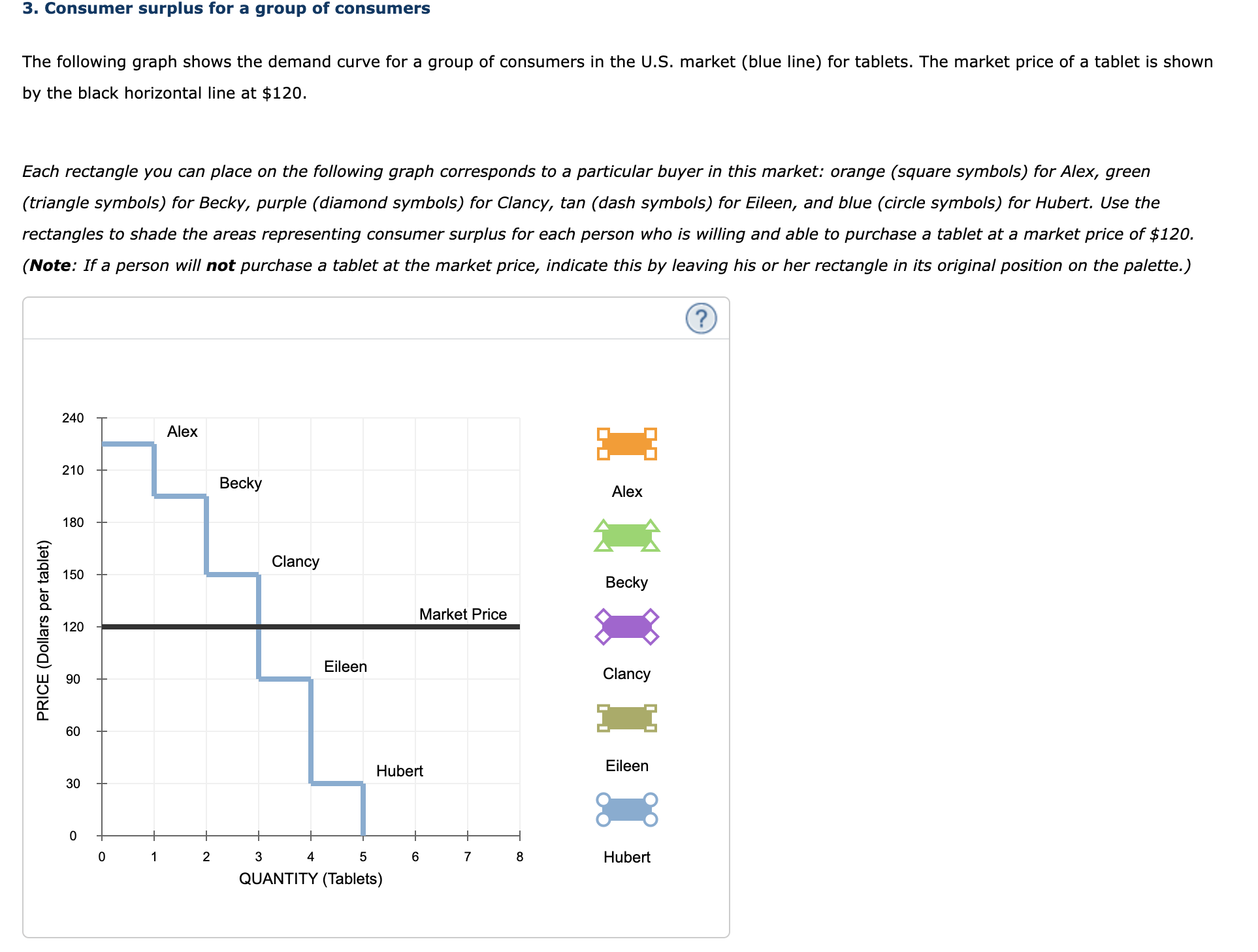
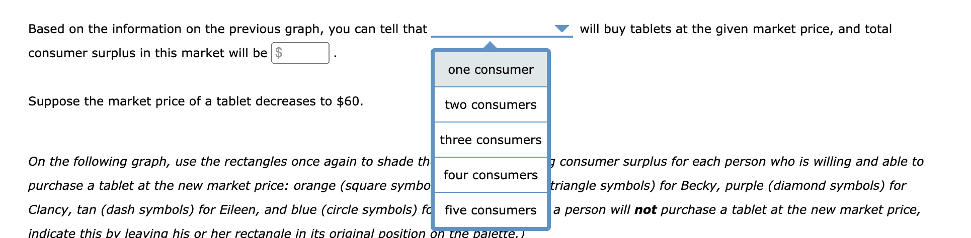
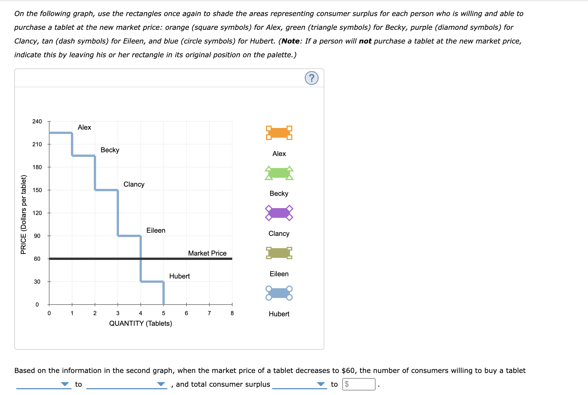
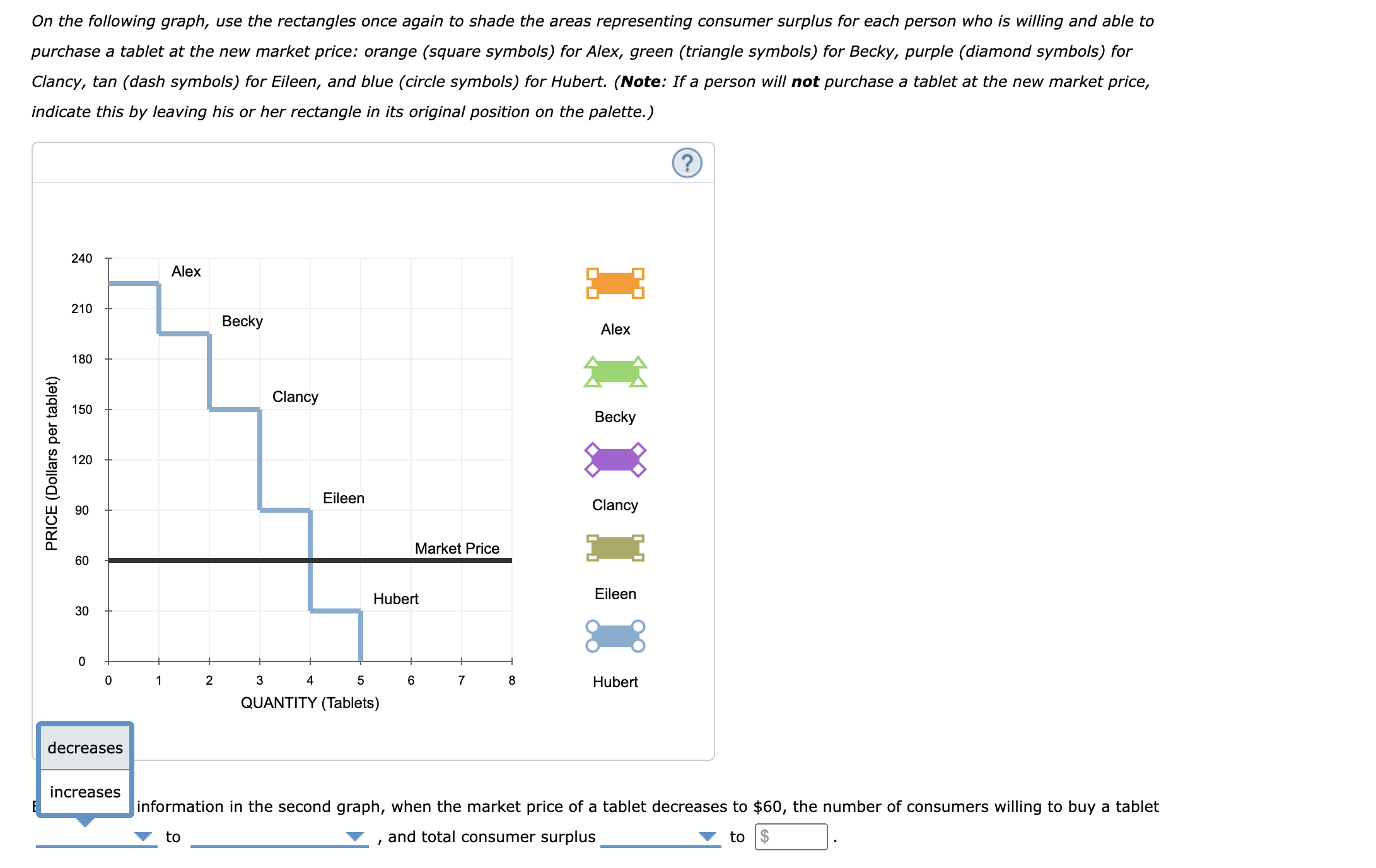
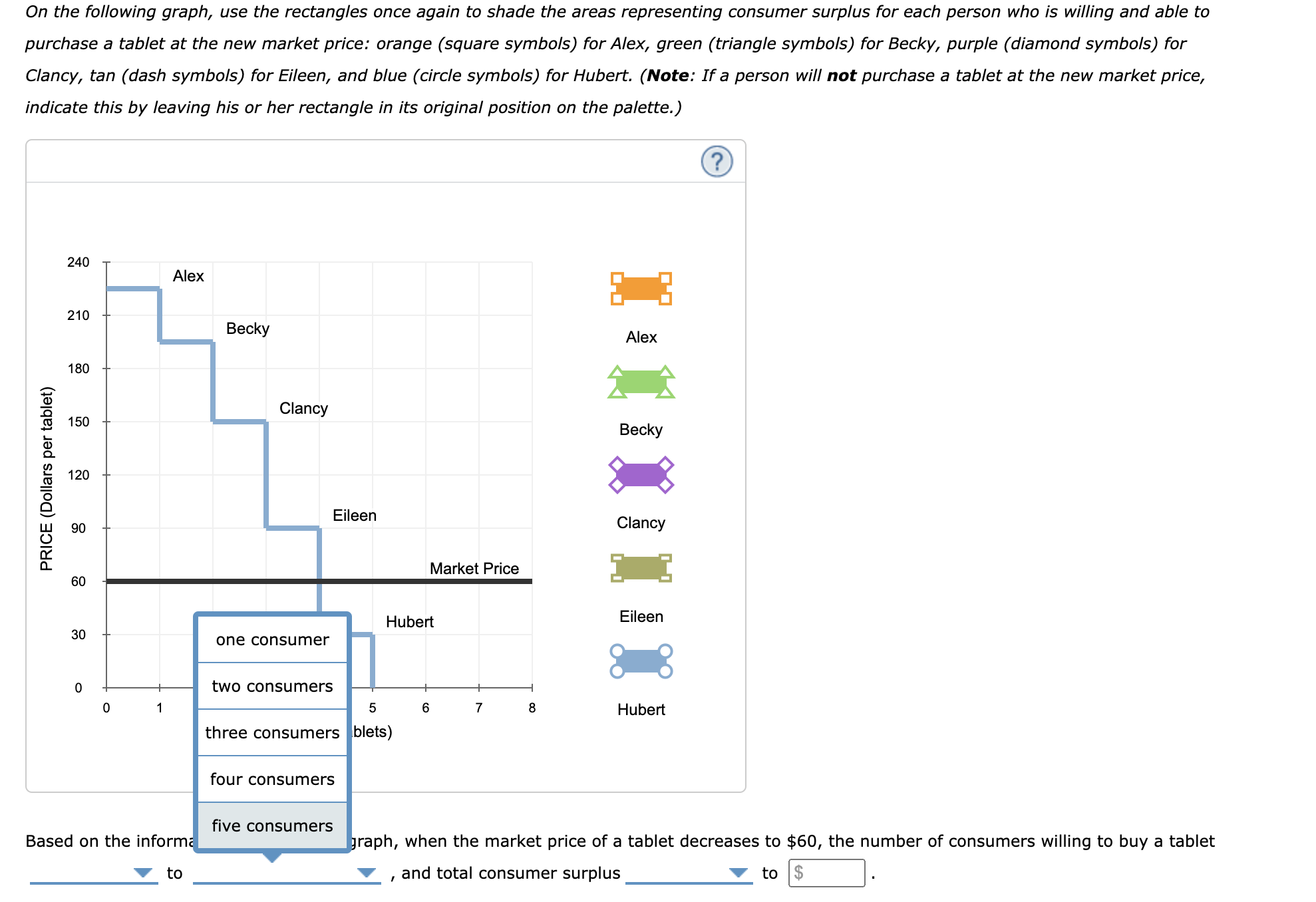
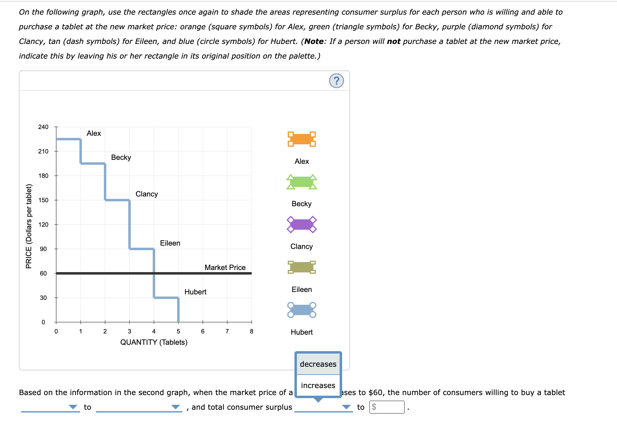
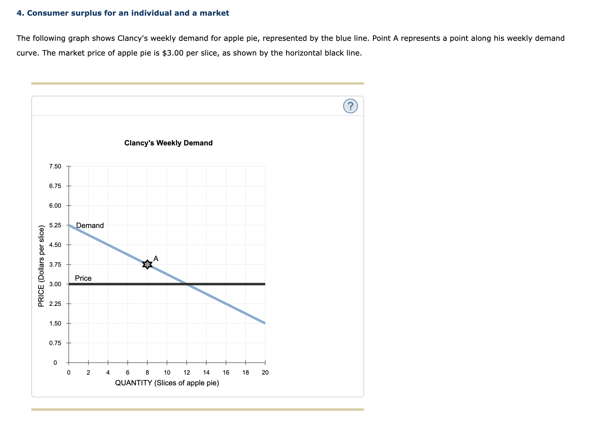
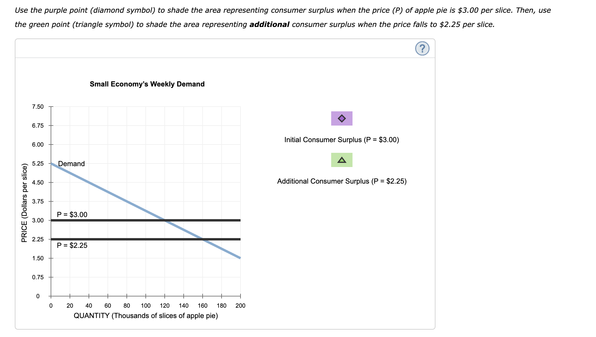
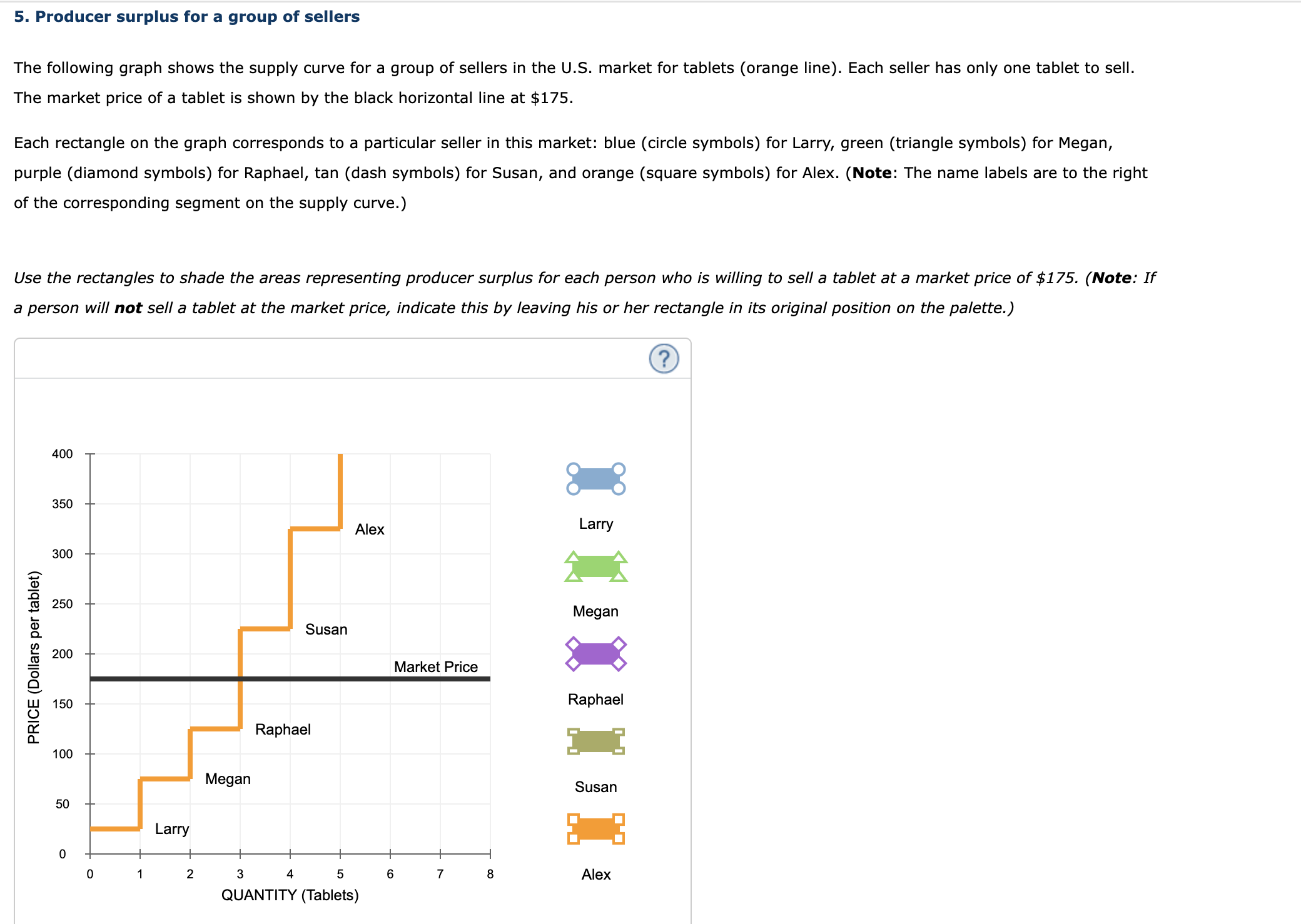


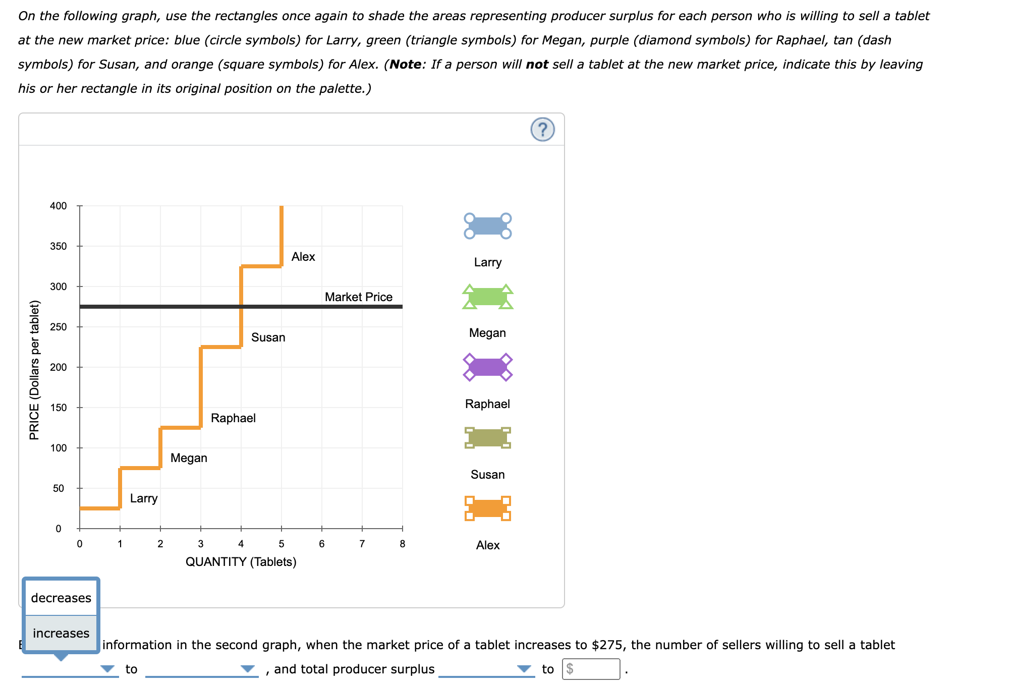

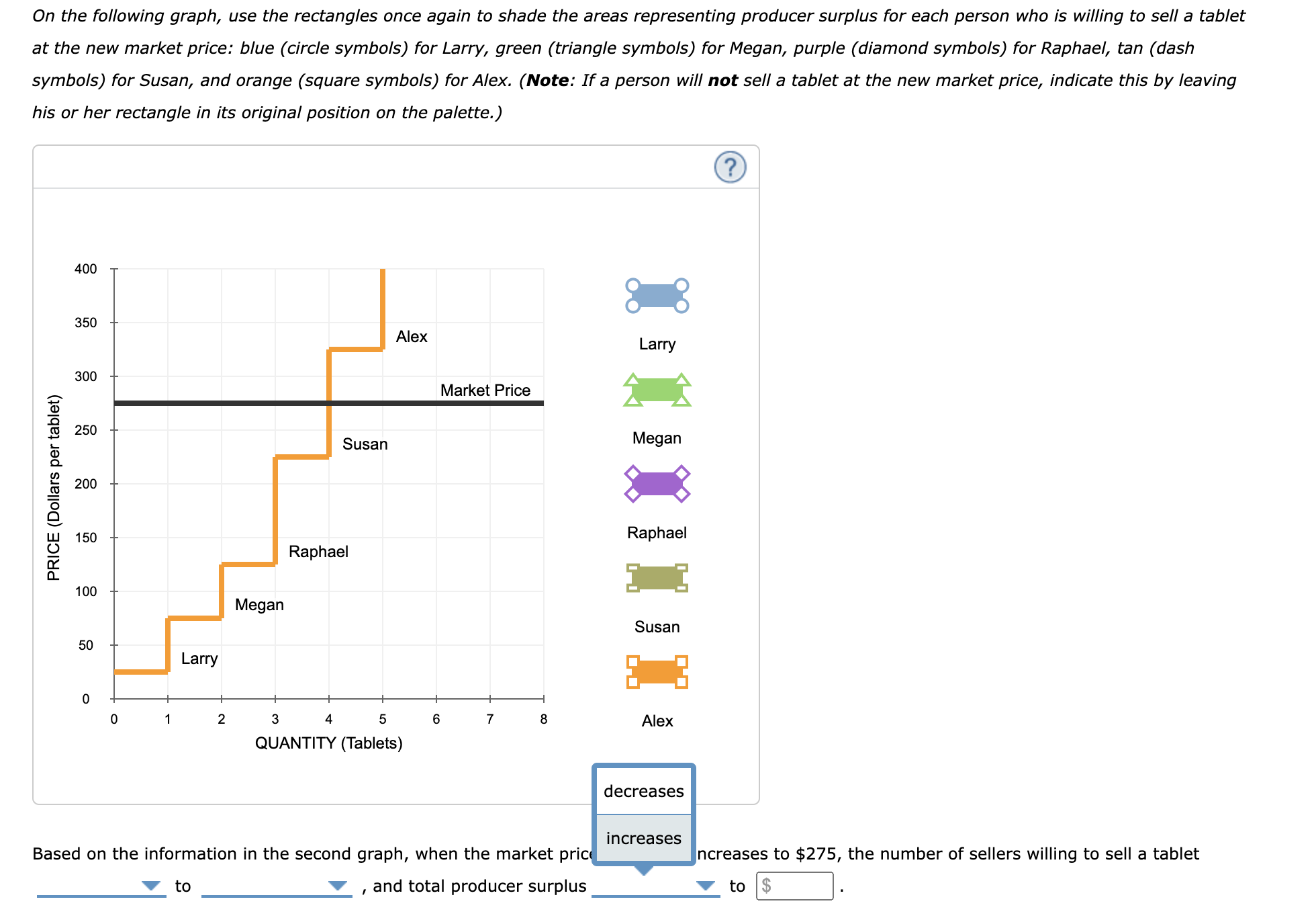

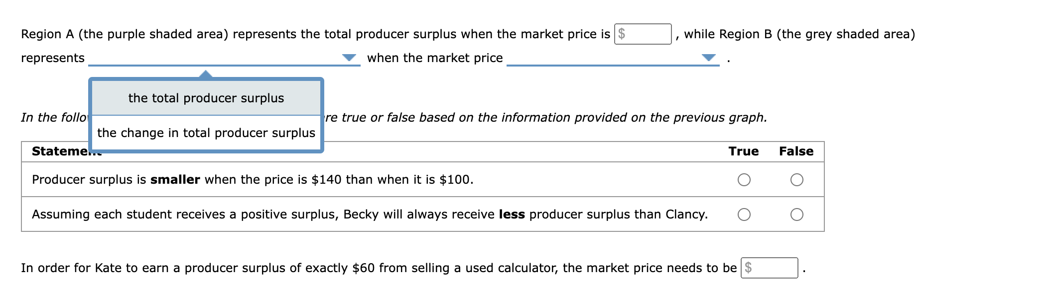
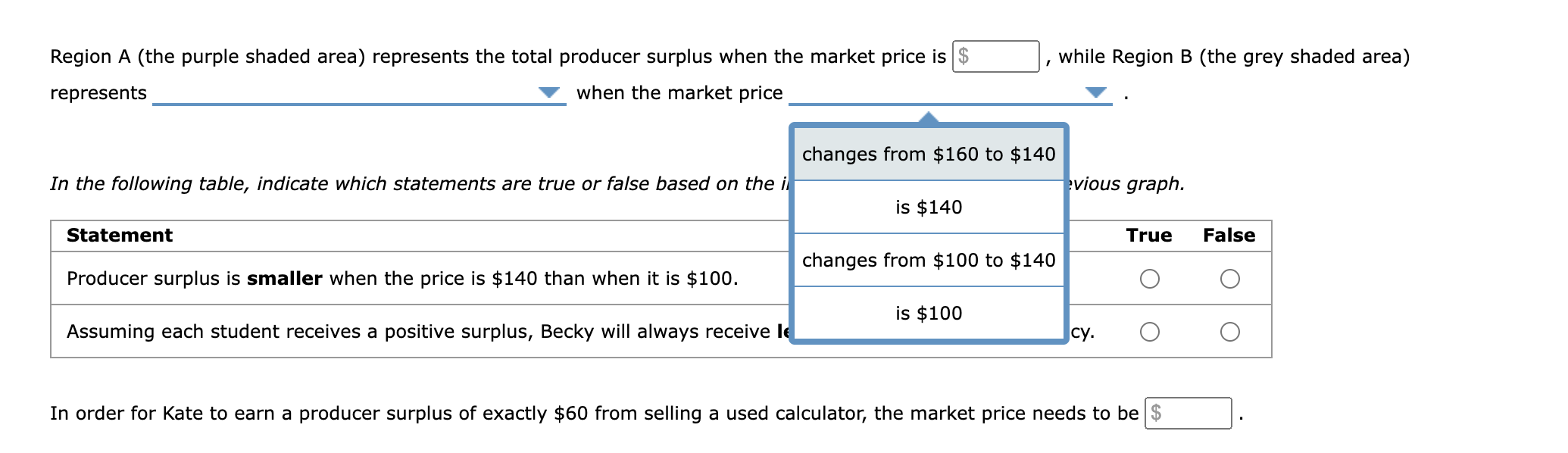

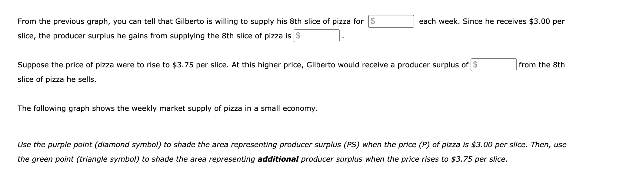

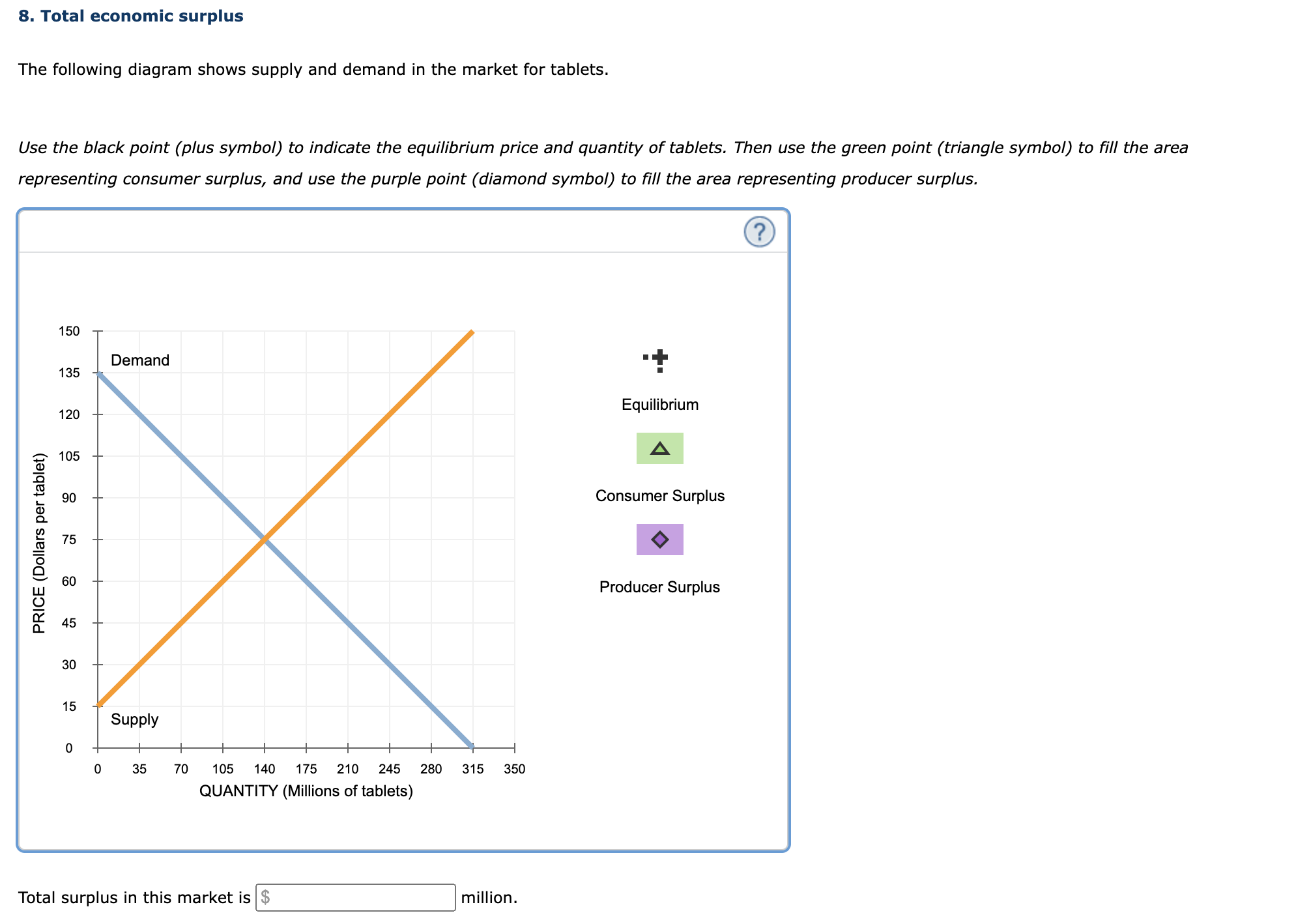


1. Welfare analysis: Basic concepts Identify whether each of the following statements best illustrates the concept of consumer surplus, producer surplus, or neither. Consumer Producer Statement Surplus Surplus Neither I sold a used laptop for $170, even though I was willing to go as low as $160 in order to . O O O sell It. Even though I was willing to pay up to $36 for a jersey sweater, I bought a jersey sweater O O O for only $30. A local store was having a sale on watches, so I bought a watch for my brother. 0 O O 2. Individual demand and consumer surplus Consider the market for yachts. The market price of each yacht is $350,000, and each buyer demands no more than one yacht. Suppose that Alex is the only consumer in the yacht market. His willingness to pay for a yacht is $560,000. Based on Alex's willingness to pay, the following graph shows his demand curve for yachts. Shade the area representing Alex's consumer surplus using the green rectangle (triangle symbols). Alex's Demand 560 H Alex's Consumer Surplus 490 420 Market Price 350 280 210 PRICE (Thousands of dollars) 140 70 QUANTITY (Yachts) Based on Becky's and Alex's respective willingness to pay, plot the market demand curve on the following graph using the blue points (circle symbol). Next, shade Alex's consumer surplus using the green rectangle (triangle symbols), and shade Becky's consumer surplus using the purple rectangle (diamond symbols). Note: Plot your points as a step function in the order in which you would like them connected. Line segments will connect the points automatically. 560 O 490 Demand Curve 420 Market Price 350 Alex's Consumer Surplus 280 PRICE (Thousands of dollars) 210 Becky's Consumer Surplus 140 70 2 4 5 QUANTITY (Yachts) Suppose Clancy is willing to pay a total of $280,000 for a yacht.True or False: Keeping his maximum willingness to pay for a yacht in mind, Clancy will buy the yacht because it would be worth more to him than its market price of $350,000. 0 True 0 False 3. Consumer surplus for a group of consumers The following graph shows the demand curve for a group of consumers in the U.5. market (blue line) for tablets. The market price of a tablet is shown by the black horizontal line at $120. Each rectangle you can place on the following graph corresponds to a particular buyer in this market: orange (square symbols) for Alex, green (triangle symbols) for Becky, purple (diamond symbols) for Clancy, tan (dash symbols) for Eileen, and blue ( circle symbols) for Hubert. Use the rectangles to shade the areas representing consumer surplus for each person who is willing and able to purchase a tablet at a market price of $120. (Note: If a person will not purchase a tablet at the market price, indicate this by leaving his or her rectangle in its original position on the palette.) 240 I 210 Alex 180 I Clancy 150 Becky Market Price 120 1 Clancy PRICE (Dollars per tablet) 60 Eileen 30 I 0 1 2 3 4 5 6 7 B Hubert QUANTITY (Tablets) Based on the information on the previous graph, you can tell that will buy tablets at the given market price, and total consumer surplus in this market will be $ one consumer Suppose the market price of a tablet decreases to $60. two consumers three consumers On the following graph, use the rectangles once again to shade th consumer surplus for each person who is willing and able to four consumers purchase a tablet at the new market price: orange (square symbo triangle symbols) for Becky, purple (diamond symbols) for Clancy, tan (dash symbols) for Eileen, and blue (circle symbols) fo five consumers a person will not purchase a tablet at the new market price, indicate this by leaving his or her rectangle in its original position on tOn the following graph, use the rectangles once again to shade the areas representing consumer surplus for each person who is willing and able to purchase a tablet at the new market price: orange (square symbols) forAlex, green (triangle symbols) for Becky, purple (diamond symbols) for Clancy, tan (dash symbols) for Eileen, and blue (circle symbols) for Hubert. (Note: If a person will not purchase a tablet at the new market price, indicate this by leaving his or her rectangle in its original position on the palette.) 240 I 21 0 Alex 180 I 150 Becky 120 I Eileen Clancy 8 PRICE (Dollars per tablet) Market Price a: o Eileen 30 I I I o 1 2 3 4 5 e 7 a Hubert QUANTITY (Tablets) Based on the information in the second graph, when the market price of a tablet decreases to $60, the number of consumers willing to buy a tablet V to V , and total consumer surplus V to $ . 0n the following graph, use the rectangles once again to shade the areas representing consumer surplus for each person who is willing and able to purchase a tablet at the new market price: orange (square symbols) for Alex, green ( triangle symbols) for Becky, purple (diamond symbols) for Clancy, tan (dash symbols) for Eileen, and blue (circle symbols) for Hubert. (Note: If a person will not purchase a tablet at the new market price, indicate this by leaving his or her rectangle in its original position on the palette.) 240 - Alex I 210 Alex 180 I 150 Becky 120 1 Eileen Clancy PRICE (Dollars per tablet) Market Price 60 Eileen 30 I 0 1 Z 3 4 5 E 7 8 Hubert QUANTITY (Tablets) increases decreases information in the second graph, when the market price of a tablet decreases to $60, the number of consumers willing to buy a tablet V to V , and total consumer surplus V to $ 0n the following graph, use the rectangles once again to shade the areas representing consumer surplus for each person who is willing and able to purchase a tablet at the new market price: orange (square symbols) for Alex, green (triangle symbols) for Becky, purple {diamond symbols) for Clancy, tan (dash symbols) for Eileen, and blue (circle symbols) for Hubert. (Note: If a person will not purchase a tablet at the new market price, indicate this by leaving his or her rectangle in its original position on the palette.) 240 -- 210 Alex 3 .D 3 150 Becky a) D. U) E E 90 Eileen Clancy 9 m u '3- Market Pnce i so Eileen 3 one consumer tWO consumers 5 Hubert three consumers blels) four consumers five consumers Based on the inform raph, when the market price of a tablet decreases to $60, the number of consumers willing to buy a tablet V to V , and total consumer surplus V to $ . On the following graph, use the rectangles once again to shade the areas representing consumer surplus for each person who is willing and able to purchase a tablet at the new market price: orange (square symbols) for Alex, green (triangle symbols) for Becky, purple (diamond symbols) for Clancy, tan (dash symbols) for Eileen, and blue (circle symbols) for Hubert. (Note: If a person will not purchase a tablet at the new market price, indicate this by leaving his or her rectangle in its original position on the palette.) 240 Alex 210 Becky Alex 180 Clancy 150 Becky PRICE (Dollars per tablet) 120 Eileen Clancy 90 Market Price 60 Hubert Eileen 30 2 3 5 6 7 8 Hubert QUANTITY (Tablets) decreases increases Based on the information in the second graph, when the market price of a ases to $60, the number of consumers willing to buy a tablet to , and total consumer surplus to $4. Consumer surplus for an individual and a market The following graph shows Clancy's weekly demand for apple pie, represented by the blue line. Point A represents a point along his weekly demand curve. The market price of apple pie is $3.00 per slice, as shown by the horizontal black line. Clancy's Weekly Demand 7.50 6.75 6.00 5.25 4.50 3.75 3.00 2.25 PRICE (Dollars per slice) 1.50 0.75 0 | | | | | | | | | | 0 2 4 6 8 10 12 14 16 1B 20 QUANTITY (Slices of apple pie) From the previous graph, you can tell that Clancy is willing to pay 25 for his 8th slice of apple pie each week. Because he has to pay only $3.00 per slice, the consumer surplus he gains from the 8th slice of apple pie is $ Suppose the price of apple pie were to fall to $2.25 per slice. At this lower price, Clancy would receive a consumer surplus of $ from the 8th slice of apple pie he buys. The following graph shows the weekly market demand for apple pie in a small economy. Use the purple point (diamond symbol) to shade the area representing consumer surplus when the price (P) of apple pie is $3.00 per slice. Then, use the green point (triangle symbol) to shade the area representing additional consumer surplus when the price falls to $2.25 per slice. Small Economy's Weekly Demand 7.50 6 00 _ Initial Consumer Surplus (P = $3.00) 5.25 ' 4.50 Additional Consumer Surplus (P = $2.25) 3.75 3.00 PRICE (Dollars per slice) 2.25 1.50 0.75 -- 0 20 40 60 60 100 120 140 160 180 200 QUANTITY (Thousands of slices of apple pie) 5. Producer surplus for a group of sellers The following graph shows the supply curve for a group of sellers in the U.S. market for tablets (orange line). Each seller has only one tablet to sell. The market price of a tablet is shown by the black horizontal line at $175. Each rectangle on the graph corresponds to a particular seller in this market: blue (circle symbols) for Larry, green (triangle symbols) for Megan, purple (diamond symbols) for Raphael, tan (dash symbols) for Susan, and orange (square symbols) for Alex. (Note: The name labels are to the right of the corresponding segment on the supply curve.) Use the rectangles to shade the areas representing producer surplus for each person who is willing to sell a tablet at a market price of $1 75. (Note: If a person will not sell a tablet at the market price, indicate this by leaving his or her rectangle in its original position on the palette.) 400 -- 350 -- Alex Larry E .O 5L5 250 __ Megan o O. E Market Price 9 LIJ 150 _ Raphael Q o: o. m _ I Susan 50 - 3-3 0 i i i i i i i i 0 1 2 3 4 5 6 7 8 Alex QUANTITY (Tablets) 400 I 350 Alex Larry :7; .D it; 250 Megan CD 0. (=3 Market Price 9 Lu 150 Raphael 9 n: D. Susan 50 0 l l I l l l l I 0 1 2 3 4 5 s 7 8 Alex QUANTITY (Tablets) Based on the information on the preceding graph, you can tell that v will sell tablets at the given market price, and total producer surplus in this market will be. Suppose the market price of a tablet increases to $275. On the following graph, use the rectangles once again to shade the ting producer surplus for each person who is willing to sell a tablet at the new market price: blue (circle symbols) for Larry, green (tri. r Megan, purple (diamond symbols) for Raphael, tan (dash symbols) for Susan, and orange (square symbols) for Alex. (Nate: e sellers not sell a tablet at the new market price, indicate this by leaving his or her rectangle in its original position on the palette.) 0n the following graph, use the rectangles once again to shade the areas representing producer surplus for each person who is willing to sell a tablet at the new market price: blue (circle symbols) for Larry, green (triangle symbols) for Megan, purple (diamond symbols) for Raphael, tan (dash symbols) for Susan, and orange (square symbols) for Alex. (Note: If a person will not sell a tablet at the new market price, indicate this by leaving his or her rectangle in its original position on the palette.) 400 I 350 Alex Larry 300 Market Price I 250 Megan 200 I 150 Raphael PRICE (Dollars per tablet) 100 Susan 50 I 0 1 2 3 4 5 e 7 3 Alex QUANTITY (Tablets) Based on the information in the second graph, when the market price of a tablet increases to $275, the number of sellers willing to sell a tablet V to V , and total producer surplus V to -. On the following graph, use the rectangles once again to shade the areas representing producer surplus for each person who is willing to sell a tablet at the new market price: blue (circle symbols) for Larry, green (triangle symbols) for Megan, purple (diamond symbols) for Raphael, tan (dash symbols) for Susan, and orange (square symbols) for Alex. (Note: If a person will not sell a tablet at the new market price, indicate this by leaving his or her rectangle in its original position on the palette.) 400 350 Alex Larry 300 Market Price 250 Susan Megan 200 PRICE (Dollars per tablet) Raphael 150 Raphael 100 Megan Susan 50 Larry 2 5 6 7 Alex QUANTITY (Tablets) decreases increases information in the second graph, when the market price of a tablet increases to $275, the number of sellers willing to sell a tablet to , and total producer surplus to $0n the following graph, use the rectangles once again to shade the areas representing producer surplus for each person who is willing to sell a tablet at the new market price: blue (circle symbols) for Larry, green (triangle symbols) for Megan, purple (diamond symbols) for Raphael, tan (dash symbols) for Susan, and orange (square symbols) for Alex. (Note: If a person will not sell a tablet at the new market price, indicate this by leaving his or her rectangle in its original position on the palette.) 400 I 350 Alex Larry 300 Market Price I 250 Megan 200 I 150 Raphael PRICE (Dollars per tablet) 100 Susan 50 one seller I 5 (Tablets) Alex three sellers four sellers five sellers Based on the inform. und graph, when the market price of a tablet increases to $275, the number of sellers willing to sell a tablet V to V ,and total producersurplus V to $ 0n the following graph, use the rectangles once again to shade the areas representing producer surplus for each person who is willing to self a tablet at the new market price: blue (circle symbols) for Larry, green (triangle symbols) for Megan, purple ( diamond symbols) for Raphael, tan ( dash symbols) for Susan, and orange (square symbols) for Alex. (Note: If a person will not sell a tablet at the new market price, indicate this by leaving his or her rectangle in its original position on the palette.) 400 I 350 Alex Larry 300 Market Price I 250 Megan 200 I 150 Raphael PRICE (Dollars per tablet) 100 Susan 50 I 0 1 2 3 4 5 e 7 3 Alex QUANTITY (Tablets) decreases Based on the information in the second graph, when the market pric w ncreases to $275, the number of sellers willing to sell a tablet v to V , and total producer surplus V to -. 6. Producer surplus and price changes The following graph shows the supply curve for a group of students looking to sell used graphing calculators. Each student has only one used calculator to sell. Each rectangular segment under the supply curve represents the \"cost,\" or minimum acceptable price, for one student. Assume that anyone who has a cost just equal to the market price is willing to sell his or her used calculator. 240 200 160 120 PRICE (Dollars per used calculator) on Q 40 o . I I I I I I) o 1 2 a 4 5 6 QUANTITY (Used calculators) Region A (the purple shaded area) represents the total producer surplus when the market price is , while Region B (the grey shaded area) represents V when the market price V . In the following table, indicate which statements are true or false based on the information provided on the previous graph. Statement True False Producer surplus is smaller when the price is $140 than when it is $100. 0 0 Assuming each student receives a positive surplus, Becky will always receive less producer surplus than Clancy. O O In order for Kate to earn a producer surplus of exactly $60 from selling a used calculator, the market price needs to be . Region A (the purple shaded area) represents the total producer surplus when the market price is , while Region B (the grey shaded area) represents v when the market price v . the total producer surplus In the fol/o re true or false based on the information provided on the previous graph. the change in total producer surplus Stateme True False Producer surplus is smaller when the price is $140 than when it is $100. O 0 Assuming each student receives a positive surplus, Becky will always receive less producer surplus than Clancy. O O In order for Kate to earn a producer surplus of exactly $60 from selling a used calculator, the market price needs to be . Region A (the purple shaded area) represents the total producer surplus when the market price is , while Region B (the grey shaded area) represents V when the market price V . changes from $160 to $140 In the following table, indicate which statements are true or false based on the i vious graph. is $140 True False O 0 cy- O 0 Statement changes from $100 to $140 Producer surplus is smaller when the price is $140 than when it is $100. is $100 Assuming each student receives a positive surplus, Becky will always receive I In order for Kate to earn a producer surplus of exactly $60 from selling a used calculator, the market price needs to be $ 7. Producer surplus for an individual and a market Suppose the market for pizza is a perfectly competitive marketthat is, sellers take the market price as given. Gilberto owns a restaurant where he sells pizza. The following graph shows Gilberto's weekly supply curve, represented by the orange line. Point A represents a point along his supply curve. The price of pizza is $3.00 per slice, as shown by the horizontal black line. Gilberto's Weekly Supply 7.50 -- 8.75 -- 6.00 5.25 -- 4.50 3.75 3.00 PRICE (Dollars per slice) 2.25 1.50 0.75 0 2 4 6 B 10 12 14 16 18 20 QUANTITY (Slices of pizza) From the previous graph, you can tell that Gilberto is willing to supply his 8th slice of pizza for each week. Since he receives $3.00 per slice, the producer surplus he gains from supplying the 8th slice of pizza is $ . Suppose the price of pizza were to rise to $3.75 per slice. At this higher price, Gilberto would receive a producer surplus 0- from the 8th slice of pizza he sells. The following graph shows the weekly market supply of pizza in a small economy. Use the purple point (diamond symbol) to shade the area representing producer surplus (PS) when the price (P) of pizza is $3. 00 per slice. Then, use the green point (triangle symbol) to shade the area representing additional producer surplus when the price rises to $3. 75 per slice. Use the purple point (diamond symbol) to shade the area representing producer surplus (PS) when the price (P) of pizza is $3. 00 per slice. Then, use the green point (triangle symbol) to shade the area representing additional producer surplus when the price rises to $3. 75 per slice. (9 Small Economy's Weekly Supply 7.50 - 6.00 _ Initial PS (P=$3.00) 5.25 A 4.50 Additional PS (P=$3.75) 3.75 3.00 PRICE (Dollars per slide) 2.25 1.50 0.75 0 | l l | l l l l l l 0 20 40 60 80 100 120 140 160 180 200 QUANTITY (Thousands of slices of pizza) 8. Total economic surplus The following diagram shows supply and demand in the market for tablets. Use the black point (plus symbol) to indicate the equilibrium price and quantity of tablets. Then use the green point (triangle symbol) to ll the area representing consumer surplus, and use the purple point (diamond symbol) to fill the area representing producer surplus. "!' Equilibrium A Consumer Surplus Producer Surplus c 2 .D B - w a. E L\" B E I.IJ Q E a. 70 105 140 175 210 245 280 315 350 QUANTITY (Millions of tablets) Total surplus in this market is $ million. 9. Market efficiency and market failure Suppose that the following graph shows a free market equilibrium, with OF as the equilibrium quantity. Supply PRICE Demand QE QUANTITYFor an output level below QE, the value of a unit to a buyer is v the cost of a unit to a seller. Suppose a rm that produces for this market is able to influence the market price, which leads to an outcome that differs from the free market equilibrium shown in the previous graph. Such a situation is characterized by V , which is an example of V QUANTITY equal to greater than For an output level below Q5, the value of a unit to a buyer is v the cost of a unit to a seller. Suppose a rm that produces for this market is able to influence the market price, which leads to an outcome that differs from the free market equilibrium shown in the previous graph. Such a situation is characterized by V , which is an example of v For an output level below Q5, the value of a unit to a buyer is = unit to a seller. an externality Suppose a rm that produces for this market is able to influence the market . to an outcome that differs from the free market equilibrium shown in the previous graph. Such a situation is characterized by V , which is an example of v For an output level below CE, the value of a unit to a buyer is the cost of a unit to a seller. inefficiency roduces for this market is able to influence the market price, which leads to an outcome that differs from the free market consumer surplus the previous graph. Such a situation is characterized by , which is an example of
Step by Step Solution
There are 3 Steps involved in it

Get step-by-step solutions from verified subject matter experts