

Question: 1 What does the graph show? 2 Which key trends should you describe? 3 What comparisons will you make? 4 How many paragraphs will you
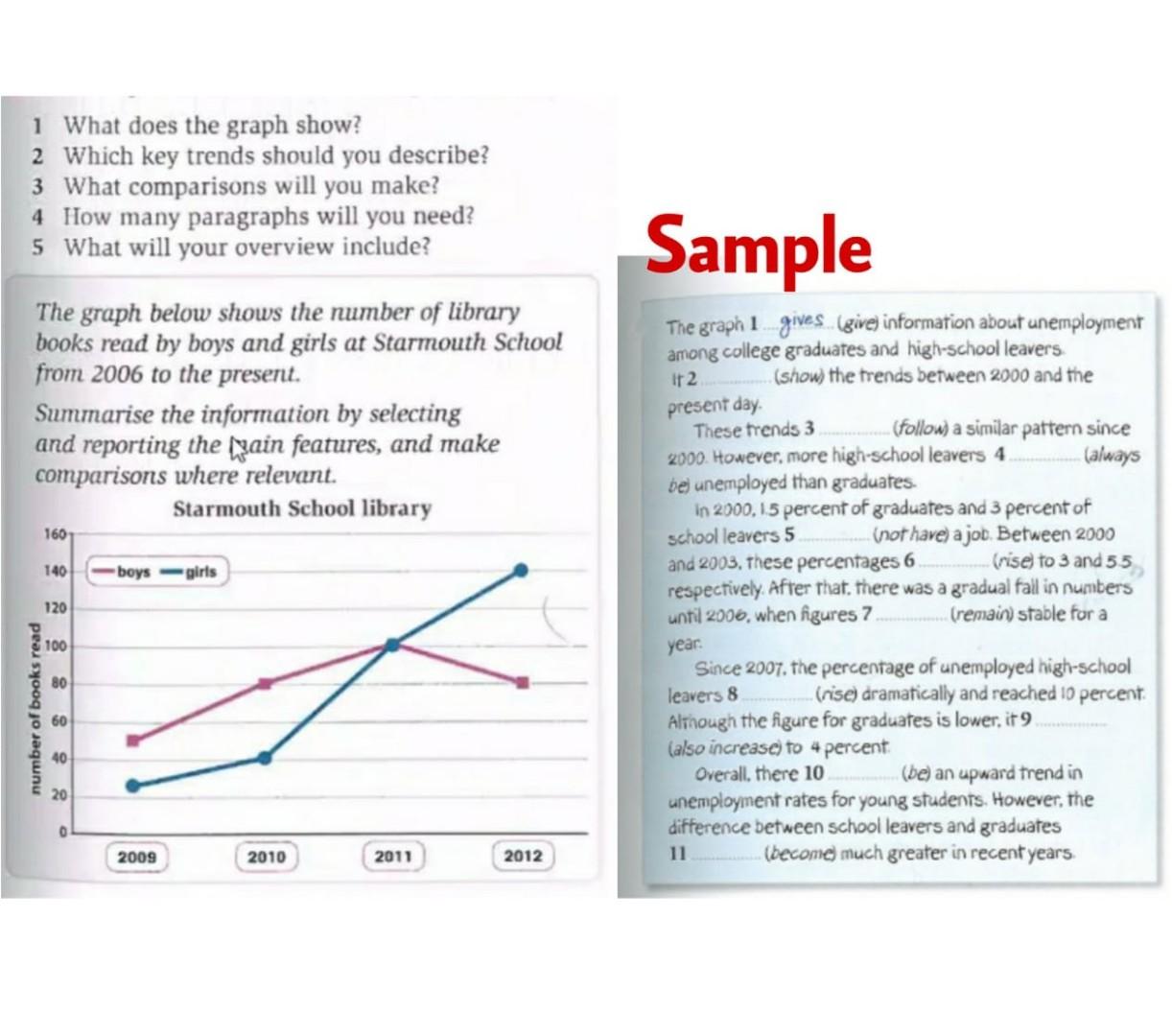
1 What does the graph show? 2 Which key trends should you describe? 3 What comparisons will you make? 4 How many paragraphs will you need? 5 What will your overview include? Sample The graph below shows the number of library books read by boys and girls at Starmouth School from 2006 to the present. Summarise the information by selecting and reporting the pain features, and make comparisons where relevant. Starmouth School library 160 140 boys girls The graph 1 gives (give) information about unemployment among college graduates and high-school leavers ir 2 (show) the trends between 2000 and the present day These trends 3 ....(follow a similar pattern since 2000. However, more high-school leavers 4 (always be) unemployed than graduates In 2000, 15 percent of graduates and 3 percent of school leavers 5 (not have a job. Between 2000 and 2003. These percentages 6 (rise) to 3 and 55 respectively . After that, there was a gradual fall in numbers until 2006, when figures 7 Cremain) stable for a year: Since 2007, the percentage of unemployed high-school leavers 8 (rise) dramatically and reached 10 percent Although the figure for graduates is lower, it 9 (also increase) to 4 percent Overall, there 10 (be) an upward trend in unemployment rates for young students. However, the difference between school leavers and graduates 11 (become much greater in recent years 120 100 80 number of books read 60 40 20 2009 2010 2011 2012
Step by Step Solution
There are 3 Steps involved in it
1 Expert Approved Answer
Step: 1 Unlock

Question Has Been Solved by an Expert!
Get step-by-step solutions from verified subject matter experts
Step: 2 Unlock
Step: 3 Unlock