

Question: (1) When dealing with a time series, we can see the change of variable along with time. The time series may increase or decrease. Sometime
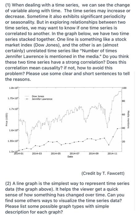
(1) When dealing with a time series, we can see the change of variable along with time. The time series may increase or decrease. Sometime it also exhibits significant periodicity or seasonality. But in exploring relationships between two time series, we may want to know if one time series is correlated to another. In the graph below, we have two time series stacked together. One line is something like a stock market index (Dow Jones), and the other is an (almost certainly) unrelated time series like "Number of times Jennifer Lawrence is mentioned in the media." Do you think these two time series have a strong correlation? Does this correlation mean causality? if not, how to avoid this problem? Please use some clear and short sentences to tell the reasons. 1.8x10 100 1.75x10* Dow Jones Jennifer Lawrence 80 1.7x10* Price (USD) Media mentions 1.6x10" ujarly performans 1.55x10 1.5x 10" 2014-01 2014-03 2014-05 2014-07 Date 2014-09 2014-11 (Credit by T. Fawcett) (2) A line graph is the simplest way to represent time series data (the graph above). It helps the viewer get a quick sense of how something has changed over time. Can you find some others ways to visualize the time series data? Please list some possible graph types with simple description for each graph? (1) When dealing with a time series, we can see the change of variable along with time. The time series may increase or decrease. Sometime it also exhibits significant periodicity or seasonality. But in exploring relationships between two time series, we may want to know if one time series is correlated to another. In the graph below, we have two time series stacked together. One line is something like a stock market index (Dow Jones), and the other is an (almost certainly) unrelated time series like "Number of times Jennifer Lawrence is mentioned in the media." Do you think these two time series have a strong correlation? Does this correlation mean causality? if not, how to avoid this problem? Please use some clear and short sentences to tell the reasons. 1.8x10 100 1.75x10* Dow Jones Jennifer Lawrence 80 1.7x10* Price (USD) Media mentions 1.6x10" ujarly performans 1.55x10 1.5x 10" 2014-01 2014-03 2014-05 2014-07 Date 2014-09 2014-11 (Credit by T. Fawcett) (2) A line graph is the simplest way to represent time series data (the graph above). It helps the viewer get a quick sense of how something has changed over time. Can you find some others ways to visualize the time series data? Please list some possible graph types with simple description for each graph
Step by Step Solution
There are 3 Steps involved in it
Question ID 16054334 1 Correlation and Causality in Time Series Do these time series have strong correlation From the description of the graph Dow Jon... View full answer

Get step-by-step solutions from verified subject matter experts