

Question: 14.Use the Quick Analysis tool to create a chart like the one below showing how many service calls were answered per city. Create the chart

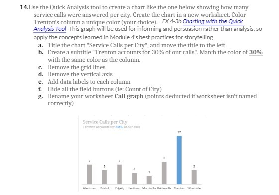
14.Use the Quick Analysis tool to create a chart like the one below showing how many service calls were answered per city. Create the chart in a new worksheet. Color Trenton's column a unique color (your choice). EX 4-3b Charting with the Quick Analysis Tool This graph will be used for informing and persuasion rather than analysis, 50 apply the concepts learned in Module 4's best practices for storytelling: a. Title the chart "Service Calls per City", and move the title to the left b. Create a subtitle "Trenton accounts for 30% of our calls". Match the color of 30% with the same color as the column. C. Remove the grid lines d. Remove the vertical axis e. Add data labels to each column f. Hide all the field buttons (ie: Count of City) g. Rename your worksheet Call graph (points deducted if worksheet isn't named correctly) Service Calls per City Trenton accounts for 309% of our calls 17 7
Step by Step Solution
There are 3 Steps involved in it

Get step-by-step solutions from verified subject matter experts