

Question: 2. The graph below shows the relationship between the average monthly temperature and the amount of natural gas consumed in Joan's midwestern home. The figure
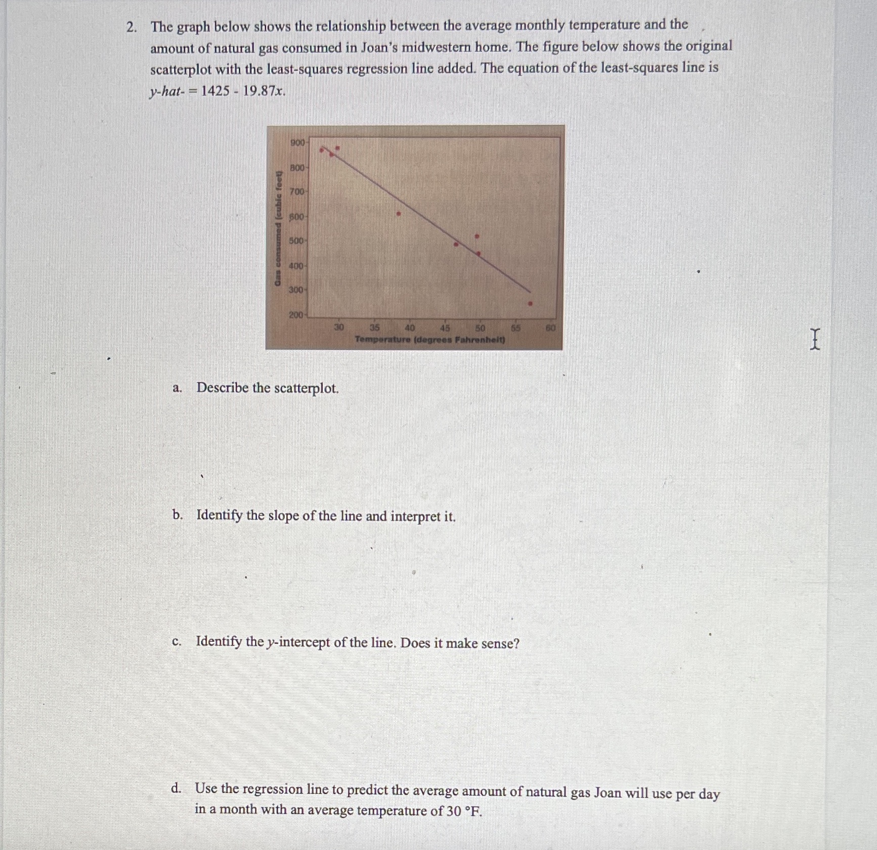
2. The graph below shows the relationship between the average monthly temperature and the amount of natural gas consumed in Joan's midwestern home. The figure below shows the original scatterplot with the least-squares regression line added. The equation of the least-squares line is y-hat- = 1425 - 19.87x. 900 BOD 700 600 500 ano 300 200 30 35 40 45 50 60 Temperature (degrees Fahrenheit) Describe the scatterplot. b. Identify the slope of the line and interpret it. c. Identify the y-intercept of the line. Does it make sense? d. Use the regression line to predict the average amount of natural gas Joan will use per day in a month with an average temperature of 30 .F
Step by Step Solution
There are 3 Steps involved in it

Get step-by-step solutions from verified subject matter experts