Question: 3) Plotting mutation-selection balance: The very best way to master the graphical approach to determining mutation-selection balance is to practice it. Let's consider evolutionary change
3) Plotting mutation-selection balance: The very
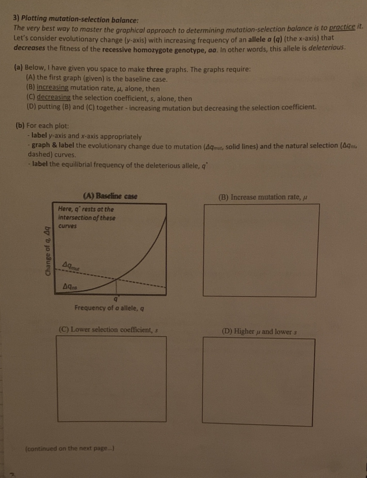
3) Plotting mutation-selection balance: The very best way to master the graphical approach to determining mutation-selection balance is to practice it. Let's consider evolutionary change (y-axis) with increasing frequency of an allele a (q) (the x-axis) that decreases the fitness of the recessive homozygote genotype, aa. In other words, this allele is deleterious. (a) Below, I have given you space to make three graphs. The graphs require: (A) the first graph (given) is the baseline case. (B) increasing mutation rate, u, alone, then (C) decreasing the selection coefficient, s, alone, then (D) putting (B) and (C) together - increasing mutation but decreasing the selection coefficient. (b) For each plot: label y-axis and x-axis appropriately - graph & label the evolutionary change due to mutation (4qmut, solid lines) and the natural selection (Aqrs, dashed) curves. - label the equilibrial frequency of the deleterious allele, q (A) Baseline case (B) Increase mutation rate, / Here, q' rests at the intersection of these curves Change of q, Ag Aqmut Agns q Frequency of o allele, q (C) Lower selection coefficient, s (D) Higher / and lower s (continued on the next page..)

Step by Step Solution

There are 3 Steps involved in it

1 Expert Approved Answer
Step: 1 Unlock blur-text-image
Question Has Been Solved by an Expert!

Get step-by-step solutions from verified subject matter experts

Step: 2 Unlock
Step: 3 Unlock

Students Have Also Explored These Related Mathematics Questions!