

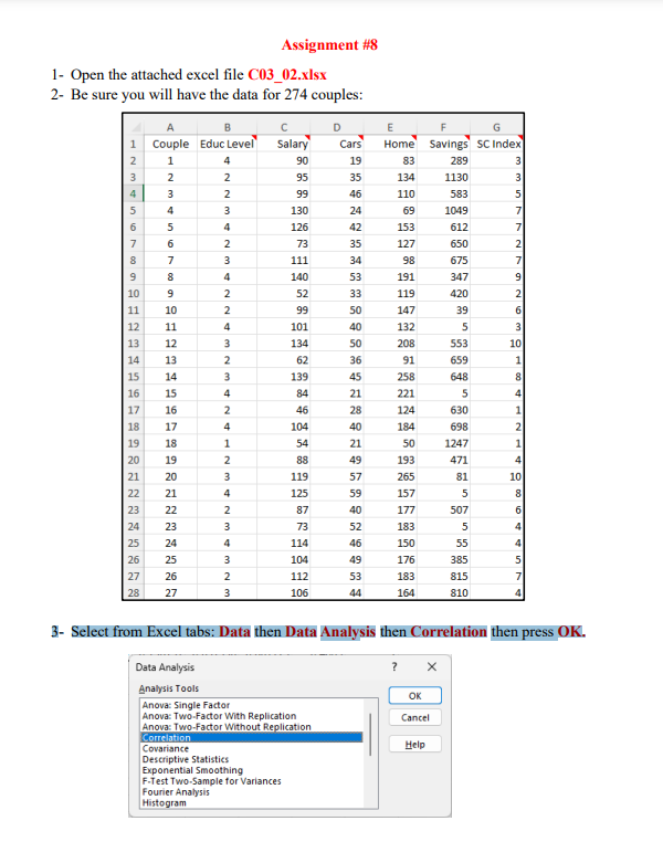
Question: 3 - Select from Excel tabs: Data then Data Analysis then Correlation then press OK . 4 - In the Correlation Dialog Box, click Input
Select from Excel tabs: Data then Data Analysis then Correlation then press OK
In the Correlation Dialog Box, click Input Range then Select all the data with the labels:
Salary, Cars, Home, Savings and SC Index for the couples.
Then select Labels in first row option, then select Output Range then select Cell I in
the Excel sheet. Be sure you have the following then press OK
You should have the following correlation table:
Note that the correlation between Savings and Salary is
and the correlation between SC Index and Salary is
Select the data of Column Salary and Savings with the labels Salary and Savings then
select Insert Tab in Excel Tabs then select Scatter Plot and be sure the output is the
following: Savings vs Salary with title Scatter Plot.
Select the data of Column Salary and SC Index with the labels Salary and SC Index
then select Insert Tab in Excel Tabs then select Scatter Plot and be sure the output is the
following: SC Index vs Salary with title Scatter Plot.
Based on your work, indicate whether there are correlation between the variables below
and the type of correlation:
Salary and Savings
SC Index and Salary
Step by Step Solution
There are 3 Steps involved in it
1 Expert Approved Answer
Step: 1 Unlock

Question Has Been Solved by an Expert!
Get step-by-step solutions from verified subject matter experts
Step: 2 Unlock
Step: 3 Unlock