

Question: 3. The following data. are a sample from the 1967 1980 Evans County study. Survival times (in years) are given for two study groups, each
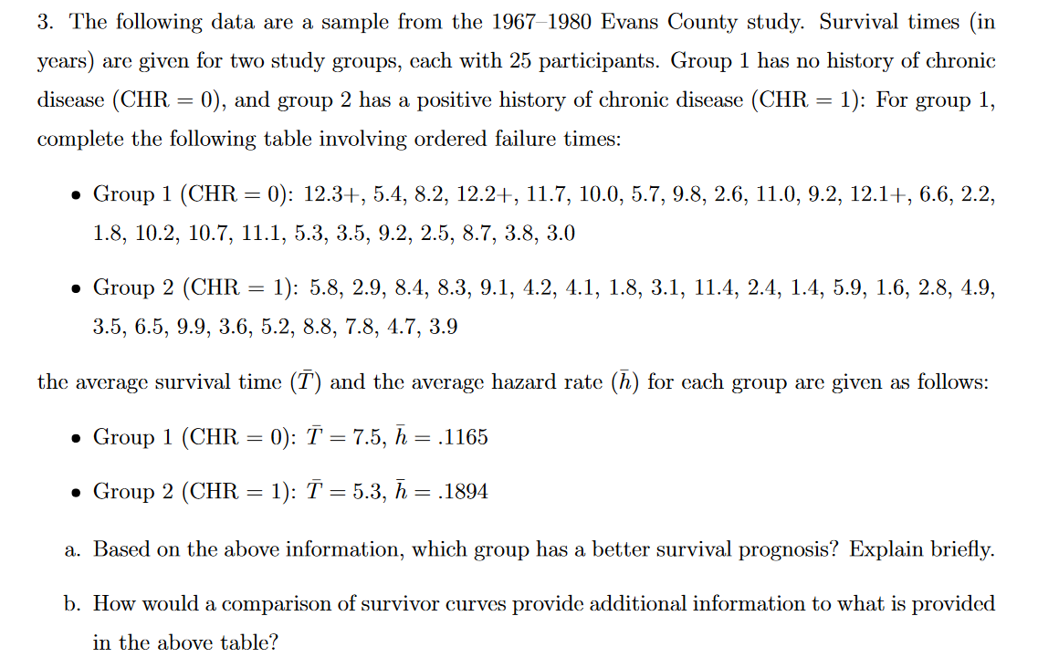
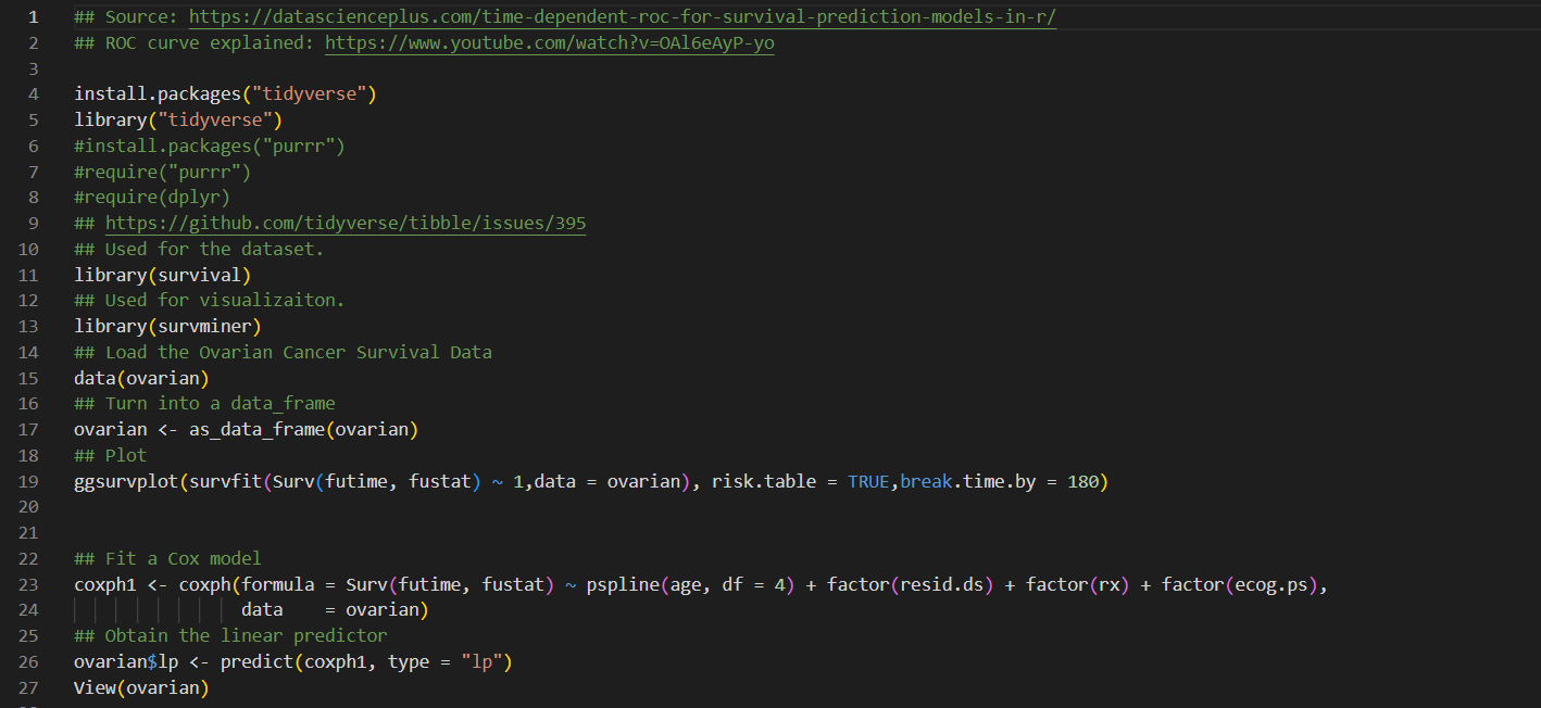
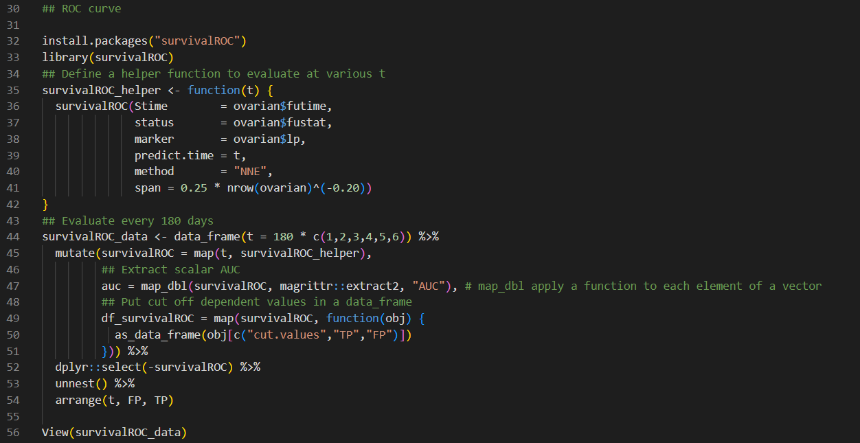

3. The following data. are a sample from the 1967 1980 Evans County study. Survival times (in years) are given for two study groups, each with 25 participants. Group 1 has no history of chronic disease (CIIR = 0), and group 2 has a positive history of chronic disease (CHE. = 1): For group 1, complete the following table involving ordered failure times: . Group 1 [CHR : 0): 12.3I , 5.4, 3.2, 12.2 + , 11.7, 10.0, 5.7, 9.3, 2.0, 11.0, 9.2, 12.1 + , 0.0, 2.2, 1.3, 10.2, 10.7, 11.1, 5.3, 3.5, 9.2, 2.5, 3.7, 3.8, 3.0 I Group 2 (Cl-1R = l): 5.8, 2.9, 8.4, 8.3, 9.1, 4.2, 4.1, 1.8, 3.1, 11.4, 2.4, 1.4, 5.9, 1.6, 2.8, 4.9, 3.5, 6.5, 9.9, 3.6, 5.2, 8.8, 7.8, 4.7, 3.9 the average survival time (T) and the average hazard rate (11) for each group are given as follows: - Group 1 (one = 0): 2\" = 7.5, E. = .1165 a Group 2 (CHR : 1): T : 5.3, .5, = .1894 a. Based on the above information, which group has a better survival prognosis? Explain briefly. b. How would a comparison of survivor curves provide additional information to what is provided in the above table? ## Source: https://datascienceplus . com/time-dependent-roc-for-survival-prediction-models-in-r/ N ## ROC curve explained: https: //www. youtube. com/watch?v=0A16eAyP-yo 3 4 install. packages ("tidyverse") 5 library("tidyverse") 6 #install. packages("purrr") 7 #require("purrr") 8 #require(dplyr) 9 ## https://github.com/tidyverse/tibble/issues/395 10 ## Used for the dataset. 11 library(survival) 12 ## Used for visualizaiton. 13 library (survminer) 14 ## Load the Ovarian Cancer Survival Data 15 data (ovarian) 16 ## Turn into a data_frame 17 ovarian % 45 mutate(survivalROC = map(t, survivalROC_helper), 46 ## Extract scalar AUC 47 auc = map_dbl(survivalROC, magrittr: : extract2, "AUC"), # map_dbl apply a function to each element of a vector 48 ## Put cut off dependent values in a data_frame 49 df_survivalROC = map(survivalROC, function(obj) { 50 as_data_frame (obj [c("cut. values", "TP", "FP") ]) 51 52 dplyr: : select(-survivalROC) %>% 53 unnest () %>% 54 arrange(t, FP, TP) 55 56 View(survivalROC_data)## Plot survivalROC data %>% ggplot (mapping = aes (x = FP, y = TP)) + geom_point( ) + geom_line() + geom_label (data = survivalROC_data %>%% dplyr: : select(t, auc) %>% unique, mapping = aes (label = sprintf("%. 3f", auc) ), x = 0.5, y = 0.5) + facet_wrap( ~ t) + theme_bw() + theme (axis . text.x = element_text (angle = 90, vjust = 0.5), legend. key = element_blank(), plot. title = element_text(hjust = 0.5), strip. background = element_blank() )
Step by Step Solution
There are 3 Steps involved in it

Get step-by-step solutions from verified subject matter experts