

Question: 5 In Power Pivot, create a calculated field for sum of revenue in the Calculation Area just below the Revenue column. Copy the calculated field
| 5 | In Power Pivot, create a calculated field for sum of revenue in the Calculation Area just below the Revenue column. Copy the calculated field and paste it as text into cell J41 of the SalesData worksheet in the main workbook. From the Power Pivot window, create a KPI that measures the Sum of Revenue value against the absolute value of $500.00. Maintain the default thresholds of 200 and 400 and select the first set of icon styles. Create a relationship between SalesData2016 and VolumeByEmp using the EmployeeID field. | 6 |
| 6 | In the Power Pivot window, create a Chart and Table (Horizontal) combination on the MetricsDashboard worksheet in cell B2. In the PivotChart, drag the LastName field from VolumeByEmp to the Axis (Categories) area. Drag the Category field from SalesData2016 to the Legend (Series) area. Drag the Quantity field from SalesData2016 to the Values area to calculate the sum of quantity sold. Change the chart type to a Stacked Column chart. Apply Style 9 to the PivotChart. Add a Chart Title that reads Category Volume by Employee. Add a Primary Vertical Axis title that reads Sales Volume and hide all field buttons. Add a Timeline slicer connected to the PivotChart, click the PurchaseDate check box, and position it below the chart. Apply the Light Green, TimelineStyle Light 6 to the slicer. | 15 |
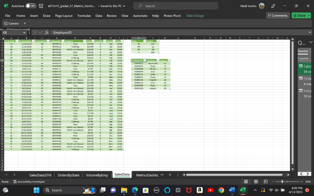
| 7 | Name the PivotTable EmployeeRevGoals. Drag the LastName field from VolumeByEmp to the Rows area. Drag the Sum of Revenue Value field from SalesData2016 to the Values area. Drag the Sum of Revenue KPI Status field to the Values area. Rename the Row Labels heading in J2 to Employees. Rename the Sum of Revenue heading in K2 to 2016 Revenue. Rename the Sum of Revenue Status heading in L2 as $500 Goal Status. If necessary, resize the column to fit the text. Apply the PivotTable Style, Light Green, Pivot Style Medium 14 to the PivotTable. | 22 |
| 8 | From the Power Pivot window, create a PivotTable on the MetricsDashboard worksheet in cell B25. Drag the State field from OrdersByState to the Rows area and the Orders field to the Values area. Rename the Row Labels heading in B25 to State and the Sum of Orders heading in C25 to Total Orders. | 12 |
| 9 | Apply Light Green, Pivot Style Medium 14 to the PivotTable and name it OrdersByState. | 6 |
| 10 | Insert the Bing Maps App for Office to the MetricsDashboard worksheet. Use the data in the OrdersByState PivotTable to generate circles onto the map. Position the map within the cell range E25:J39. | 0 |
| 11 | Prepare the dashboard for production by hiding the SalesData worksheet. Hide the column and row headings as well as the gridlines on the MetricsDashboard worksheet. | 9 |
| 12 | Minimize the ribbon. Protect the worksheet, allowing only to Use PivotTable & PivotChart and Edit objects. |
Step by Step Solution
There are 3 Steps involved in it
1 Expert Approved Answer
Step: 1 Unlock

Question Has Been Solved by an Expert!
Get step-by-step solutions from verified subject matter experts
Step: 2 Unlock
Step: 3 Unlock