

Question: 5) Shown below is a graph comparing the traffic sent (bits/sec) for both the No_Areas scenario and the Q4_No_Areas_Faiure scenario. Explain the graph. OSPF. Traffic
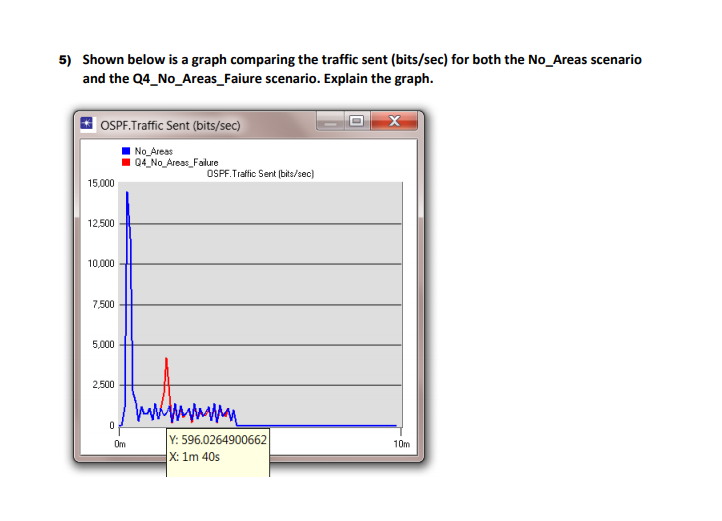
5) Shown below is a graph comparing the traffic sent (bits/sec) for both the No_Areas scenario and the Q4_No_Areas_Faiure scenario. Explain the graph. OSPF. Traffic Sent (bits/sec) No_Areas Q4_No_Areas_Failure OSPF Traffic Sent (bits/sec) 15,000 12,500 10,000 7,500 5,000 2500 0 Om Y: 596.0264900662 X: 1m 40s 10m
Step by Step Solution
There are 3 Steps involved in it
1 Expert Approved Answer
Step: 1 Unlock

Question Has Been Solved by an Expert!
Get step-by-step solutions from verified subject matter experts
Step: 2 Unlock
Step: 3 Unlock