

Question: A: Delays vs. Snowfall (2 glots on the same sheetl i) Create a plot that shows over time how the average delay occurs as well
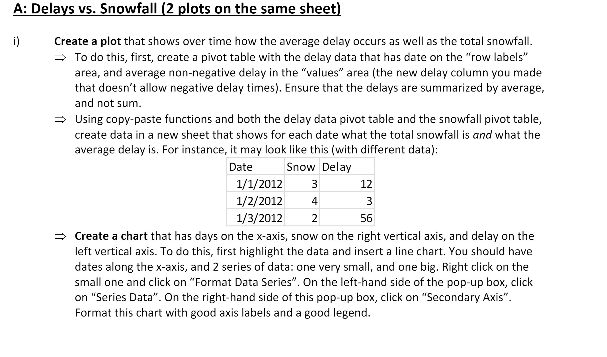
A: Delays vs. Snowfall (2 glots on the same sheetl i) Create a plot that shows over time how the average delay occurs as well as the total snowfall. :> To do this, first, create a pivot table with the delay data that has date on the "row labels\" area, and average non-negative delay in the \"values\" area (the new delay column you made that doesn't allow negative delay times). Ensure that the delays are summarized by average, and not sum. Using copypaste functions and both the delay data pivot table and the snowfall pivot table, create data in a new sheet that shows for each date what the total snowfall is and what the average delay is. For instance, it may look like this (with different data): Date Snow Delay 1/1/2012 3 12 1/ 2/ 2012 4 3 1/ 3/ 2012 2 56 Create a chart that has days on the x-axis, snow on the right vertical axis, and delay on the left vertical axis. To do this, first highlight the data and insert a line chart. You should have dates along the x-axis, and 2 series of data: one very small, and one big. Right click on the small one and click on \"Format Data Series\". On the left-hand side of the pop-up box, click on \"Series Data\". On the right-hand side of this pop-up box, click on \"Secondary Axis\". Format this chart with good axis labels and a good legend
Step by Step Solution
There are 3 Steps involved in it

Get step-by-step solutions from verified subject matter experts