Question: A market analyst wants to analyze and compare different tech companies based on their anual profits, revenue growth rate, and employee count. The analyst aims
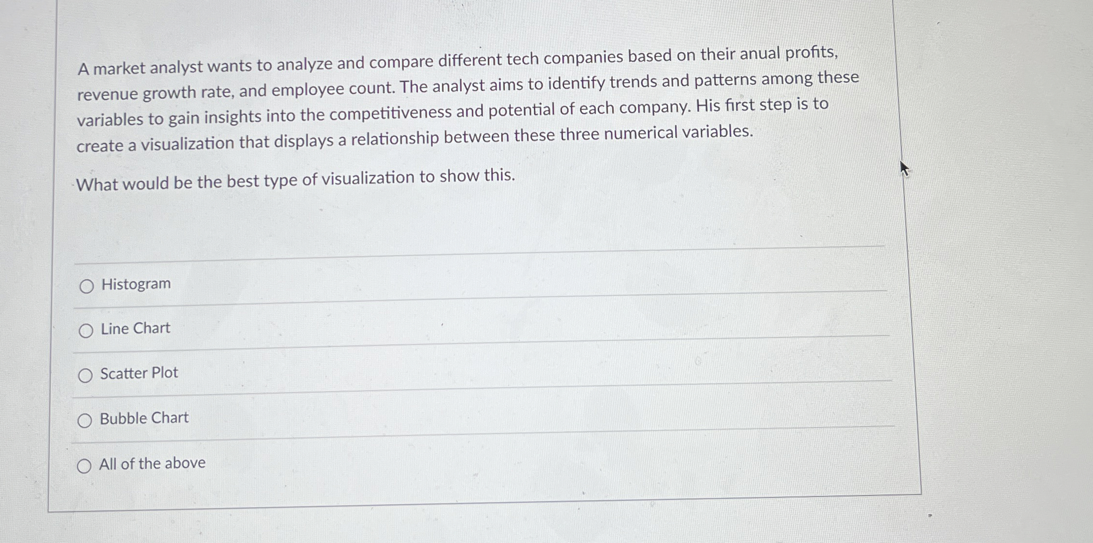
A market analyst wants to analyze and compare different tech companies based on their anual profits, revenue growth rate, and employee count. The analyst aims to identify trends and patterns among these variables to gain insights into the competitiveness and potential of each company. His first step is to create a visualization that displays a relationship between these three numerical variables.
What would be the best type of visualization to show this.
Histogram
Line Chart
Scatter Plot
Bubble Chart
All of the above

Step by Step Solution
There are 3 Steps involved in it
1 Expert Approved Answer
Step: 1 Unlock


Question Has Been Solved by an Expert!
Get step-by-step solutions from verified subject matter experts
Step: 2 Unlock
Step: 3 Unlock


