Question: A reliability engineer samples 100 electronic components, assigns them to an accelerated test environment, and measures their failure times. Of the following graphs, which is

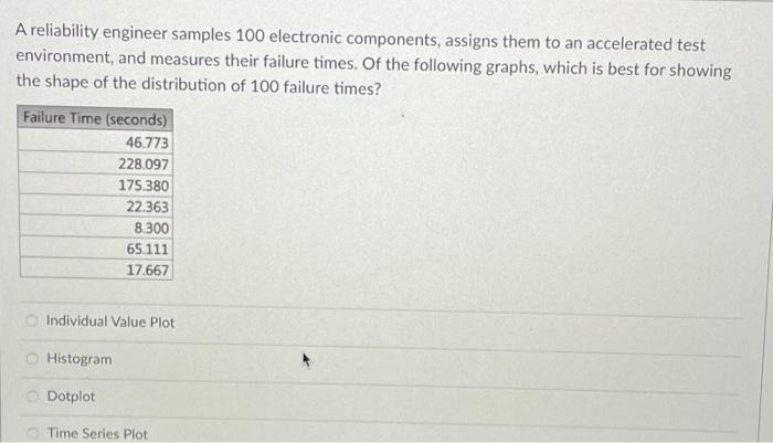
A reliability engineer samples 100 electronic components, assigns them to an accelerated test environment, and measures their failure times. Of the following graphs, which is best for showing the shape of the distribution of 100 failure times? Individual Value Plot Histogram Dotplot Time Series Plot
Step by Step Solution
There are 3 Steps involved in it

Get step-by-step solutions from verified subject matter experts


