

Question: a) The 2 related graphs are given below. What do they show us? b) How do these graphs change? Show typical graphs for both
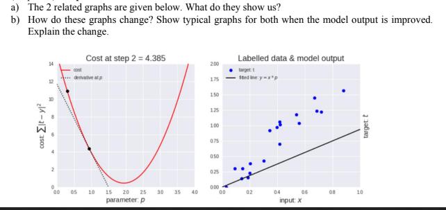
a) The 2 related graphs are given below. What do they show us? b) How do these graphs change? Show typical graphs for both when the model output is improved. Explain the change. cost: t-y Cost at step 2 = 4.385 Labelled data & model output 2:00 denvative atp 175 150 125 100 075 050 025 0:00 00 05 10 15 20 25 30 35 40 00 02 04 parameter: p input: x 06 08 10 target t
Step by Step Solution
There are 3 Steps involved in it
1 Expert Approved Answer
Step: 1 Unlock

Question Has Been Solved by an Expert!
Get step-by-step solutions from verified subject matter experts
Step: 2 Unlock
Step: 3 Unlock