

Question: | a wulf Stude A Cont @ Pears @ Hom @ Assig @ 1 X P 14.3. @ Micro a Thed Q Dem. Q Chap
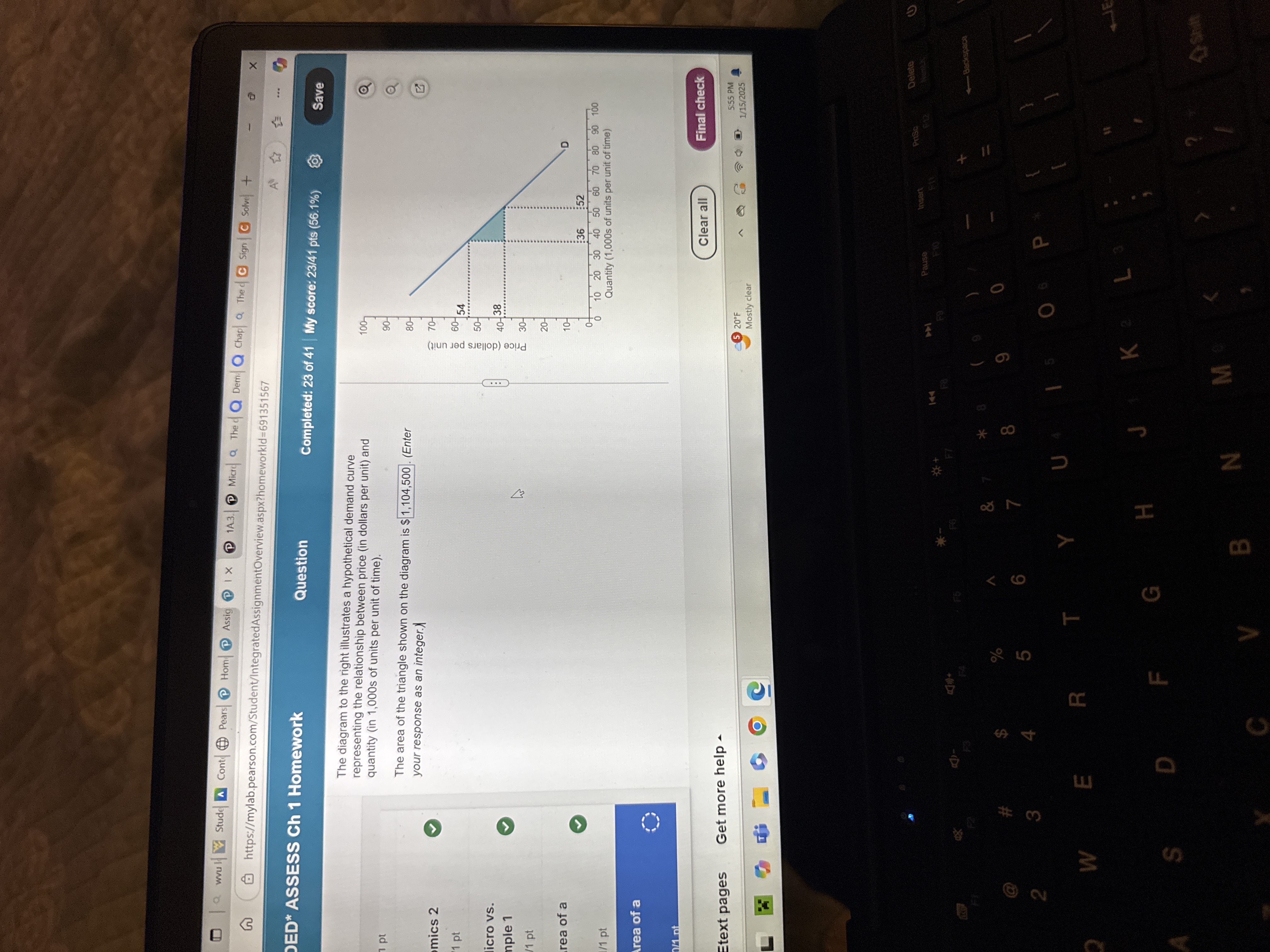 | a wulf Stude A Cont @ Pears @ Hom @ Assig @ 1 X P 14.3. @ Micro a Thed Q Dem. Q Chap Q Thed @ sign (C) solve + ( https://mylab.pearson.com/Student/IntegratedAssignmentOverview.aspx?homeworkld=691351567 X ED* ASSESS Ch 1 Homework Question Completed: 23 of 41 |My score: 23/41 pts (56.1%) Save The diagram to the right illustrates a hypothetical demand curve representing the relationship between price (in dollars per unit) and 100 1 pt quantity (in 1,000s of units per unit of time). The area of the triangle shown on the diagram is $ 1, 104,500 . (Enter your response as an integer.) mics 2 1 pt 54 Price (dollars per unit) licro vs. nple 1 V 1 pt rea of a :36 :52 /1 pt 10 20 30 40 50 60 70 80 90 100 Quantity (1,000s of units per unit of time) Area of a Clear all Final check Etext pages Get more help - 5 20OF 5:55 PM Mostly clear 1/15/2025 insert Prise Delete Pause 44 0 P U W E R T Y K L J F G H S D Shit N M V B
Step by Step Solution
There are 3 Steps involved in it

Get step-by-step solutions from verified subject matter experts