

Question: Am I doing this assignment right My work So far below N8 X V fx B D E F G H K A 1 ars
Am I doing this assignment right
My work So far below
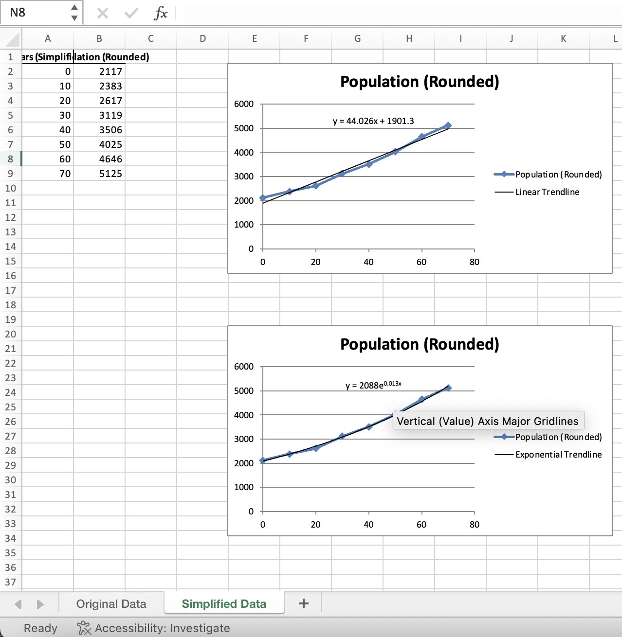
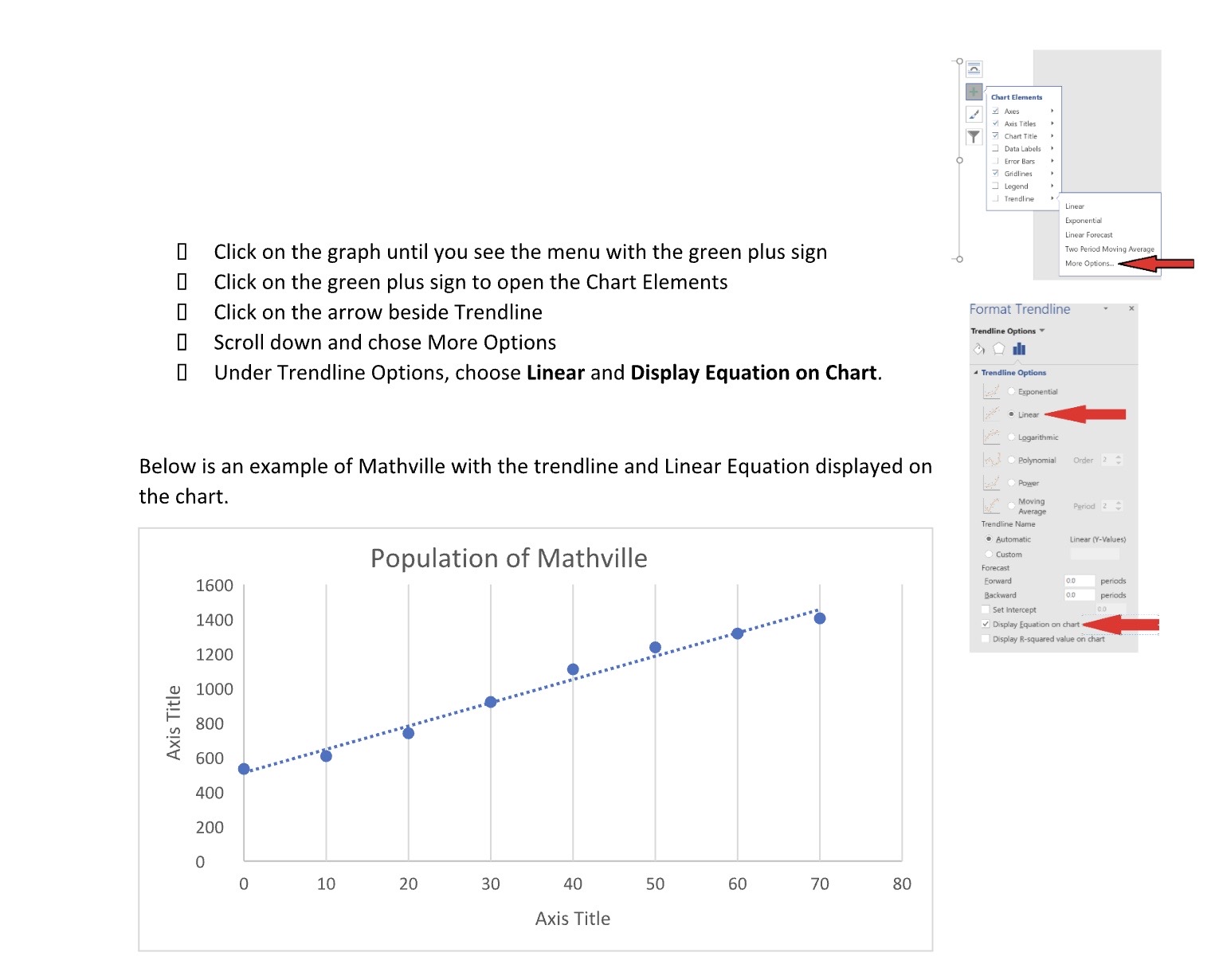
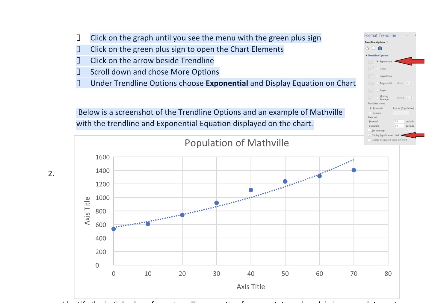
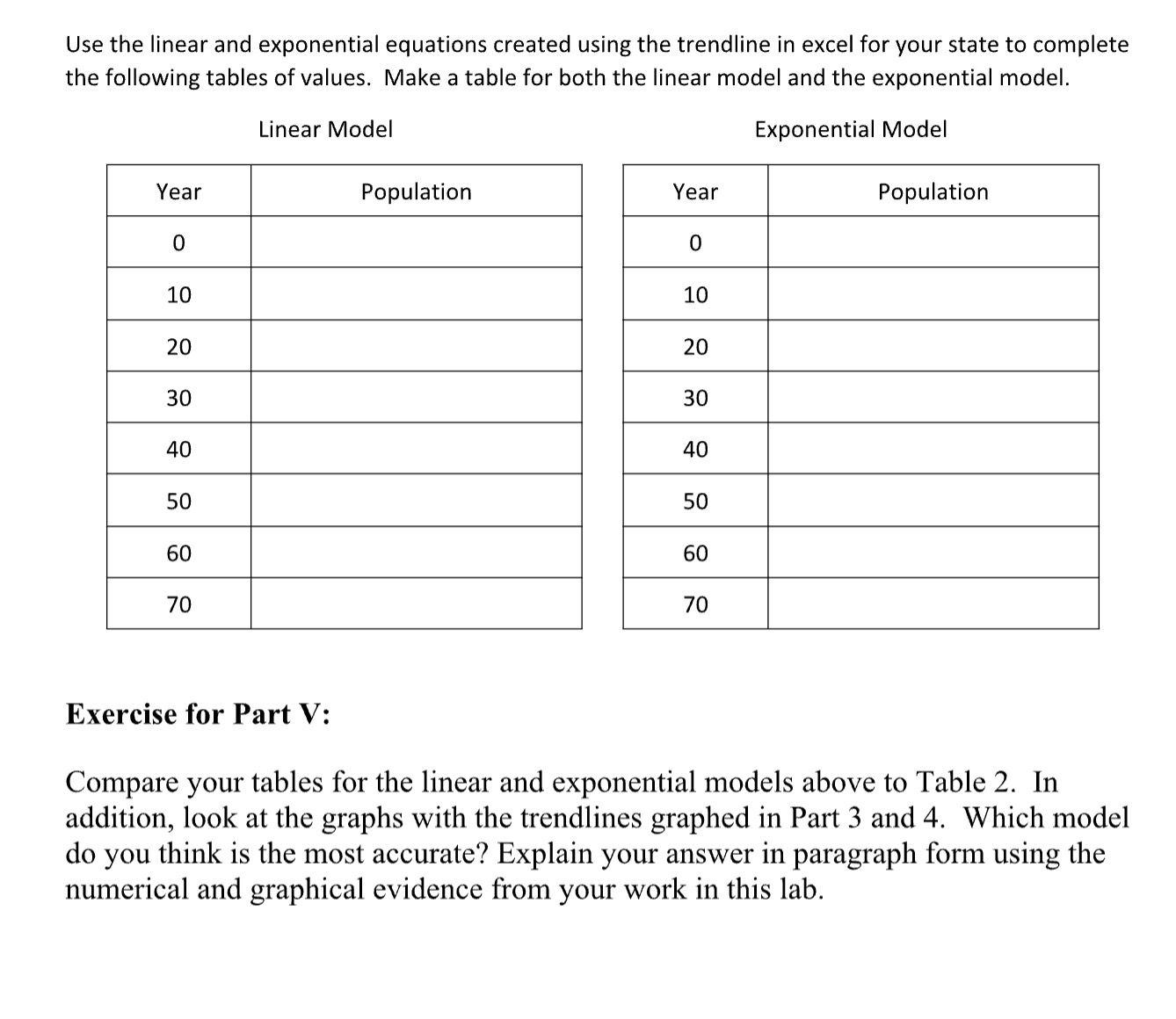
N8 X V fx B D E F G H K A 1 ars (Simplifilation (Rounded) 2117 Population (Rounded) 1AWN LO 2383 20 2617 6000 30 3119 y = 44.026x + 1901.3 40 3506 5000 50 4025 4000 60 4646 70 5125 3000 Population ( Rounded) 10 Linear Trendline 11 2000 12 1000 13 14 15 0 20 40 60 80 16 17 18 19 20 21 Population (Rounded) 22 6000 23 y = 2088e0.013x 24 5000 25 4000 26 Vertical (Value) Axis Major Gridlines 27 -Population ( Rounded) 3000 28 Exponential Trendline 29 2000 30 1000 31 32 0 0 20 40 60 80 33 34 35 36 37 D Original Data Simplified Data + Ready Accessibility: InvestigateChart Elements Axes v Axis Titles Chart Title Data Labels | Error Bars Gridlines Legend _ Trendline Lineor Exponential Linear Forecast 0 Click on the graph until you see the menu with the green plus sign Two Period Moving Average More Options. 0 Click on the green plus sign to open the Chart Elements 0 Click on the arrow beside Trendline Format Trendline Trendline Options 0 Scroll down and chose More Options Under Trendline Options, choose Linear and Display Equation on Chart. Trendline Options Exponential .Linear Logarithmic Below is an example of Mathville with the trendline and Linear Equation displayed on red . Polynomial Order 2 Power the chart. Moving Average Period 2 Trendline Name . Automatic Linear (Y-Values) Population of Mathville Custom Forecast 1600 Forward 0.0 periods Backward periods Set Intercept 1400 Display Equation on chart Display R-squared value on chart 1200 1000 Axis Title 800 600 400 200 10 20 30 40 50 60 70 80 Axis TitleI Click on the graph until you see the menu with the green plus sign Format Trendline Trendline Options I Click on the green plus sign to open the Chart Elements Trendline Options 0 Click on the arrow beside Trendline . Exponential [ Scroll down and chose More Options Linear be Logarithmic Under Trendline Options choose Exponential and Display Equation on Chart Polynomial Order 2 Power Moving Average Period 2 4 Trendline Name Below is a screenshot of the Trendline Options and an example of Mathville . Automatic Expon (Population) Custom Forecast with the trendline and Exponential Equation displayed on the chart. Forward 0.0 periods Backward periods Set Intercept Display Equation on chart Population of Mathville Display R-squared value on chart 1600 2. 1400 1200 1000 Axis Title 800 600 400 200 0 0 10 20 30 40 50 60 70 80 Axis TitleUse the linear and exponential equations created using the trendline in excel for your state to complete the following tables of values. Make a table for both the linear model and the exponential model. Linear Model Exponential Model Year Population Population 10 20 30 40 50 60 70 Exercise for Part V: Compare your tables for the linear and exponential models above to Table 2. In addition, look at the graphs with the trendlines graphed in Part 3 and 4. Which model do you think is the most accurate? Explain your answer in paragraph form using the numerical and graphical evidence from your work in this lab
Step by Step Solution
There are 3 Steps involved in it

Get step-by-step solutions from verified subject matter experts