

Question: Assignment Two Instructions - (No Bootstrap) I really need to write this code that work with Visual studio code using html and css file. to
Assignment Two Instructions - (No Bootstrap)
I really need to write this code that work with Visual studio code using html and css file. to create the layout attached to the document.
Inside your Responsive-Portfolio folder, find your styles.css file. You will write your media queries at the bottom of styles.css.
Use three @media screen tags, each with one of these max-widths: 980px, 768px and 640px.
You use 980px because you never want any of the content to be cut off. Since the desktop layout is about 960px wide, you want the media queries to kick in before your content gets cut off.
768px is about the width of a tablet and 640px is about the width of a phone in landscape.
Make the layout match the following screenshots:
portfolio.html: 980px, 768px, 640px (these are the recommended sizes to be use )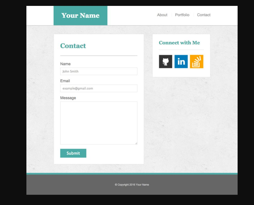
contact.html: 980px, 768px, 640px
Make the position of the header static (the default positioning) when the screen is 640px wide. The header design takes up a lot of room; you don't want it to stick to the top of a small screen and leave no room for the rest of your site.
Be sure to include the viewport tag in all your HTML files, otherwise your media-queries won't function as expected on mobile devices. (Hint: You won't need to use exact pixels for anything other than the container)
Protip: Use the Chrome extensions Window Resizer and Browser Width to see the browser dimensions in Chrome.
Deploy your new portfolio (now with media queries!) to GitHub Pages.
Your Name About Portfolio Contact Connect with Me Contact Name John Smith Email example@gmail.com Message Submit Copyright 2016 Your Name
Step by Step Solution
There are 3 Steps involved in it

Get step-by-step solutions from verified subject matter experts
 Study Help