

Question: > Assignments SOLUTION: Tableau DEl projec... # Canvas Learning Management. 1 Chapter 8 Tableau 10 pts For this case, you will create several calculations to
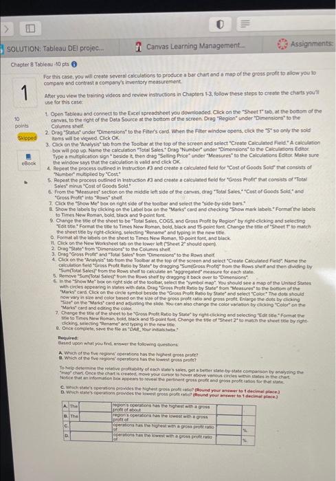
> Assignments SOLUTION: Tableau DEl projec... # Canvas Learning Management. 1 Chapter 8 Tableau 10 pts For this case, you will create several calculations to produce a bar chart and a map of the grous profit to allow you to compare and contrasta company's inventory measurement After you view the training videos and review instructions in Chapters 1-3, follow these steps to create the charts you use for this case 1. Open Tableau and connect to the Excel spreadsheet you downloaded. Click on the Sheet tab, at the bottom of the 10 canvas, to the right of the Data Source at the bottom of the screen Drag "Region under "Dimensions to the pois Columns Shelf 2. Drag Status' under "Dimensions to the Filter's card. When the Fiter window opens, click the "S so only the sold Skloped noms will be viewed. Click OK 3. Click on the Analysis tab from the Toolbar at the top of the screen and select "Create Calculated field. A calculation box will pop up. Name the calculation "Total Sales Drag "Number" under "Dimensions to the calculations Editor Type a multiplication sign beside it, then drag "Selling Price under "Measures to the Calculations Editor Make sure eBook the window says that the calculation is valid and click OK 4. Repeat the process outlined in Instruction 13 and create a calculated field for "Cost of Goods Sold that consists of "Number multiplied by "Cost. 5. Repeat the process outlined in instruction 13 and create a criculated field for "Gross Profishat consists of Total Sales minus *Cost of Goods Sold! 6. From the Measures" section on the middle left side of the canvas, drag "Total Sales Cost of Goods Sold" and "Gross Proficinto "Rows" shelf 7. Click the "Show Me" box on right side of the toolbar and select the side by side bars. 8. Show the labels by clicking on the label bou on the Marks card and checking "Show mark inbels Format the labels to Times New Roman, bold, black and 9 point font Change the side of the sheet to be "Total Sales COGS and Gross Profit by Region" by right-clicking and selecting Edit Format the title to Times New Roman, bold, black and 15 point font Change the title of "Sheet T to match the sheet title by right-clicking selecting "Rename and typing in the new title Format all the best on the sheet to Times New Roman, 10 point font and black lower left Sheet should open 04 The Row shelt 4. Click on the to from by 5. Renovering "SumGross Profitrom the Row shelf and then dividing by calculation and Gross Proche Haltestelor the top of the screen and select "Create Calculated File Name the Sun (Total Sales 10 cakcute an agregated measure for each state the "Show Methox on the side of the body gong back over to Dimensions select the "Symbol with ordes appearing in sales with dota. Drag "Groms Profit Ratlo by State from "Measures to the bottom of the map" You should see a map of the United States Marks Card Click on the circle symbol beside the "Gross Proft Ratio by State and select "Coloe The dots should now vary in size and color based on the wire of the gross proftratio and gross profit. Enlarge the dots by dicking Se on the Mariscard and adjusting the side You can also change the color variation by clicking Color on the "Marks card and editing the colo 7. Change the utle of the sheet to be "Grow Pront Ratio by State by right-clicking and selecting "Ede Fome the e to Times New Roman, bold, black and 15-point font Change the title of Sheet 2 to match the sheetite by right dicking selecting "Rename and typing in the new title & Once complete, Save the files. Your initial Required Based on what you find answer the following questions A Which of the five region operation has the highest gross profe? . Which of the five region' operation has the lowest gross profit? To help determine the relative protity of each states get better state-bystate comparson by anwysing the chat once the charts cated, move your car to have above scores within the chart Notice at non ho appears to reveal the pertinent gross profit and gross profits for that C. Whichte's operations provides the chest gross pronto Round your answer to decimal place Wichstes operations provides the lowest gross profound your weer to 1 decimal place) A The regions per as the highest with a gros pot about 8. The regon operations as the lowest with a gross tot c operation has the highest gross pro D ons has the lowest with a group of Jal hapter 8 Tableau 10 pts 30s 1 oints Skipped eBook Data analytics is the process of examining data sets in order to draw conclusions about the information they contain. If you have not completed any of the prior data analytics cases, follow the instructions listed in the Chapter 1 Data Analytics case to get set up. You will need to watch the videos referred to in the Chapter 1-3 Data Analytics cases. No additional videos are required for this case. All short training videos can be found here. in prior chapters, you used Tabienu to examine a data set and create calculations to compare two companies financial information. In the case you are seeking to gain insight into the relative profitability of a company in various regions of the country and various states in which it sells. Your focus is on assessing the company's ability to generate gross profit on the sale of its inventory Gross proft represents a company's ability to cover expenses other than cost of goods sold. Tableau Instructions: You have avallable to you an extensive data set that includes detailed financial data for the company's inventory sales, The data set is in the form of an Excel file available to download from Connect, or under Student Resources within the Library tab. There are four Excel files available. The one for use in this case is named "inventory xlsx"Download this file to the computer save it, and open it in Tableau For this case, you will create several calculations to produce a bar chart and a map of the gross profit to allow you to compare and contrasta company's inventory measurement After you view the training videos and review instructions in Chapters 13, follow these steps to create the charts you'll use 1 Open Tableau and connect to the Excel spreadsheet you downloaded. Click on the "Sheet 1" tab, at the bottom of the canvas, to the right of the Data Source at the bottom of the screen Drag "Region under "Dimensions to the Columns shelt 2. Drag "status" under "Dimensions to the Filter's card. When the Filter window opens, click the "S" so only the sold items will be viewed. Click OK 3. Click on the "Analysis tab from the Toolbar at the top of the screen and select "Create Calculated field. A calculation box will pop up. Name the calculation "Total Sales.Drag "Number under "Dimensions to the Calculations Editor Type a multiplication sign" beside it, then drag "Selling Price under "Measures to the Calculations Editor. Make sure the window says that the calculation is valid and click OK 4 Repeat the process outlined in Instruction 13 and create a calculated field for "Cost of Goods Sold" that consists of "Number" multiplied by Cost" 5. Repeat the process outlined in Instruction 13 and create a calculated field for "Gross Profit that consists of "Total Sales minus "Cost of Goods Sold 6. From the Measures" section on the middle left side of the canvas, drag Total Sales, Cost of Goods Sold and "Gross Profit into "Rows" shell 7. Click the "Show Me" box on right side of the toolbar and select the "side by sidebars 8. Show the labels by clicking on the Label box on the Marks card and checking "Show mark labels. Format the labels to Times New Roman, bold, black and 9-point font 9. Change the title of the sheet to be "Total Sales, COGS, and Gross Profit by Region" by night-clicking and selecting "Edit title. Format the title to Times New Roman, bold, black and 15-point font Change the title of "Sheet to match the sheet title by night clicking, selecting "Rename and typing in the new tide O Format all the labels on the sheet to Times New Roman, 10-point font and black 11. Click on the New Worksheet tab on the lower left Sheet 2 should openi 2. Drag State" from "Dimensions to the Columns Shell 3. Drag "Gross Profit" and "Total Sales from "Dimensions to the Rows shelf 4. Click on the "Analysis" tab from the Toolbar at the top of the screen and select "Create Calculated Field Name the calculation field Gross Profit Ratio by State" by dragging "SumGross Prof from the Rows shelf and then dividing by "Sum(Total Sales from the Rows shelf to calculate an aggregated measure for each state. 5. Remove "SumTotal Sales from the Rows shelf by dragging it back over to "Dimensions! 6. In the "Show Me" box on right side of the toolbar, select the symbol map" You should see a map of the United States with circles appearing in states with data Drag "Gross Profit Ratio by State from "Measures to the bottom of the "Marks" card. Click on the circle symbol beside the "Gross Profit Ratio by State and select "Color" The dots should now vary in size and color based on the size of the gross proftratio and gross profit. Enlarge the dots by clicking "Size" on the Markes card and adjusting the slide. You can also change the coloration by clicking "Color on the "Marss card and editing the color 7. Change the sue of the sheet to be "Gross Proft Ratio by State ty right-clicking and selecting 'Edit title.' Format the title to Times New Roman, bold, black and 15 point font Change the side of "Sheet2" to match the sheet title by right clicking selecting "Rename and typing in the new title 8. Once complete, save the file as "DAR_Your initialstwo Required: Based upon what you find answer the following questions A. Which of the five regions operations as the highest possono > Assignments SOLUTION: Tableau DEl projec... # Canvas Learning Management. 1 Chapter 8 Tableau 10 pts For this case, you will create several calculations to produce a bar chart and a map of the grous profit to allow you to compare and contrasta company's inventory measurement After you view the training videos and review instructions in Chapters 1-3, follow these steps to create the charts you use for this case 1. Open Tableau and connect to the Excel spreadsheet you downloaded. Click on the Sheet tab, at the bottom of the 10 canvas, to the right of the Data Source at the bottom of the screen Drag "Region under "Dimensions to the pois Columns Shelf 2. Drag Status' under "Dimensions to the Filter's card. When the Fiter window opens, click the "S so only the sold Skloped noms will be viewed. Click OK 3. Click on the Analysis tab from the Toolbar at the top of the screen and select "Create Calculated field. A calculation box will pop up. Name the calculation "Total Sales Drag "Number" under "Dimensions to the calculations Editor Type a multiplication sign beside it, then drag "Selling Price under "Measures to the Calculations Editor Make sure eBook the window says that the calculation is valid and click OK 4. Repeat the process outlined in Instruction 13 and create a calculated field for "Cost of Goods Sold that consists of "Number multiplied by "Cost. 5. Repeat the process outlined in instruction 13 and create a criculated field for "Gross Profishat consists of Total Sales minus *Cost of Goods Sold! 6. From the Measures" section on the middle left side of the canvas, drag "Total Sales Cost of Goods Sold" and "Gross Proficinto "Rows" shelf 7. Click the "Show Me" box on right side of the toolbar and select the side by side bars. 8. Show the labels by clicking on the label bou on the Marks card and checking "Show mark inbels Format the labels to Times New Roman, bold, black and 9 point font Change the side of the sheet to be "Total Sales COGS and Gross Profit by Region" by right-clicking and selecting Edit Format the title to Times New Roman, bold, black and 15 point font Change the title of "Sheet T to match the sheet title by right-clicking selecting "Rename and typing in the new title Format all the best on the sheet to Times New Roman, 10 point font and black lower left Sheet should open 04 The Row shelt 4. Click on the to from by 5. Renovering "SumGross Profitrom the Row shelf and then dividing by calculation and Gross Proche Haltestelor the top of the screen and select "Create Calculated File Name the Sun (Total Sales 10 cakcute an agregated measure for each state the "Show Methox on the side of the body gong back over to Dimensions select the "Symbol with ordes appearing in sales with dota. Drag "Groms Profit Ratlo by State from "Measures to the bottom of the map" You should see a map of the United States Marks Card Click on the circle symbol beside the "Gross Proft Ratio by State and select "Coloe The dots should now vary in size and color based on the wire of the gross proftratio and gross profit. Enlarge the dots by dicking Se on the Mariscard and adjusting the side You can also change the color variation by clicking Color on the "Marks card and editing the colo 7. Change the utle of the sheet to be "Grow Pront Ratio by State by right-clicking and selecting "Ede Fome the e to Times New Roman, bold, black and 15-point font Change the title of Sheet 2 to match the sheetite by right dicking selecting "Rename and typing in the new title & Once complete, Save the files. Your initial Required Based on what you find answer the following questions A Which of the five region operation has the highest gross profe? . Which of the five region' operation has the lowest gross profit? To help determine the relative protity of each states get better state-bystate comparson by anwysing the chat once the charts cated, move your car to have above scores within the chart Notice at non ho appears to reveal the pertinent gross profit and gross profits for that C. Whichte's operations provides the chest gross pronto Round your answer to decimal place Wichstes operations provides the lowest gross profound your weer to 1 decimal place) A The regions per as the highest with a gros pot about 8. The regon operations as the lowest with a gross tot c operation has the highest gross pro D ons has the lowest with a group of Jal hapter 8 Tableau 10 pts 30s 1 oints Skipped eBook Data analytics is the process of examining data sets in order to draw conclusions about the information they contain. If you have not completed any of the prior data analytics cases, follow the instructions listed in the Chapter 1 Data Analytics case to get set up. You will need to watch the videos referred to in the Chapter 1-3 Data Analytics cases. No additional videos are required for this case. All short training videos can be found here. in prior chapters, you used Tabienu to examine a data set and create calculations to compare two companies financial information. In the case you are seeking to gain insight into the relative profitability of a company in various regions of the country and various states in which it sells. Your focus is on assessing the company's ability to generate gross profit on the sale of its inventory Gross proft represents a company's ability to cover expenses other than cost of goods sold. Tableau Instructions: You have avallable to you an extensive data set that includes detailed financial data for the company's inventory sales, The data set is in the form of an Excel file available to download from Connect, or under Student Resources within the Library tab. There are four Excel files available. The one for use in this case is named "inventory xlsx"Download this file to the computer save it, and open it in Tableau For this case, you will create several calculations to produce a bar chart and a map of the gross profit to allow you to compare and contrasta company's inventory measurement After you view the training videos and review instructions in Chapters 13, follow these steps to create the charts you'll use 1 Open Tableau and connect to the Excel spreadsheet you downloaded. Click on the "Sheet 1" tab, at the bottom of the canvas, to the right of the Data Source at the bottom of the screen Drag "Region under "Dimensions to the Columns shelt 2. Drag "status" under "Dimensions to the Filter's card. When the Filter window opens, click the "S" so only the sold items will be viewed. Click OK 3. Click on the "Analysis tab from the Toolbar at the top of the screen and select "Create Calculated field. A calculation box will pop up. Name the calculation "Total Sales.Drag "Number under "Dimensions to the Calculations Editor Type a multiplication sign" beside it, then drag "Selling Price under "Measures to the Calculations Editor. Make sure the window says that the calculation is valid and click OK 4 Repeat the process outlined in Instruction 13 and create a calculated field for "Cost of Goods Sold" that consists of "Number" multiplied by Cost" 5. Repeat the process outlined in Instruction 13 and create a calculated field for "Gross Profit that consists of "Total Sales minus "Cost of Goods Sold 6. From the Measures" section on the middle left side of the canvas, drag Total Sales, Cost of Goods Sold and "Gross Profit into "Rows" shell 7. Click the "Show Me" box on right side of the toolbar and select the "side by sidebars 8. Show the labels by clicking on the Label box on the Marks card and checking "Show mark labels. Format the labels to Times New Roman, bold, black and 9-point font 9. Change the title of the sheet to be "Total Sales, COGS, and Gross Profit by Region" by night-clicking and selecting "Edit title. Format the title to Times New Roman, bold, black and 15-point font Change the title of "Sheet to match the sheet title by night clicking, selecting "Rename and typing in the new tide O Format all the labels on the sheet to Times New Roman, 10-point font and black 11. Click on the New Worksheet tab on the lower left Sheet 2 should openi 2. Drag State" from "Dimensions to the Columns Shell 3. Drag "Gross Profit" and "Total Sales from "Dimensions to the Rows shelf 4. Click on the "Analysis" tab from the Toolbar at the top of the screen and select "Create Calculated Field Name the calculation field Gross Profit Ratio by State" by dragging "SumGross Prof from the Rows shelf and then dividing by "Sum(Total Sales from the Rows shelf to calculate an aggregated measure for each state. 5. Remove "SumTotal Sales from the Rows shelf by dragging it back over to "Dimensions! 6. In the "Show Me" box on right side of the toolbar, select the symbol map" You should see a map of the United States with circles appearing in states with data Drag "Gross Profit Ratio by State from "Measures to the bottom of the "Marks" card. Click on the circle symbol beside the "Gross Profit Ratio by State and select "Color" The dots should now vary in size and color based on the size of the gross proftratio and gross profit. Enlarge the dots by clicking "Size" on the Markes card and adjusting the slide. You can also change the coloration by clicking "Color on the "Marss card and editing the color 7. Change the sue of the sheet to be "Gross Proft Ratio by State ty right-clicking and selecting 'Edit title.' Format the title to Times New Roman, bold, black and 15 point font Change the side of "Sheet2" to match the sheet title by right clicking selecting "Rename and typing in the new title 8. Once complete, save the file as "DAR_Your initialstwo Required: Based upon what you find answer the following questions A. Which of the five regions operations as the highest possono
Step by Step Solution
There are 3 Steps involved in it

Get step-by-step solutions from verified subject matter experts