

Question: Building a Chart Using Trick or Treat Data Each year my home is bombarded on Halloween with an incredible amount of Trick or Treaters. So
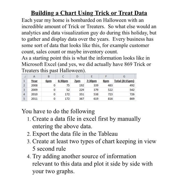
Building a Chart Using Trick or Treat Data Each year my home is bombarded on Halloween with an incredible amount of Trick or Treaters. So what else would an analytics and data visualization guy do during this holiday, but to gather and display data over the years. Every business has some sort of data that looks like this, for example customer count, sales count or maybe inventory count. As a starting point this is what the information looks like in Microsoft Excel (and yes, we did actually have 869 Trick or Treaters this past Halloween). B E F G 1 Year 6pm 6:30pm 7pm 7:30pm 8pm Total (8:15pm] 2 2008 0 75 192 339 492 3 2009 229 379 522 542 4 2010 0 351 538 726 5 2011 367 619 483 0 52 172 172 723 816 0 869 You have to do the following 1. Create a data file in excel first by manually entering the above data. 2. Export the data file in the Tableau 3. Create at least two types of chart keeping in view 5 second rule 4. Try adding another source of information relevant to this data and plot it side by side with your two graphs
Step by Step Solution
There are 3 Steps involved in it

Get step-by-step solutions from verified subject matter experts