

Question: Can you check my interpretations for the run chart, frequency histogram, and u - chart for the following question? Tom Pyzdek, a noted quality consultant,
Can you check my interpretations for the run chart, frequency histogram, and uchart for the following question?
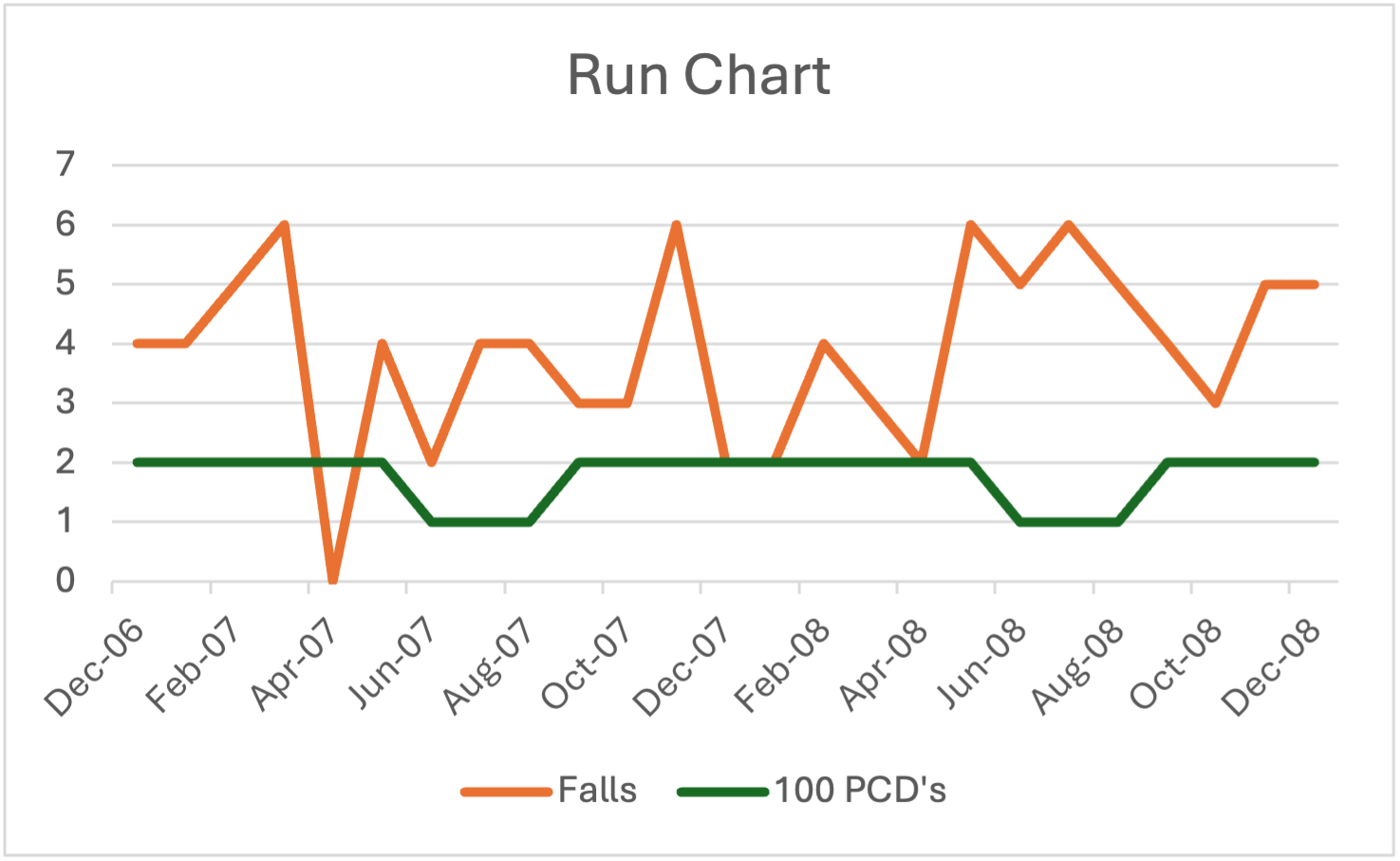
Tom Pyzdek, a noted quality consultant, presented data on patient falls at the Great Falls Hospital fictitious name for patients as shown in the HWData.xlsx file found on Canvas. Note that the sample size is in s of Patient Care Days PCDs Develop a run chart, a frequency histogram, and a uchart for these data, and include these charts in your answers. What insights do you get from each chart? What would you advise the administration of the hospital to do about patient falls?
The run chart of patient falls over time analysis a relatively stable pattern with occasional fluctuations. Most months show a consistent number of falls, with no significant upward or downward trends. However, there are a few month with noticeable spikes in patient falls eg March November June and August which could indicate periods when patient safety may have been compromised. These outlier months warrant closer attention to investigate potential factors contributing to the rise in falls, such as changes in staffing levels, patient conditions, or facility operations. Despite these outliers, the overall trend appears to be stable, suggesting that the hospitals patient fall prevention measures may generally be effective but need finetuning during highrisk periods.
The frequency histogram shows that PCDs Patient Care Days are more common than PCD across the entire data set, with most months falling into the PCDs category. This suggests that patient falls tend to occur more frequently during periods of higher patient care volume or longer stays, as represented by higher PCD counts. The histogram helps highlight variability in patient care, pointing to potential issues during highercarevolume periods. Although most months report falls per PCDs the occasional higher counts indicate that, during certain months, the fall rate could be higher than expected, and further investigation is warranted in those months.
The uchart, which normalizes the fall data against PCDs provides an overview of the fall rate per unit of patient care. From the uchart, most of the data points fall within control limits indicating that the process is generally in control. However, the chart reveals some outofcontrol points, particularly in the months of March November June and August where the falls rates exceed the upper control limits UCL These spikes indicate special causes or significant deviations in the process, suggesting that these months may required additional scrutiny to identify any root causes for the higher fall rates. The uchart suggest that while the overall process is table, the hospital should focus on preventing such outofcontrol events by reviewing operational factors during those specific months.
Step by Step Solution
There are 3 Steps involved in it
1 Expert Approved Answer
Step: 1 Unlock

Question Has Been Solved by an Expert!
Get step-by-step solutions from verified subject matter experts
Step: 2 Unlock
Step: 3 Unlock