

Question: Can you help with the python program below: This is Lab 6. Source: https://en.wikipedia.org/wiki/Demographics_of_New_York_City,,,,,, * All population figures are consistent with present-day boundaries.,,,,,, First census
Can you help with the python program below:
This is Lab 6.
Source: https://en.wikipedia.org/wiki/Demographics_of_New_York_City,,,,,, * All population figures are consistent with present-day boundaries.,,,,,, First census after the consolidation of the five boroughs,,,,,, ,,,,,, ,,,,,, Year,Manhattan,Brooklyn,Queens,Bronx,Staten Island,Total 1698,4937,2017,,,727,7681 1771,21863,3623,,,2847,28423 1790,33131,4549,6159,1781,3827,49447 1800,60515,5740,6642,1755,4563,79215
Note that it has 5 extra lines at the top before the column names occur. The pandas function for reading in CSV files is read_csv(). It has an option to skip rows which we will use here:
pop = pd.read_csv('nycHistPop.csv',skiprows=5) Before going on, let's print out the variable pop. pop is a dataframe, described in the reading above:
print(pop)
The last line of our first pandas program is:
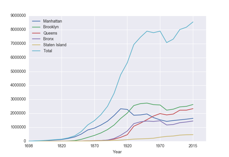
pop.plot(x="Year")
which makes a graphical display of all of the data series in the variable pop with the series corresponding to the column "Year" as the x-axis. Your output should look something like:
To recap: our program is:
import matplotlib.pyplot as plt import pandas as pd pop = pd.read_csv('nycHistPop.csv',skiprows=5) pop.plot(x="Year") plt.show() which did the following:
- Imported the pandas library that contains structures and functions for organizing and visualizing data. We also imported the pyplot library which pandas uses to create figures.
- It read in a CSV file, containing NYC population historical data.
- It displayed the data as a visual plot of years versus borough populations.
- The last line shows the figure you created in a separate graphics window.
There are useful built-in statistics functions for the dataframes in pandas. For example, if you would like to know the maximum value for the series "Bronx", you apply the max() function to that series:
print("The largest number living in the Bronx is", pop["Bronx"].max()) Similarly the average (mean) population for Queens can be computed:
print("The average number living in the Queens is", pop["Queens"].mean()) Challenges
- What happens if you leave off the x = "Year"? Why?
- What happens if you add in x = "Year", y = "Bronx"?
- What does the series functions: .min(), .std(), and .count() do?
Manipulating Columns
Each column in the original spreadsheet is a column, or series. We can look at the column for the Bronx with:
print(pop['Bronx'])
How would you look at the one for Brooklyn?
A nice thing about series is that you can do basic arithmetic with them. For example,
print(pop['Bronx']*2)
prints out double the values in the column.
You can also use multiple columns in a calculation:
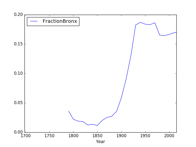
print(pop['Bronx']/pop['Total'])
prints out the fraction of the total population that lives in the Bronx.
We can save that series by creating a new column for it:
pop['Fraction'] = pop['Bronx']/pop['Total']
and then can use it to create a new graph:
pop.plot(x = 'Year', y = 'Fraction')
We can save it to a file, by storing the current figure (via "get current figure" or gcf() function and then saving it:
fig = plt.gcf() fig.savefig('fractionBX.png') shown in the following plot:
Putting this altogether, we have a program:
#Libraries for plotting and data processing: import matplotlib.pyplot as plt import pandas as pd #Open the CSV file and store in pop pop = pd.read_csv('nycHistPop.csv',skiprows=5) #Compute the fraction of the population in the Bronx, and save as new column: pop['Fraction'] = pop['Bronx']/pop['Total'] #Create a plot of year versus fraction of pop. in Bronx (with labels): pop.plot(x = 'Year', y = 'Fraction') #Save to the file: fractionBX.png fig = plt.gcf() fig.savefig('fractionBX.png)
This is the question that I need to answer:
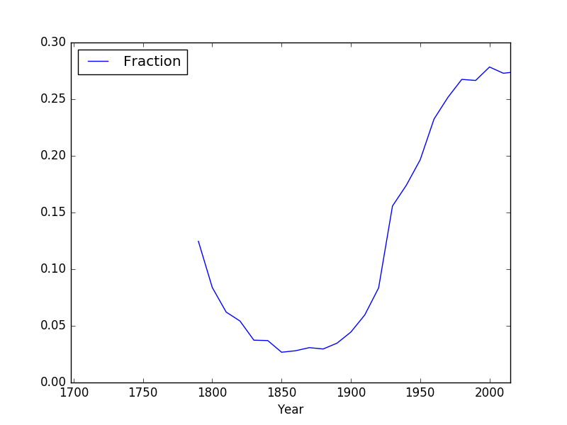
Modify the program from Lab 6 that displays the NYC historical population data. Your program should ask the user for the borough, an name for the output file, and then display the fraction of the population that has lived in that borough, over time.
A sample run of the program:
Enter borough name: Queens Enter output file name: qFraction.png
The file qFraction.png:
Note: before submitting your program for grading, remove the commands that show the image (i.e. the ones that pop up the graphics window with the image). The program is graded on a server on the cloud and does not have a graphics window, so, the plt.show() and plt.imshow() commands will give an error. Instead, the files your program produces are compared pixel-by-pixel to the answer to check for correctness.
9000000 Manhattan Brooklyn 8000000 _ Queens Bronx 000000Staten Island Total 6000000 5000000 4000000 3000000 2000000 1000000 1698 1820 1870 1920 1970 2015 Year 0.20 FractionBronx 0.15 0.10 0.05 0700 1750 1800 18501900 1950 2000 0.00 Year 0.30 Fraction 0.25 0.20 0.15 0.10 0.05 0700 1750 1800 18501900 1950 2000 0.00 Year 9000000 Manhattan Brooklyn 8000000 _ Queens Bronx 000000Staten Island Total 6000000 5000000 4000000 3000000 2000000 1000000 1698 1820 1870 1920 1970 2015 Year 0.20 FractionBronx 0.15 0.10 0.05 0700 1750 1800 18501900 1950 2000 0.00 Year 0.30 Fraction 0.25 0.20 0.15 0.10 0.05 0700 1750 1800 18501900 1950 2000 0.00 Year
Step by Step Solution
There are 3 Steps involved in it

Get step-by-step solutions from verified subject matter experts