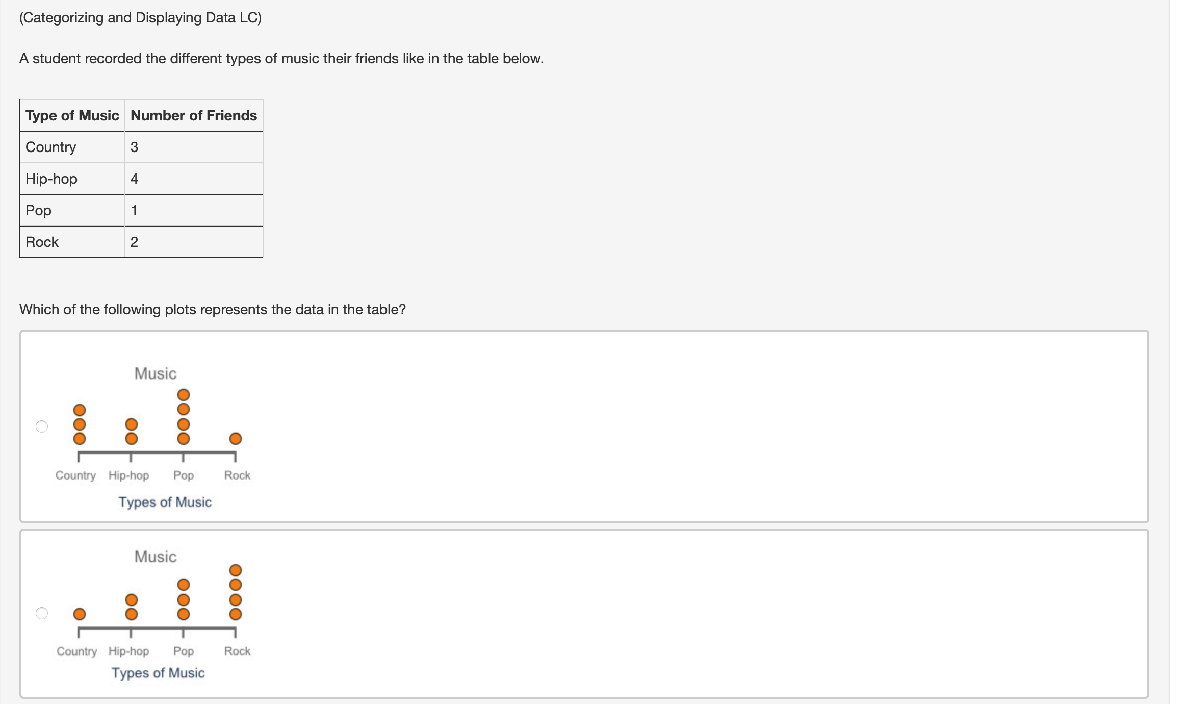
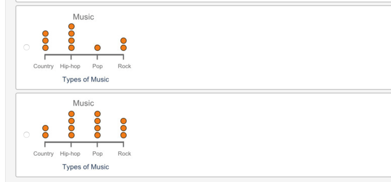
Question: (Categorizing and Displaying Data LC) A student recorded the different types of music their friends like in the table below. Type of Music Number of

(Categorizing and Displaying Data LC) A student(Categorizing and Displaying Data LC) A student(Categorizing and Displaying Data LC) A student(Categorizing and Displaying Data LC) A student(Categorizing and Displaying Data LC) A student(Categorizing and Displaying Data LC) A student(Categorizing and Displaying Data LC) A student(Categorizing and Displaying Data LC) A student
(Categorizing and Displaying Data LC) A student recorded the different types of music their friends like in the table below. Type of Music Number of Friends Country 3 Hip-hop 4 Pop 1 Rock 2 Which of the following plots represents the data in the table? Music 0 O O O O O O O O 0 Country H'prhop Pop Rock Types of Music Music 0 O O O O O O O O O Cuunliy Hip-hop Pop Rock Types of Music Music OOO O Country Hip-hop Pop Rock Types of Music Music OO ooOO OOO O Country Hip-hop Pop Rock Types of MusicA school is studying Math for Data and Financial Literacy standardized test scores. Which of the following displays could be used to represent the data, and why? 0 Bar chart, because test scores are numerical Box plot, because test scores are categorical Circle graph, because test scores are categorical Stemandleafplot, because test scores are numerical The following histogram portrays data about the average age range of consumers buying the latest version of a cell phone. Age Range of Consumers Number of People -| H w h U1 0' 'I-ul on D 20-30 30-40 40-50 50-60 Choose the correct statement. Seven people age 25 bought the cell phone. Five people age 30 bought the cell phone. The largest group of consumers are people ages 2030. The smallest group of consumers are people ages 5060. A group of 25 students participated in a science competition. Their scores are below. Score (points) 3039 4049 5059 6069 7079 Number of Students 5 7 6 4 3 Would a dot plot or a histogram best represent the data presented here? Why? Histogram, because a large number of scores are reported as ranges Histogram, because a small number of scores are reported individually Dot plot, because a large number of scores are reported as ranges Dot plot, because a small number of scores are reported individually A stem-and-leaf plot shows the average life expectancy of various pets. Which data table correctly represents the data shown on the stemandIeaf plot? Pet Average Life Expectancy (years) Cat 15 Dog 13 Goldfish 6 Hamster 2 Horse 25 Koi Fish 31 Parrot 51 Snake 11 Turtle 40 Pet Average Life Expectancy (years) Cat 16 Dog 15 Goldfish 6 Hamster 2 Horse 25 Koi Fish 31 Parrot 51 Snake 1 1 Turtle 40 Pet Average Life Expectancy (years) Cat 15 Dog 13 Goldfish 6 Hamster 2 Horse 26 Koi Fish 31 Parrot 51 Snake 1 1 Turtle 41 Pet Average Life Expectancy (years) Cat 15 Dog 13 Goldfish 5 Hamster 1 Horse 25 Koi Fish 31 Parrot 51 Snake 1 1 Turtle 40

Step by Step Solution

There are 3 Steps involved in it

1 Expert Approved Answer
Step: 1 Unlock blur-text-image
Question Has Been Solved by an Expert!

Get step-by-step solutions from verified subject matter experts

Step: 2 Unlock
Step: 3 Unlock

Students Have Also Explored These Related Mathematics Questions!