

Question: Chapter 3. Supply and Demand: Pre-Class & In-Class Activities Packet Name/I.D. Number: Section: Date: Part 4. Economic Equations and Graphs 4. In the following figure,
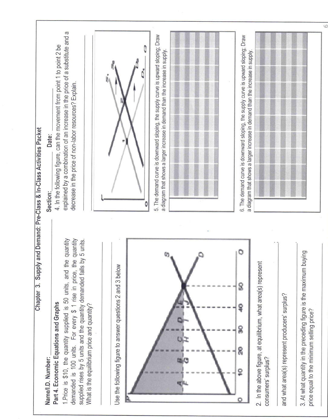
Chapter 3. Supply and Demand: Pre-Class & In-Class Activities Packet Name/I.D. Number: Section: Date: Part 4. Economic Equations and Graphs 4. In the following figure, can the movement from point 1 to point 2 be 1. Price is $10, the quantity supplied is 50 units, and the quantity explained by a combination of an increase in the price of a substitute and a demanded is 100 units. For every $ 1 rise in price, the quantity decrease in the price of non-labor resources? Explain. supplied rises by 5 units and the quantity demanded falls by 5 units What is the equilibrium price and quantity? Use the following figure to answer questions 2 and 3 below 5. The demand curve is downward sloping, the supply curve is upward sloping; Draw a diagram that shows a larger increase in demand than the increase in supply 20 30 40 50 6. The demand curve is downward sloping, the supply curve is upward sloping; Draw a diagram that shows a larger increase in demand than the increase in supply. 2. In the above figure, at equilibrium, what area(s) represent consumers' surplus? and what area(s) represent producers' surplus? 3. At what quantity in the preceding figure is the maximum buying price equal to the minimum selling price
Step by Step Solution
There are 3 Steps involved in it

Get step-by-step solutions from verified subject matter experts