

Question: Chrome - Take a Test - James Flood X mathxl.com/Student/PlayerTest. aspx?testld=213634319¢erwin=yes Laura Booth 20SPCMP MAT 200 20102 James Flood & | 05/20/20 2:40 PM Test:
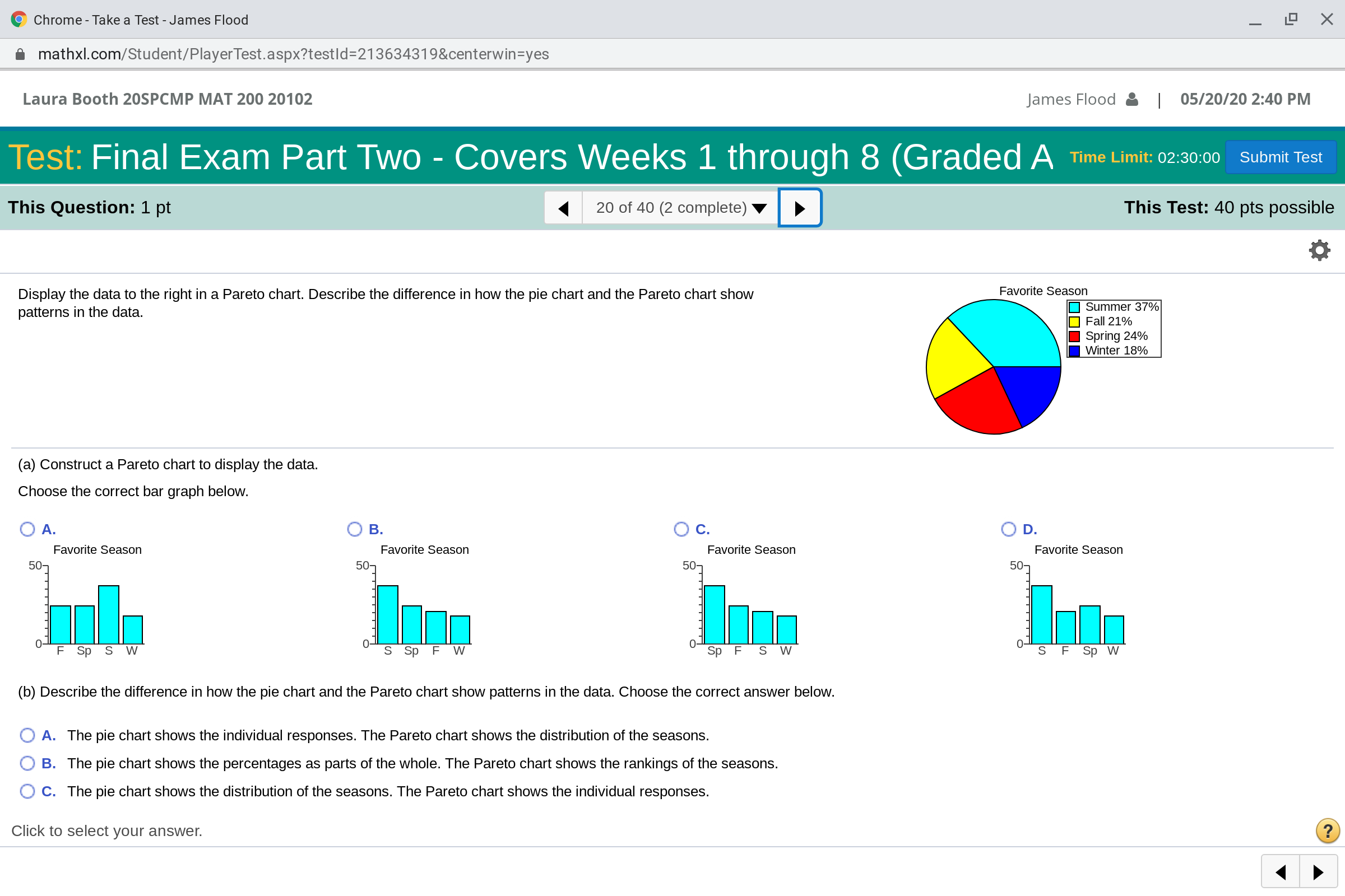
Chrome - Take a Test - James Flood X mathxl.com/Student/PlayerTest. aspx?testld=213634319¢erwin=yes Laura Booth 20SPCMP MAT 200 20102 James Flood & | 05/20/20 2:40 PM Test: Final Exam Part Two - Covers Weeks 1 through 8 (Graded A Time Limit: 02:30:00 Submit Test This Question: 1 pt 20 of 40 (2 complete) This Test: 40 pts possible Display the data to the right in a Pareto chart. Describe the difference in how the pie chart and the Pareto chart show Favorite Season patterns in the data. Summer 37% Fall 21% Spring 24% Winter 18% (a) Construct a Pareto chart to display the data. Choose the correct bar graph below. O A. O B. O c. O D. Favorite Season Favorite Se Favorite Season Favorite Season 507 507 507 50 7 Sp S W S Sp F W TO Sp S W TO S F Sp W (b) Describe the difference in how the pie chart and the Pareto chart show patterns in the data. Choose the correct answer below. O A. The pie chart shows the individual responses. The Pareto chart shows the distribution of the seasons. O B. The pie chart shows the percentages as parts of the whole. The Pareto chart shows the rankings of the seasons. O C. The pie chart shows the distribution of the seasons. The Pareto chart shows the individual responses. Click to select your answer.
Step by Step Solution
There are 3 Steps involved in it

Get step-by-step solutions from verified subject matter experts